VILA DO CONDE


VILA DO CONDE

BY ALEXANDRA NUNES DE OLIVEIRA FONSECA


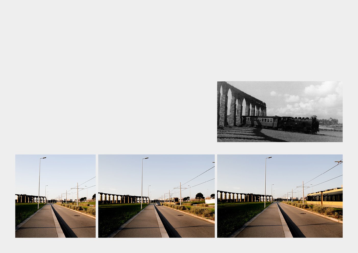
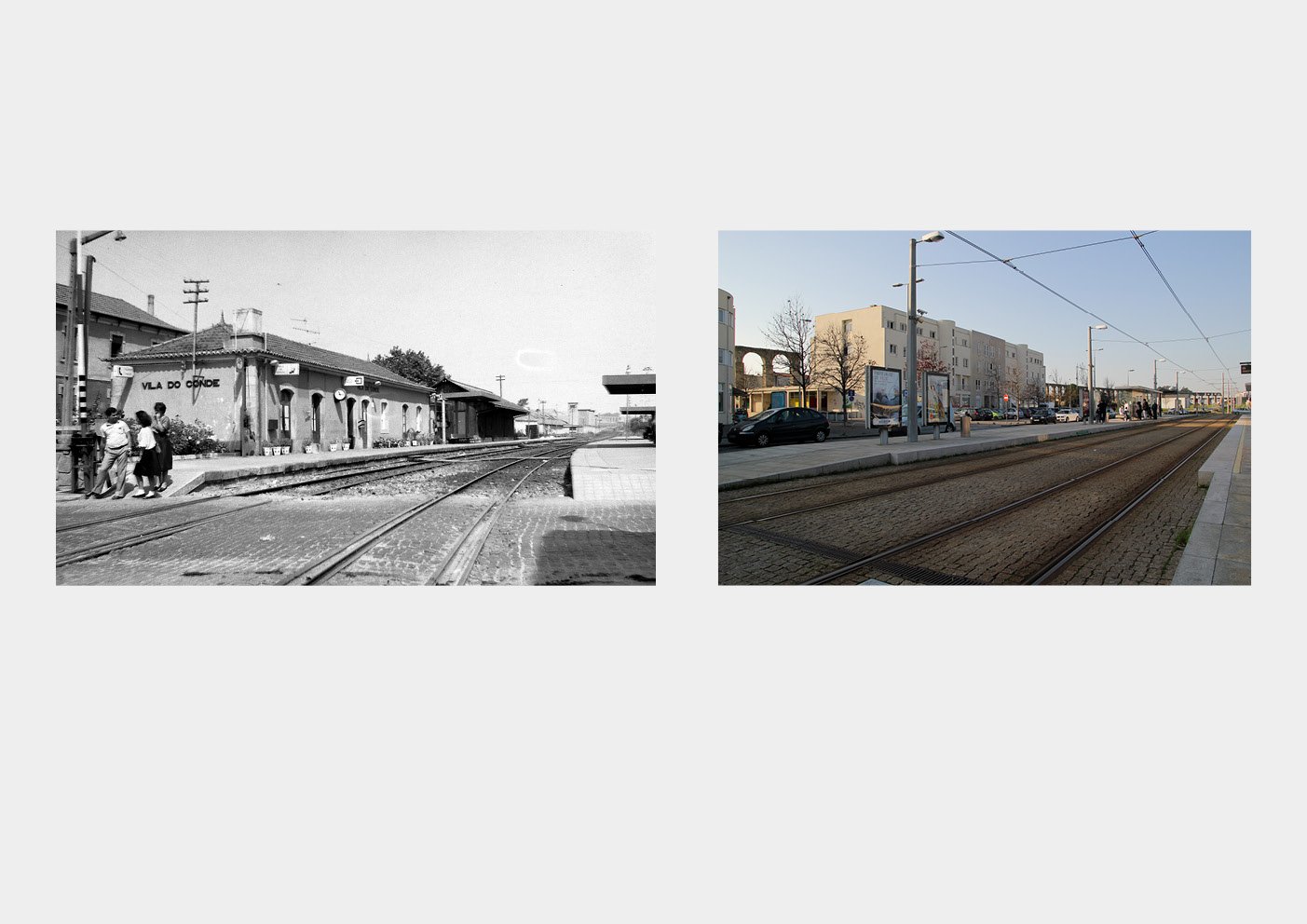
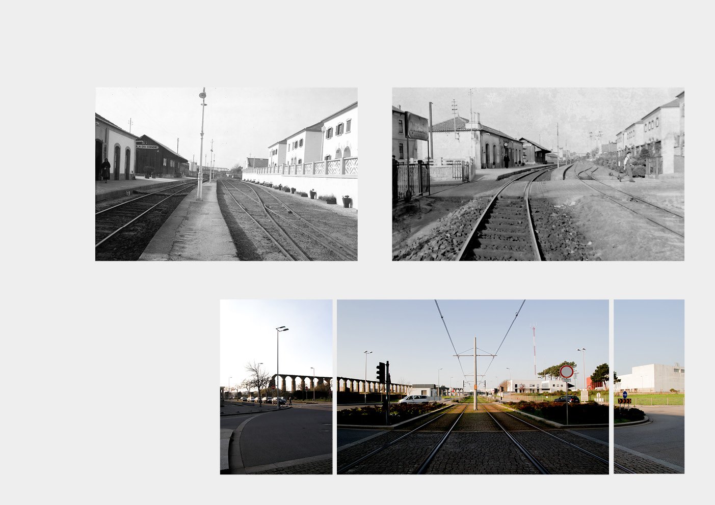
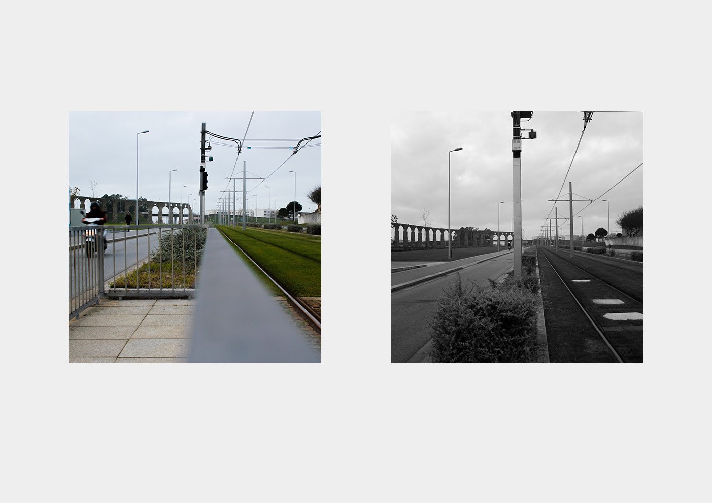
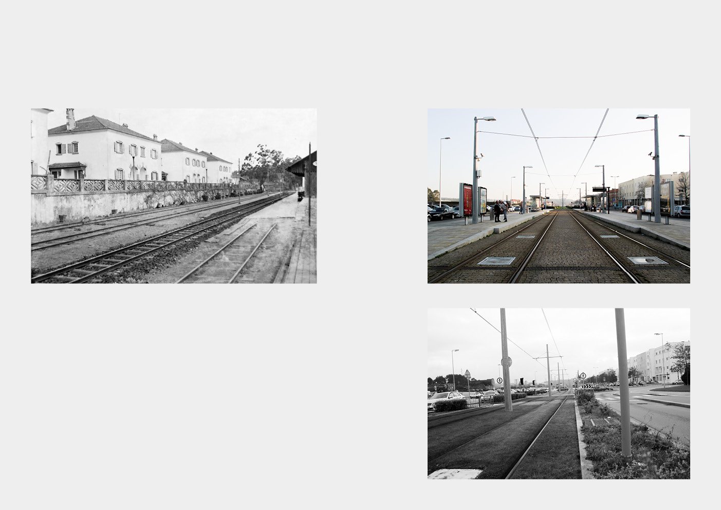
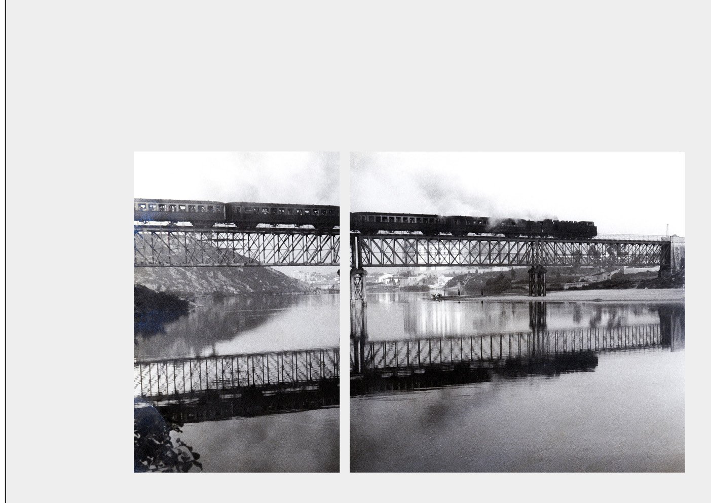
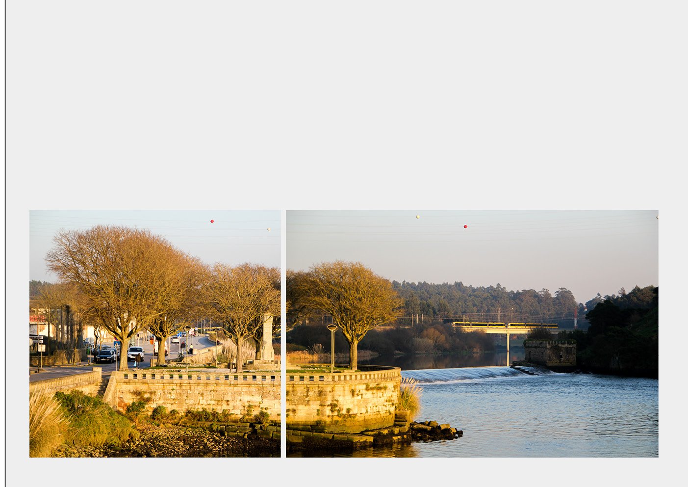
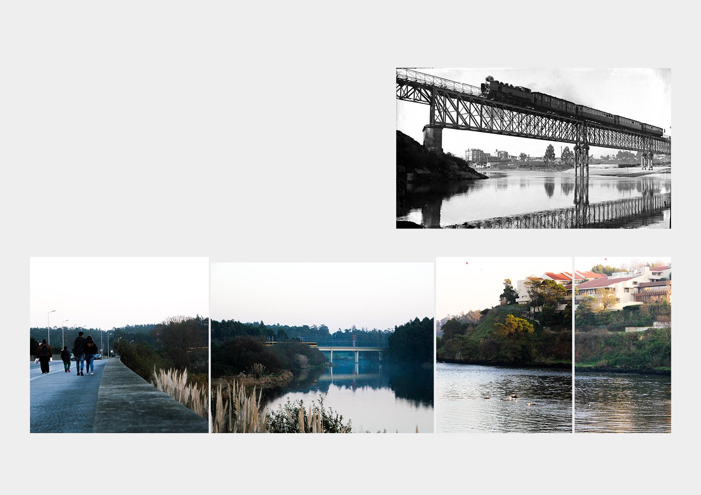
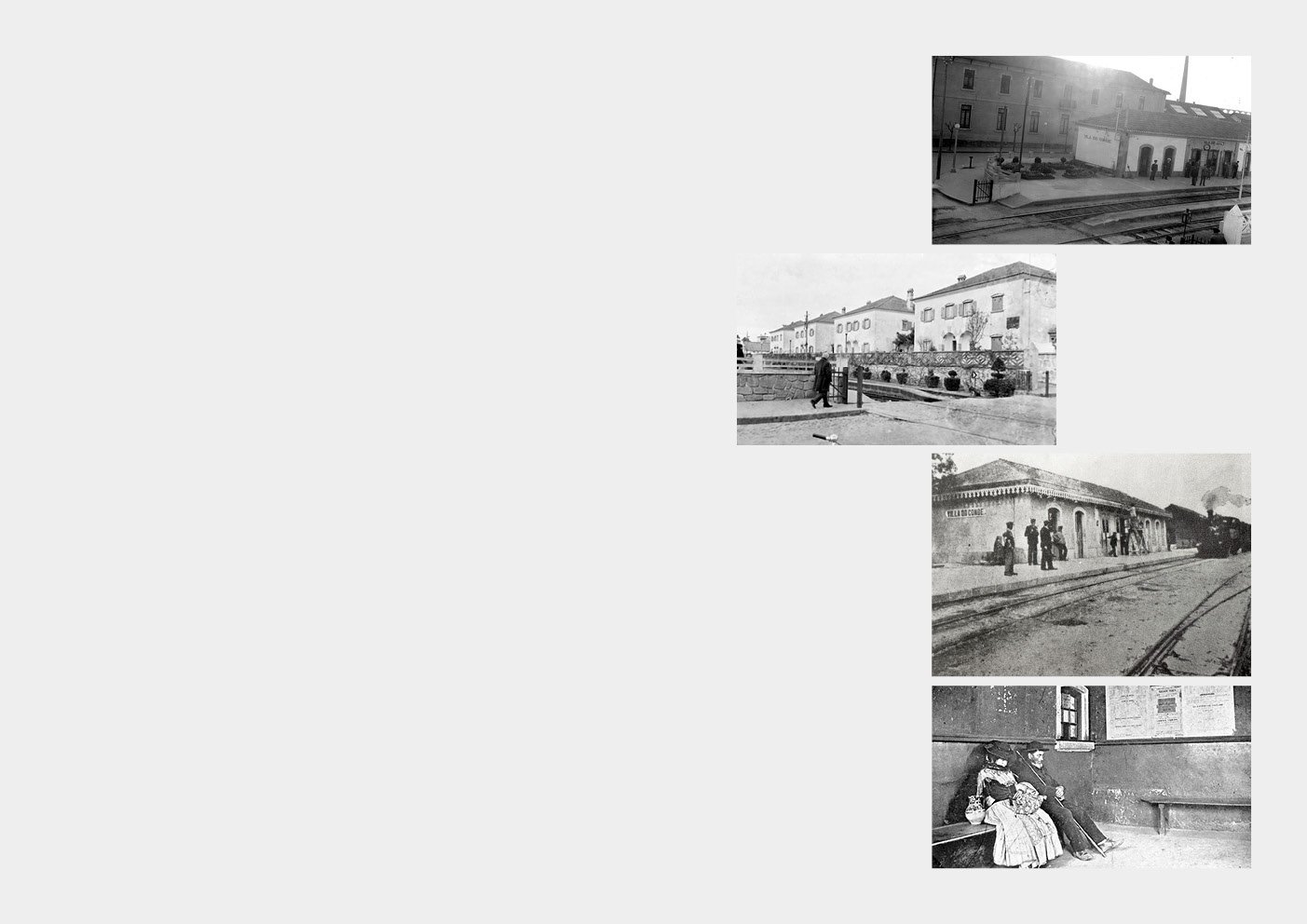
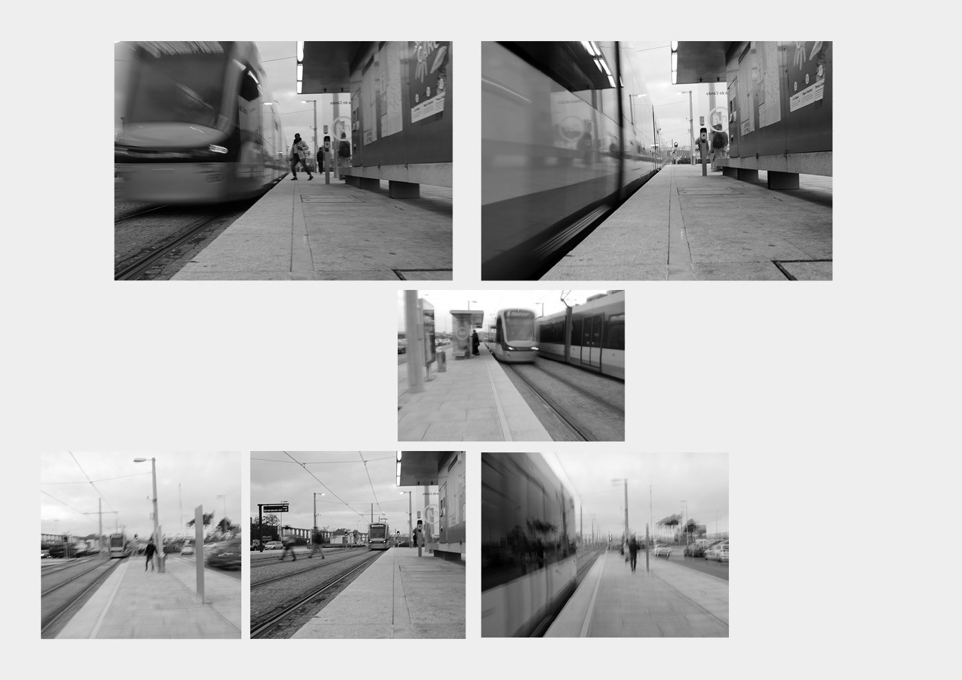
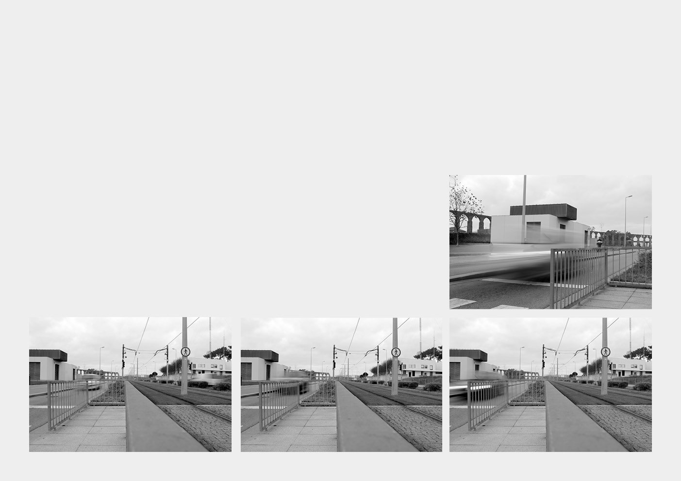
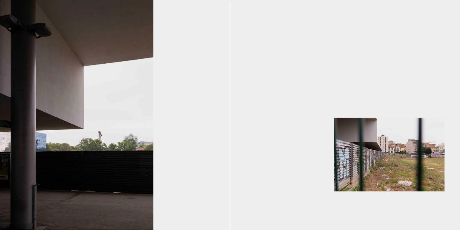
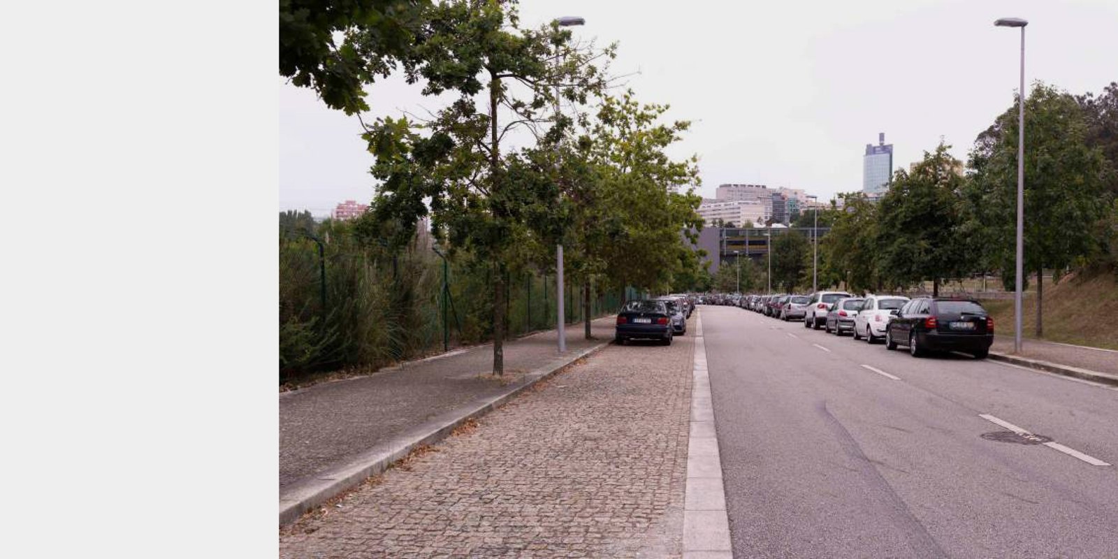
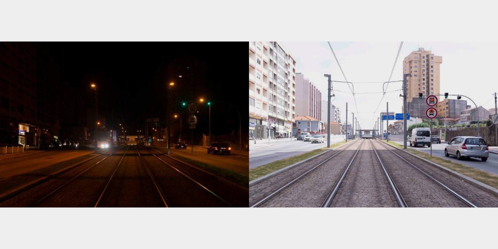
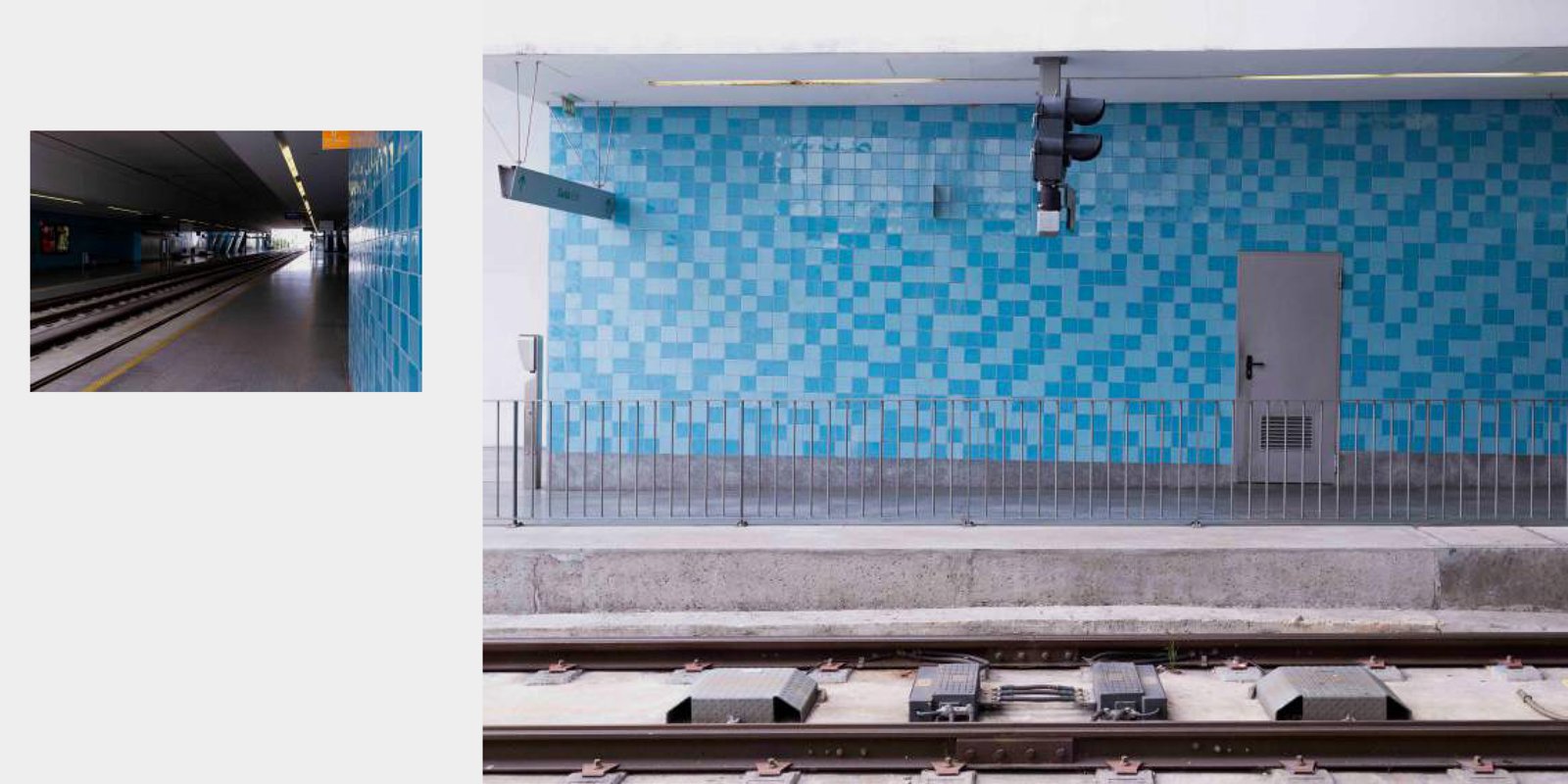
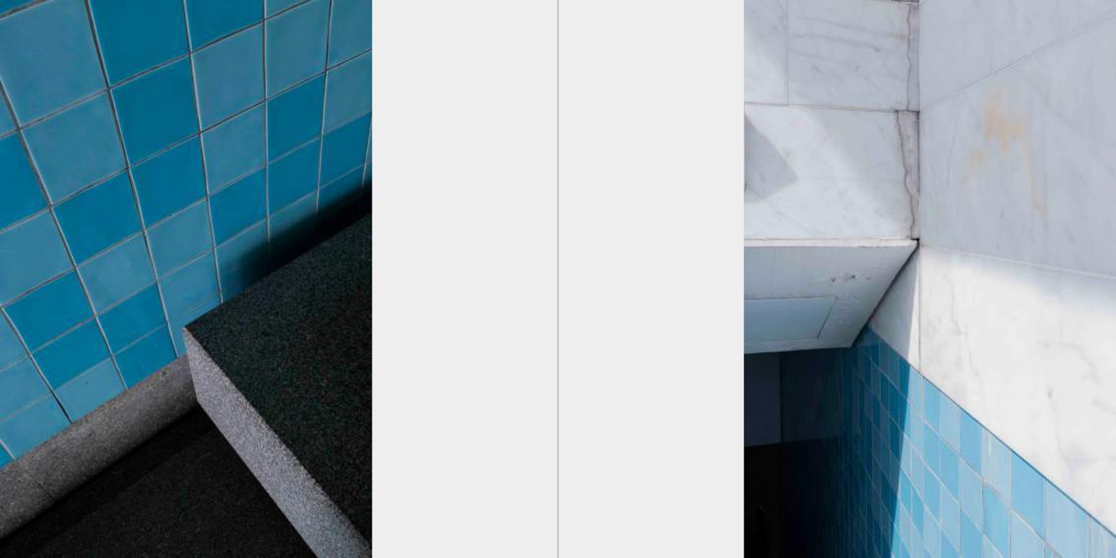
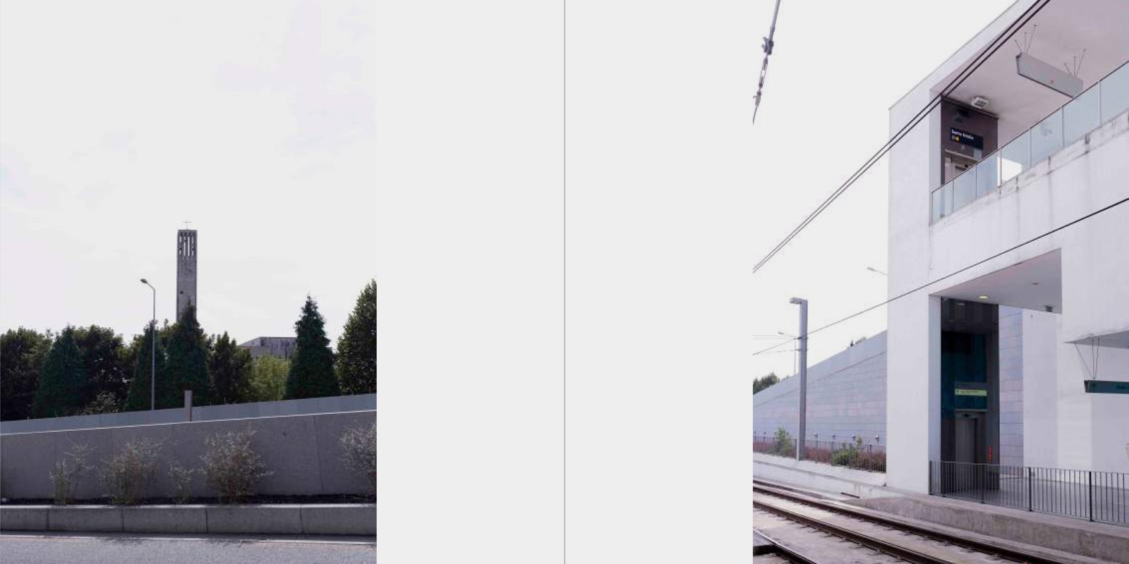
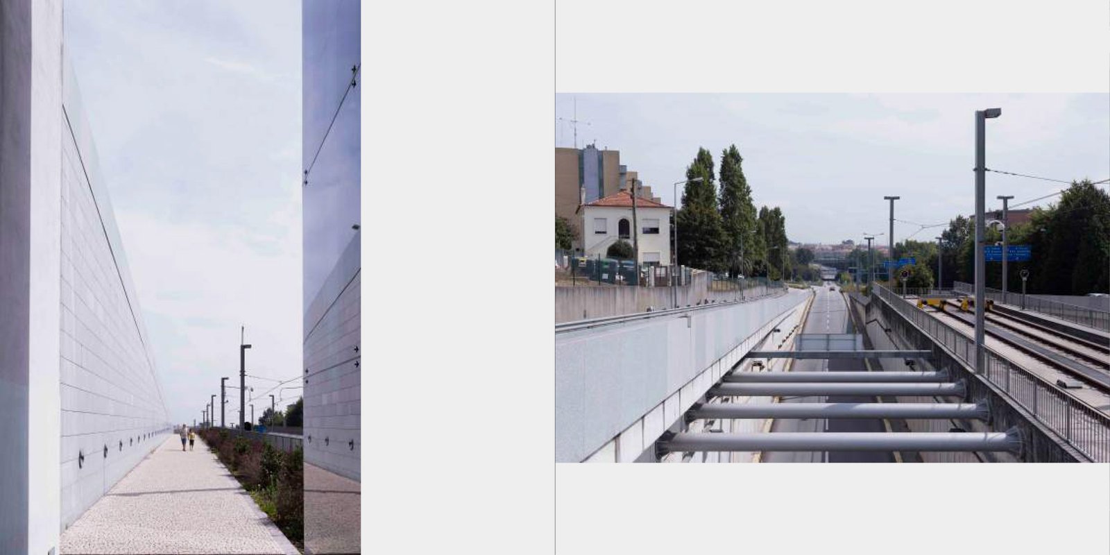
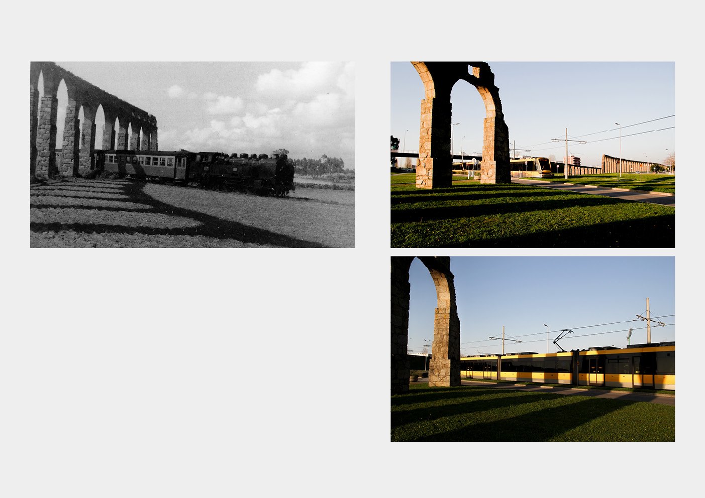
Those who travel by train or subway inevitably stares outside the window, observing the images of the landscape that rapidly fade away, while getting lost in their thoughts. Photography is used here not only as a means of artistic expression, but also, as a tool that aids in the study of the transformation of the territory. In this essay, I intend to study a place where the new urbanity dialogs with nature and the pre-existence. The objective of this essay is to build the memory of Vila do Conde's old railway line, documenting its existence and at the same time an attempt to recreate the images and the atmosphere lost in the memory of the "I" passenger always in confrontation and contrast with the material reality, as well as, the atmosphere of the current place.


THAT WHICH IS WITHIN AND OUTSIDE


THAT WHICH IS WITHIN AND OUTSIDE

BY DANILO TOLENTINO LEITE FERREIRA


“It is a bridge [...] that is nothing more than a connection between the rural and the urban. [...] It marks the entry into the city and the appointment of a time in the passage from one place to another. ”

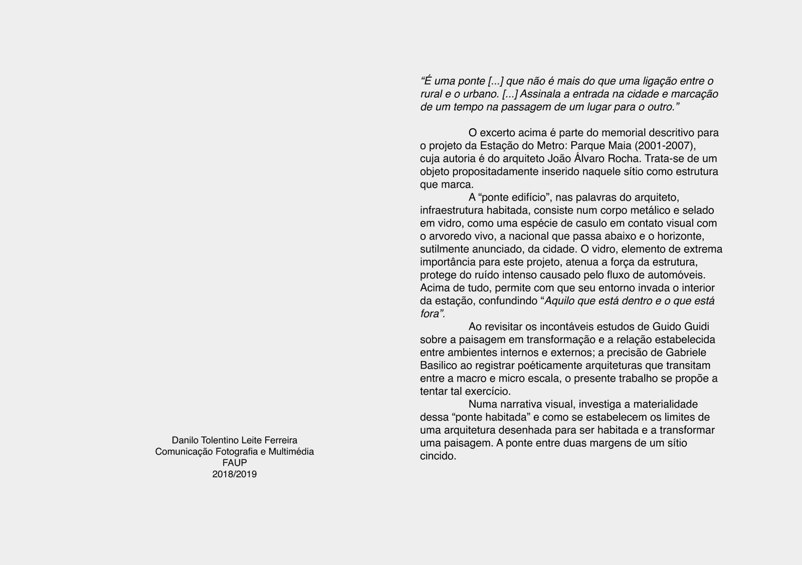
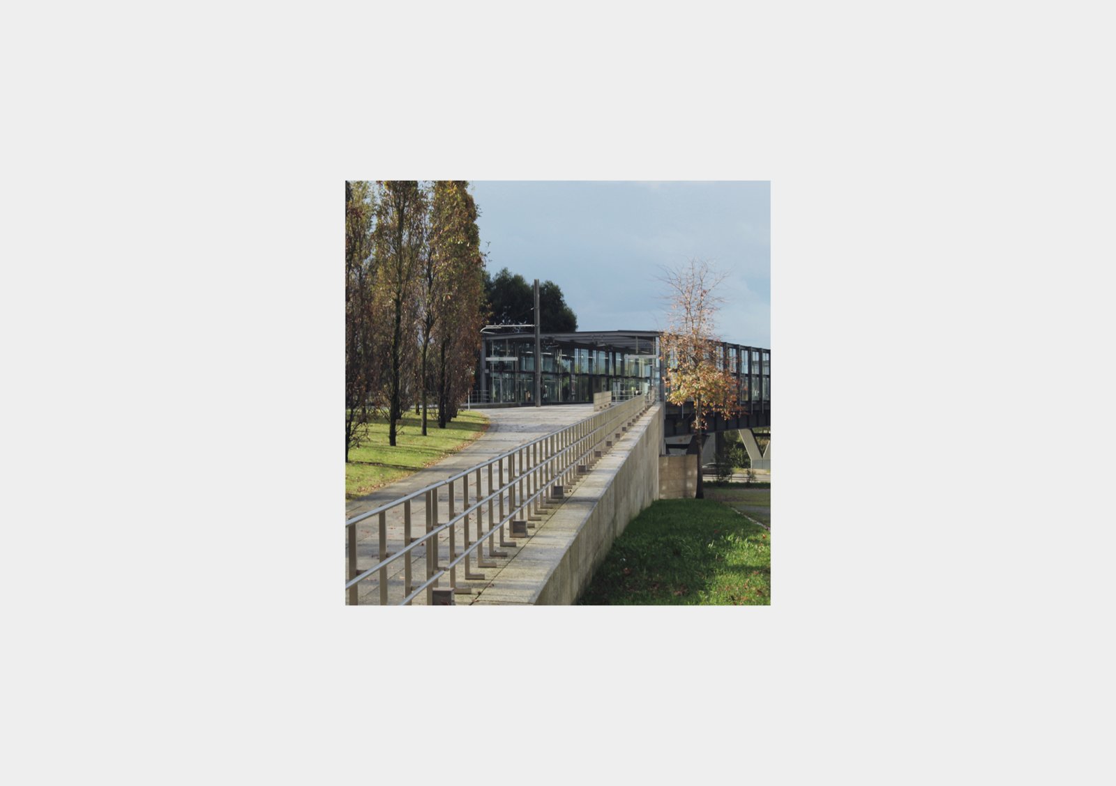
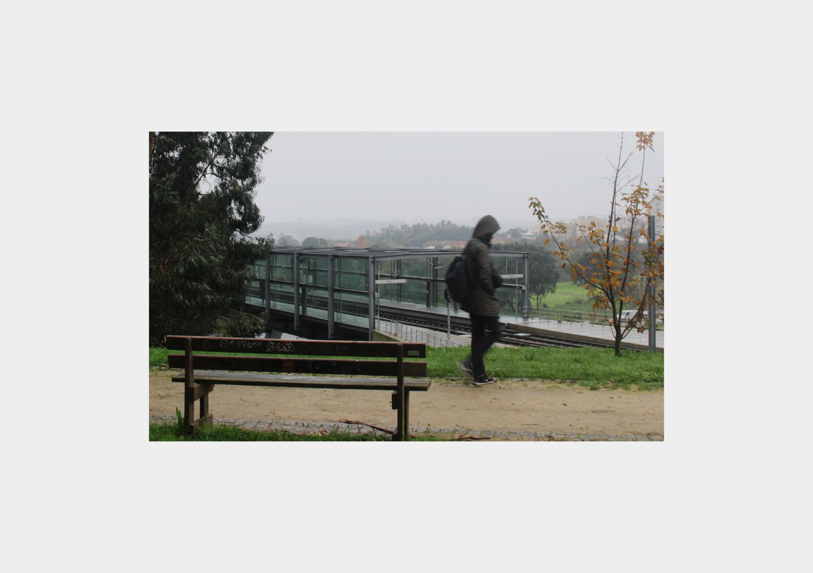
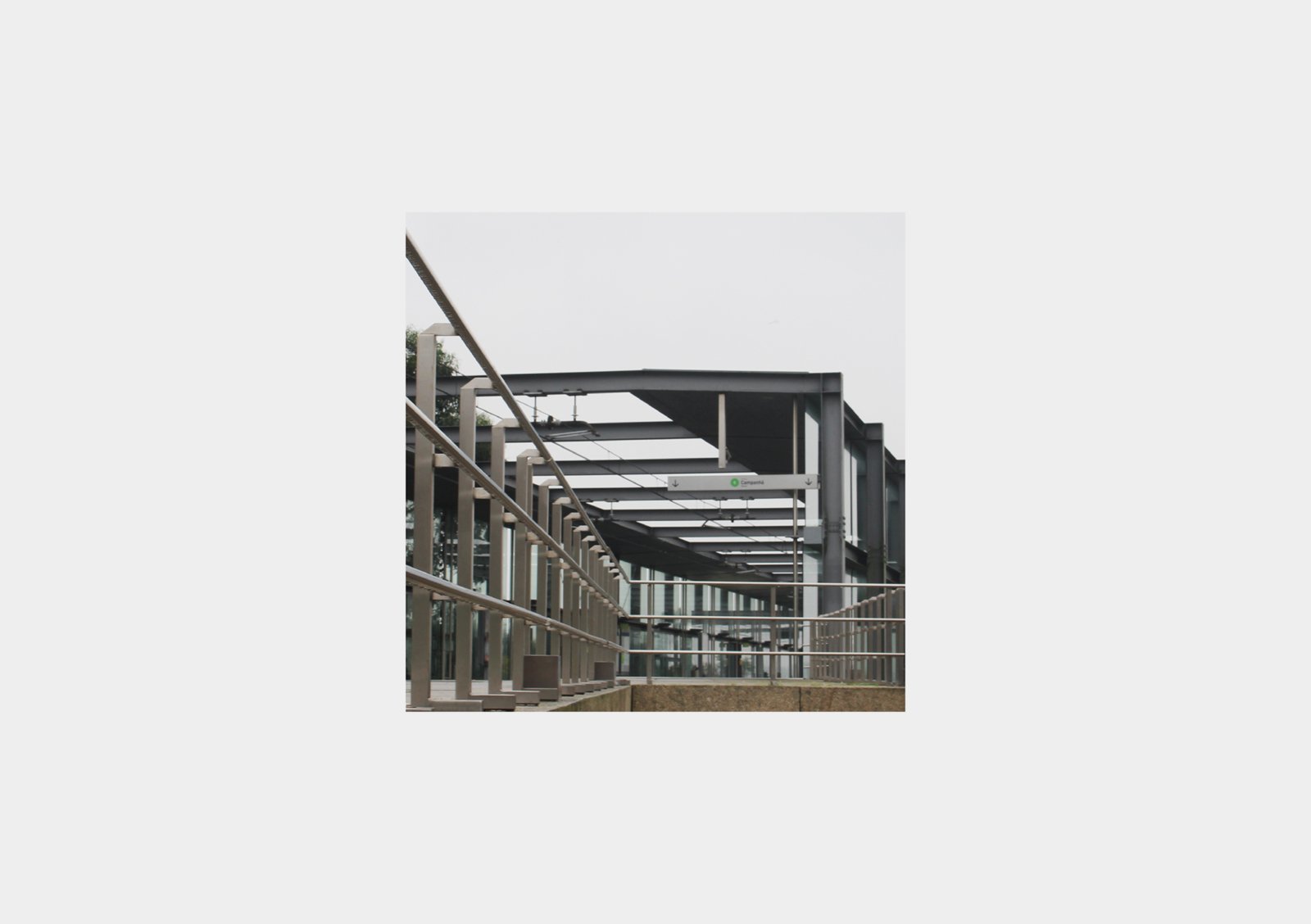
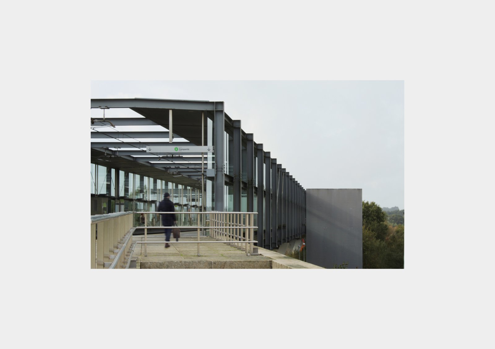
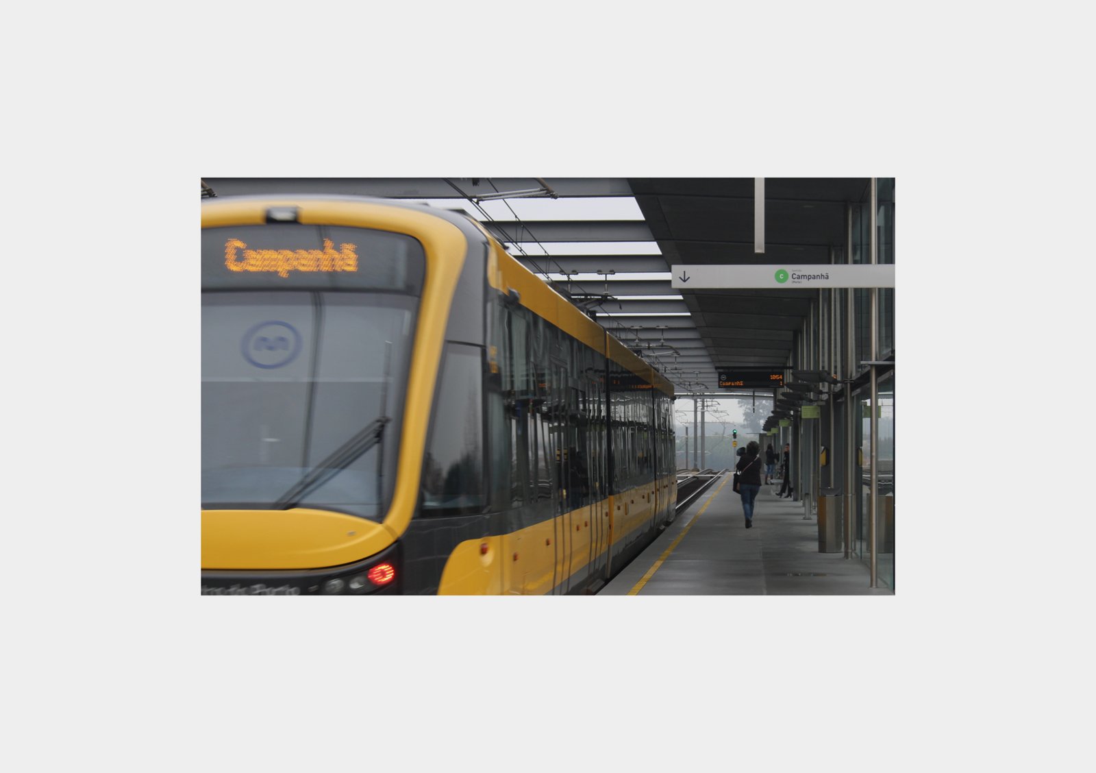
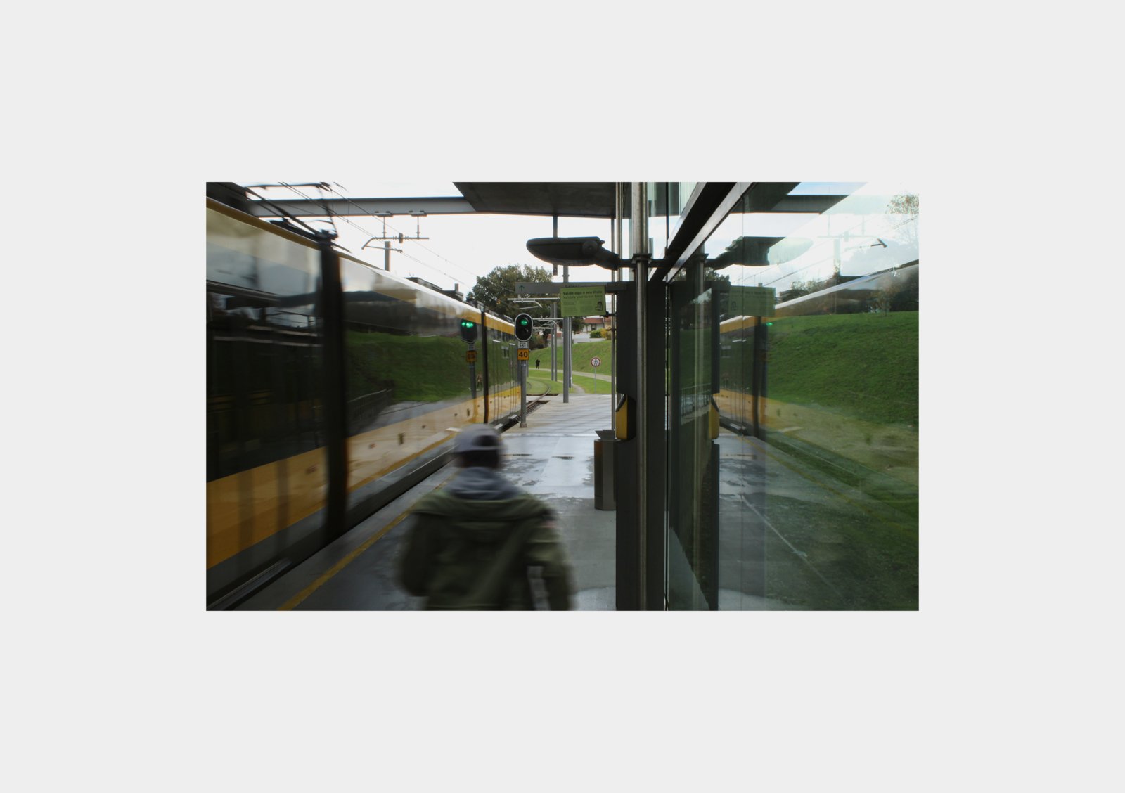
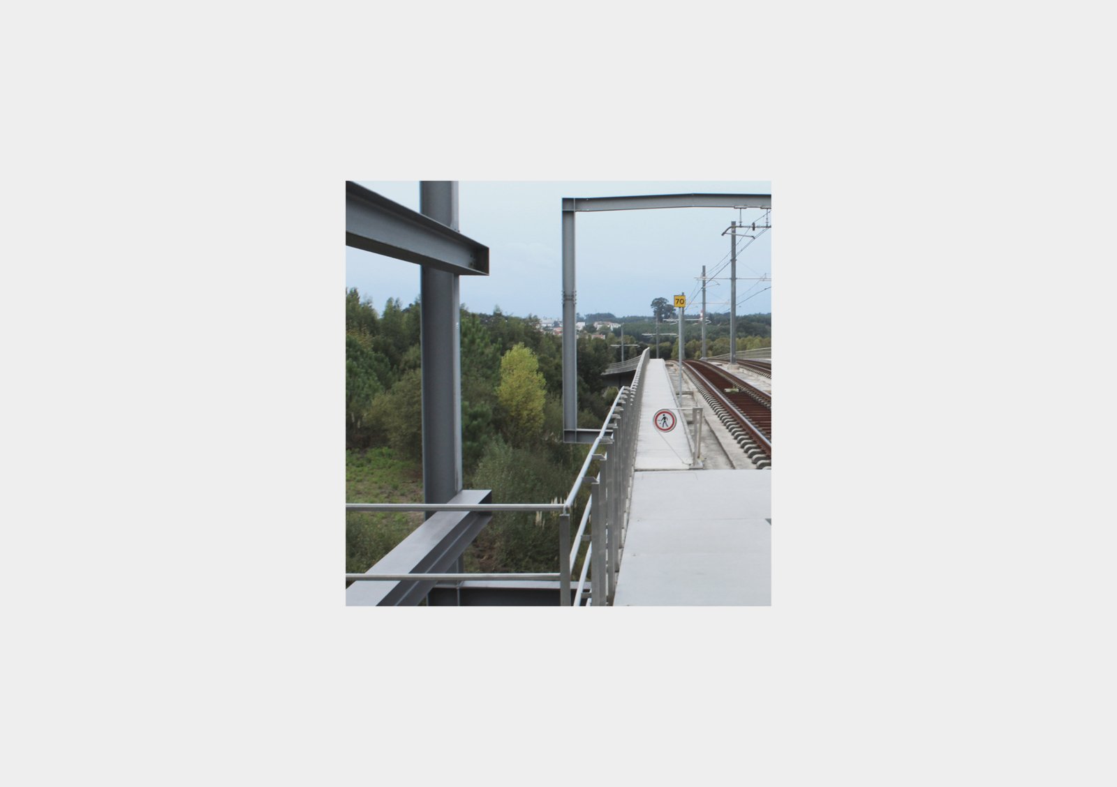
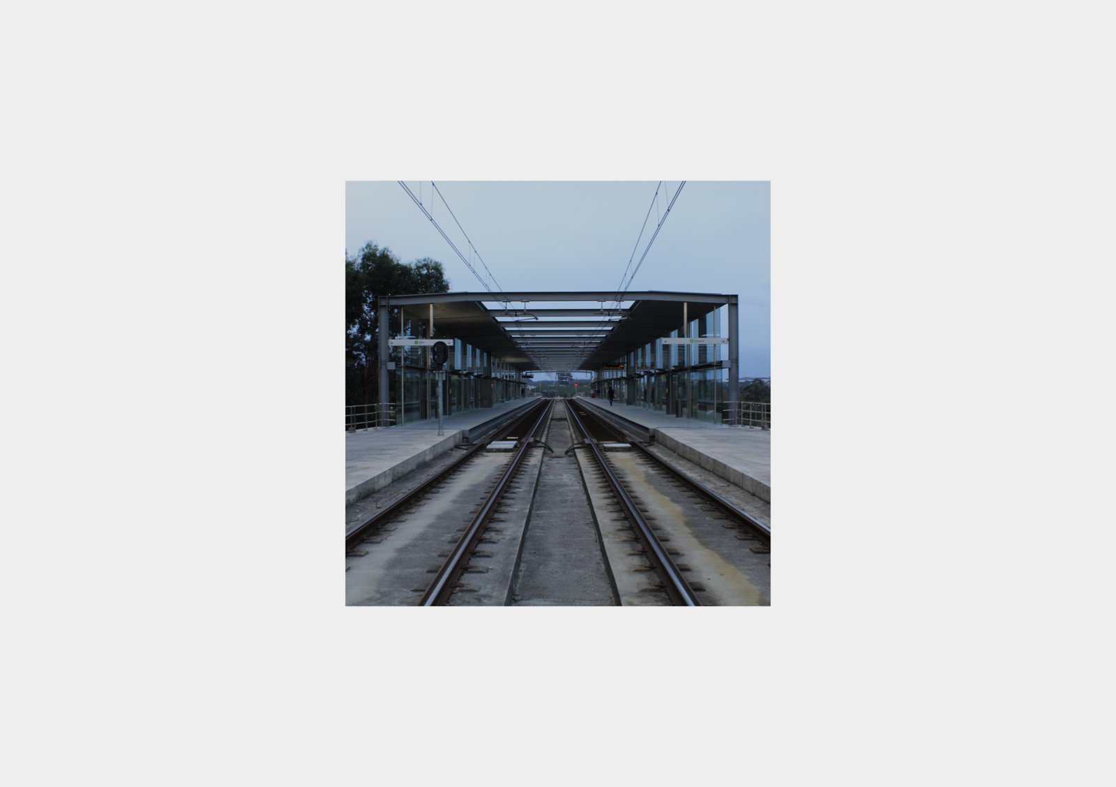
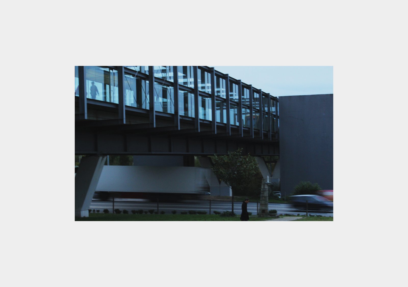
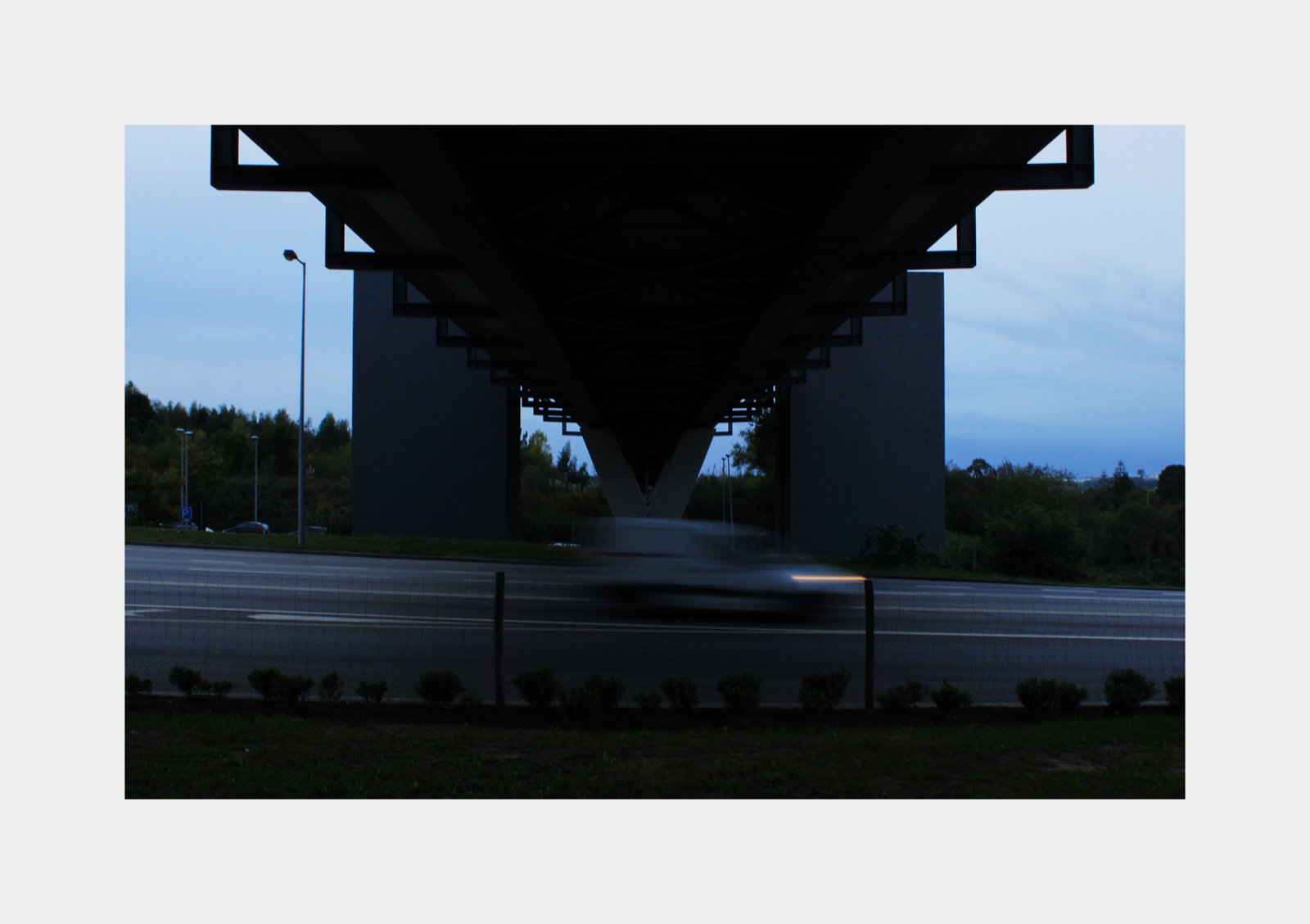
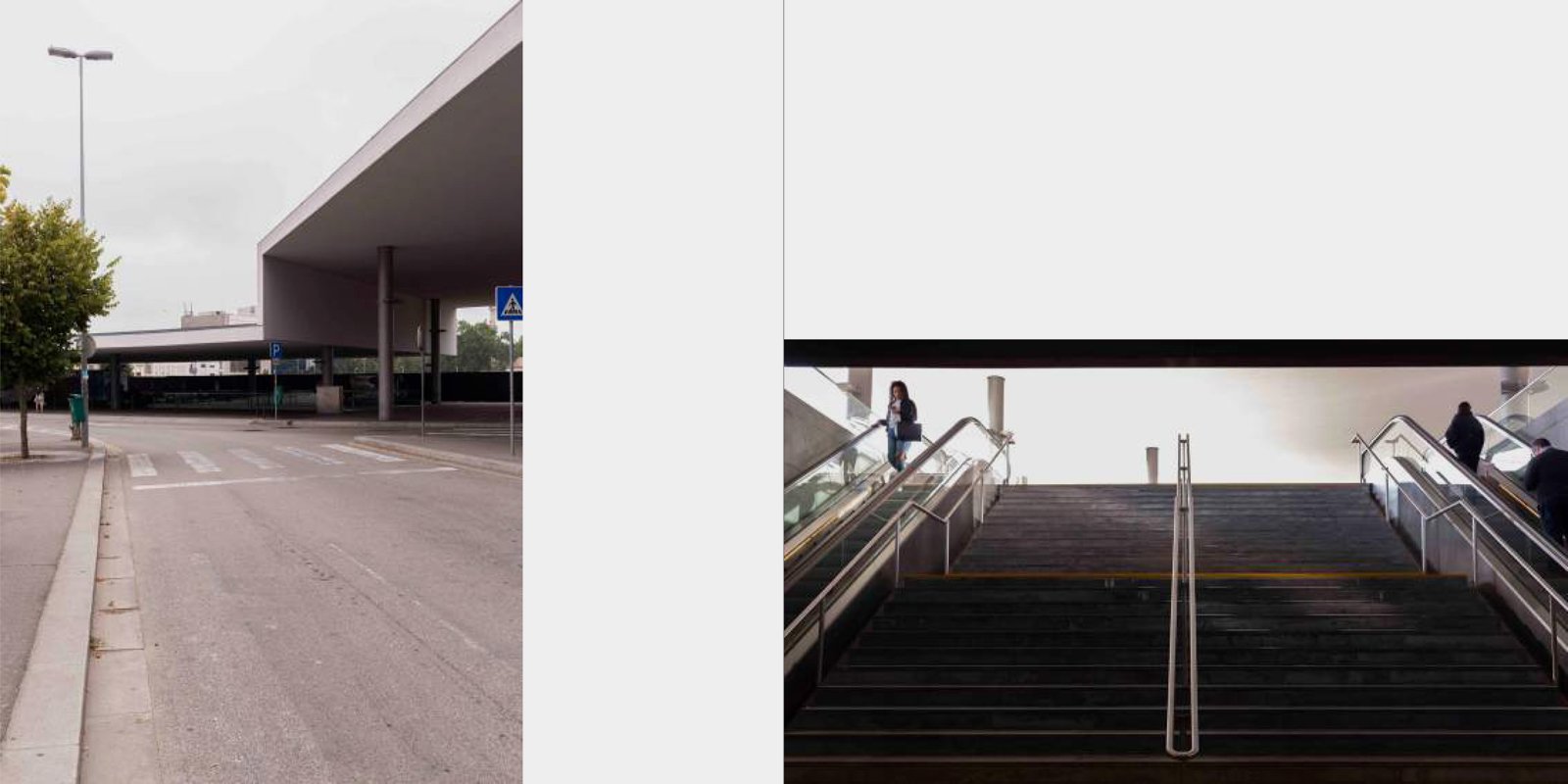
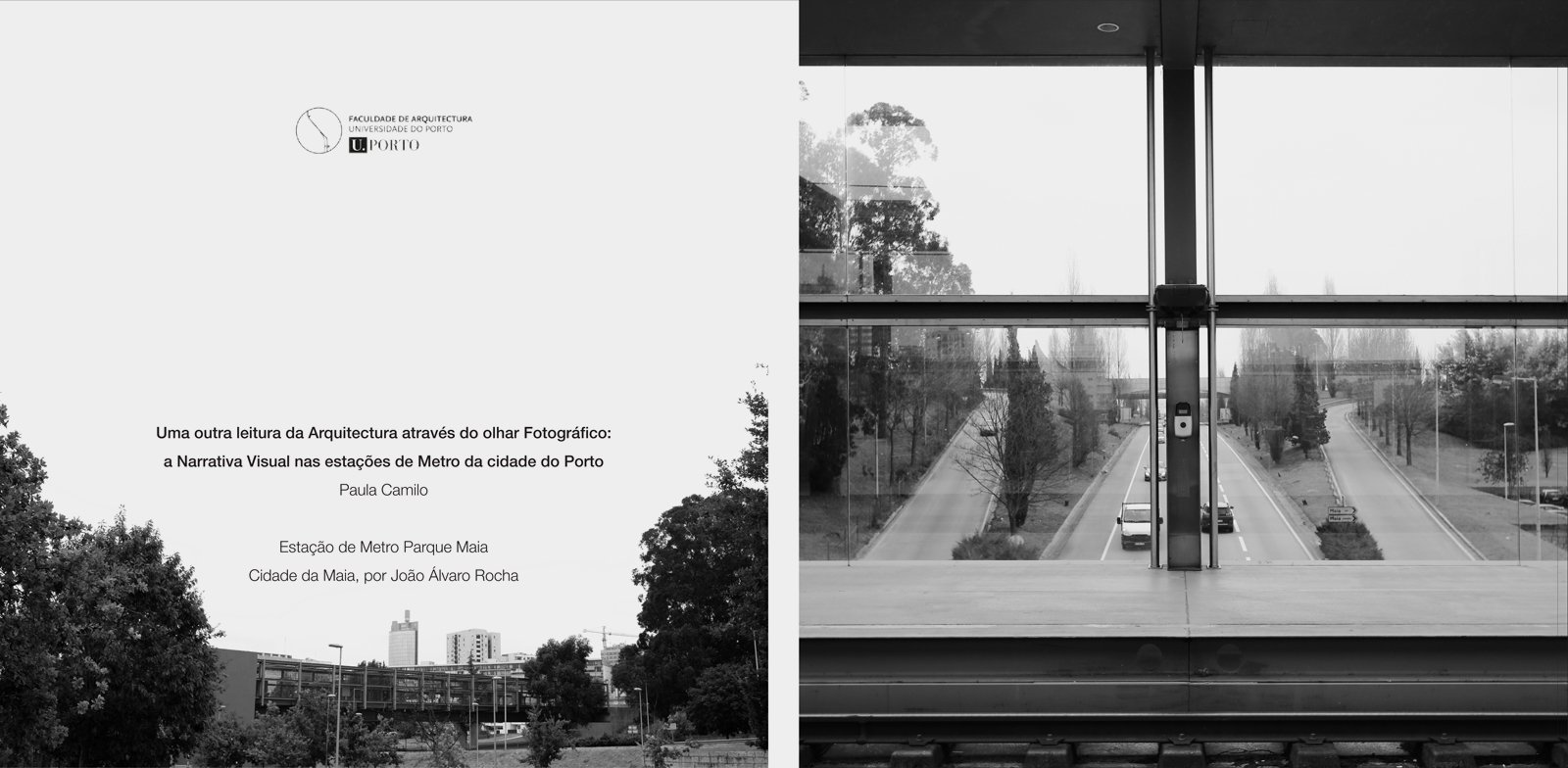
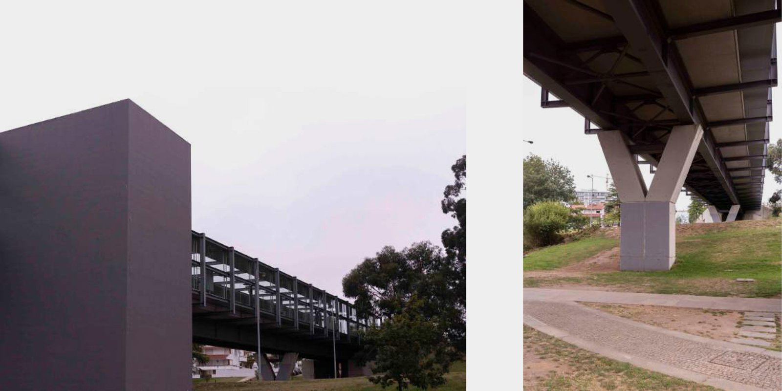
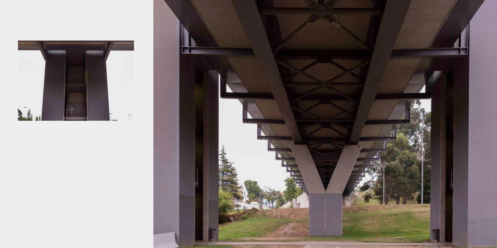
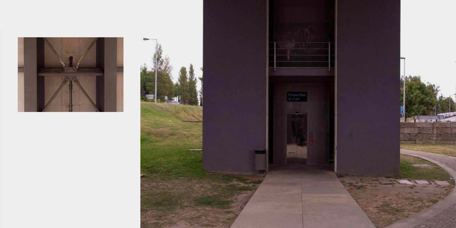
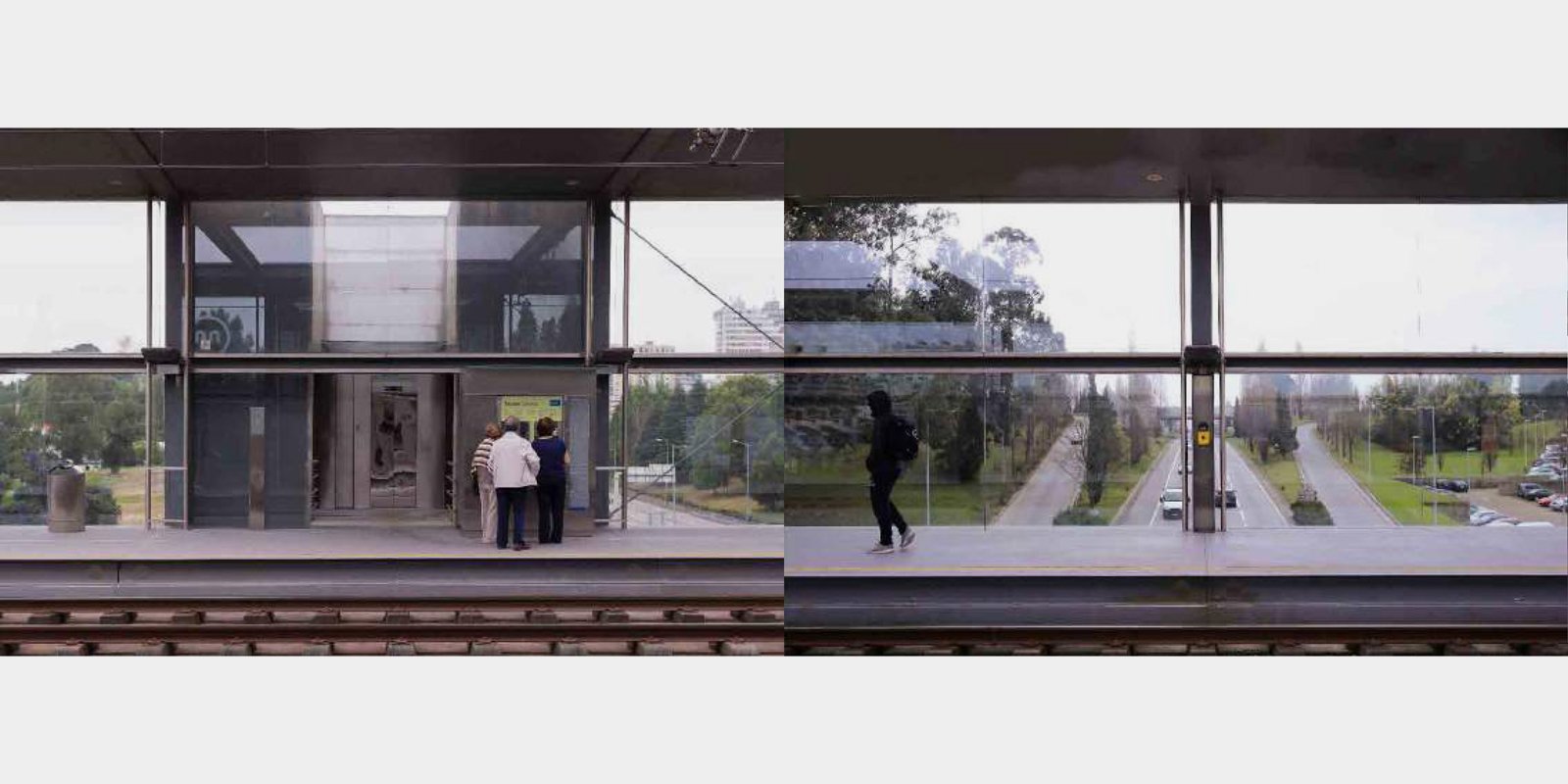
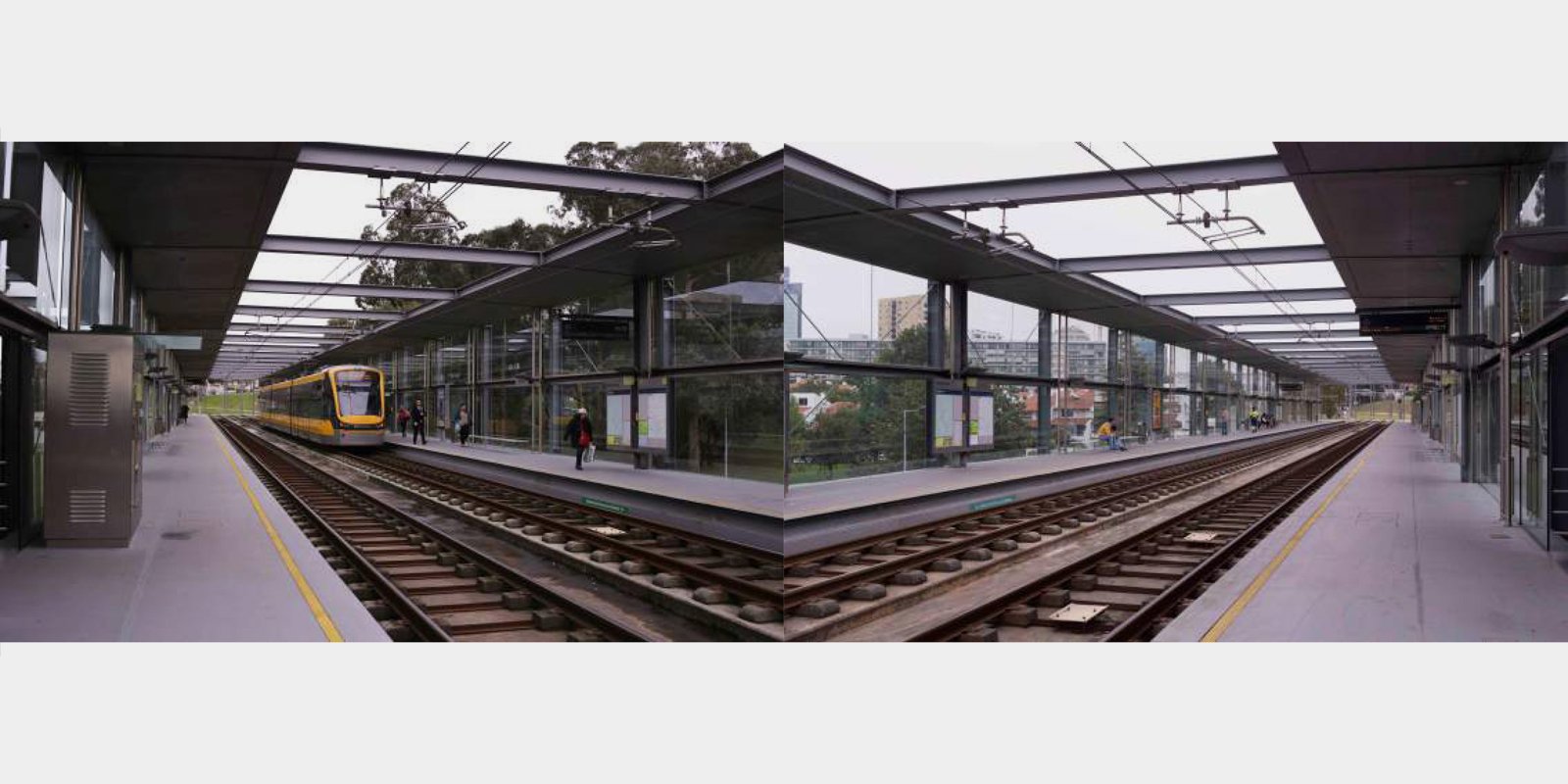
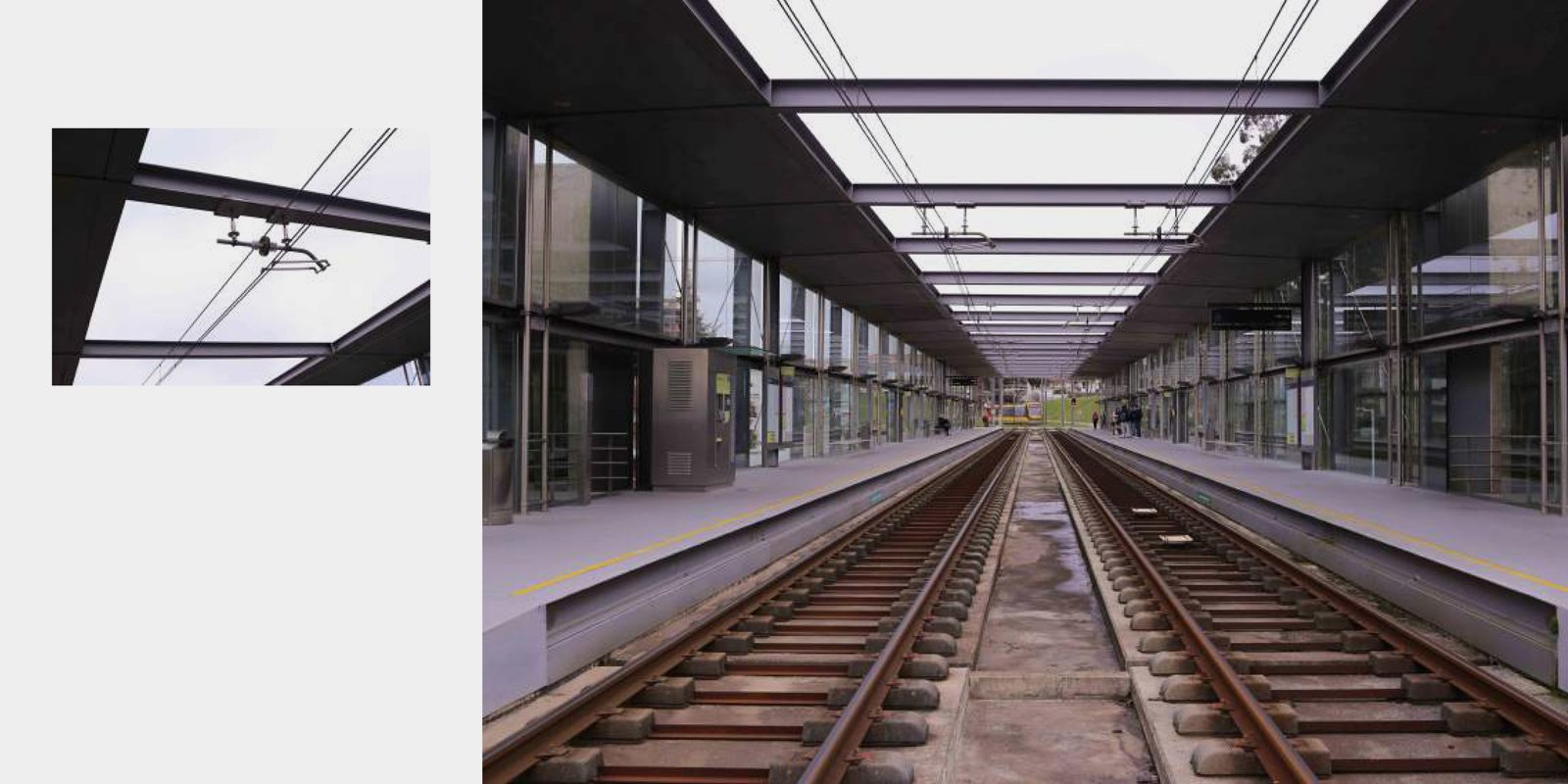
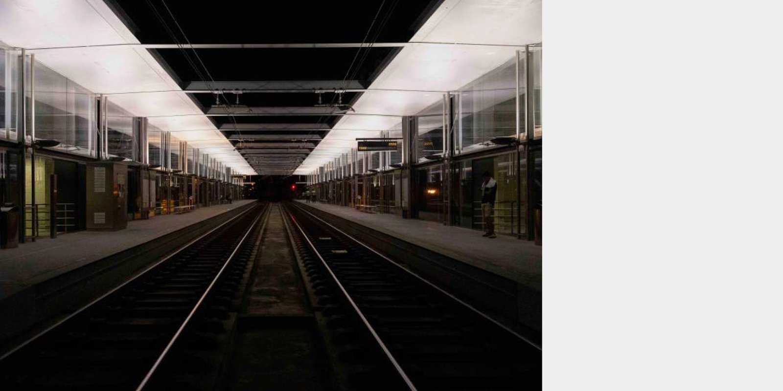
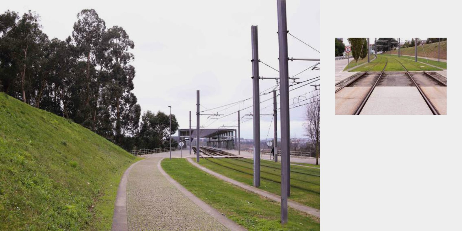
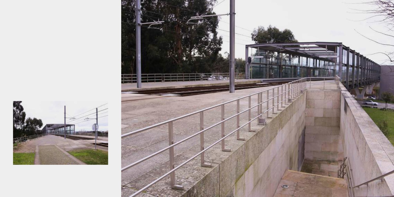
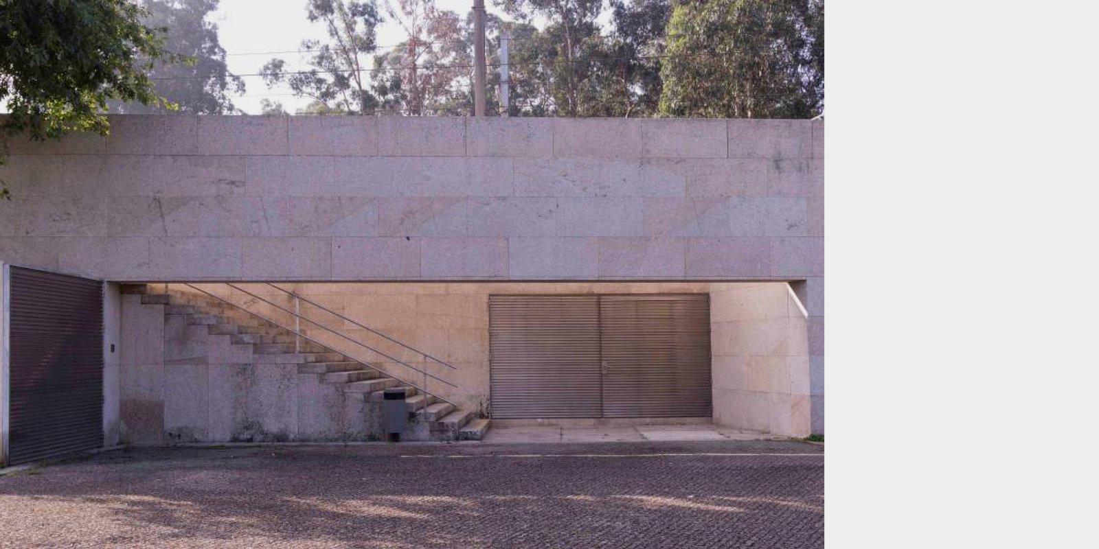
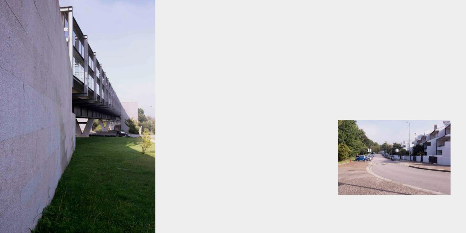
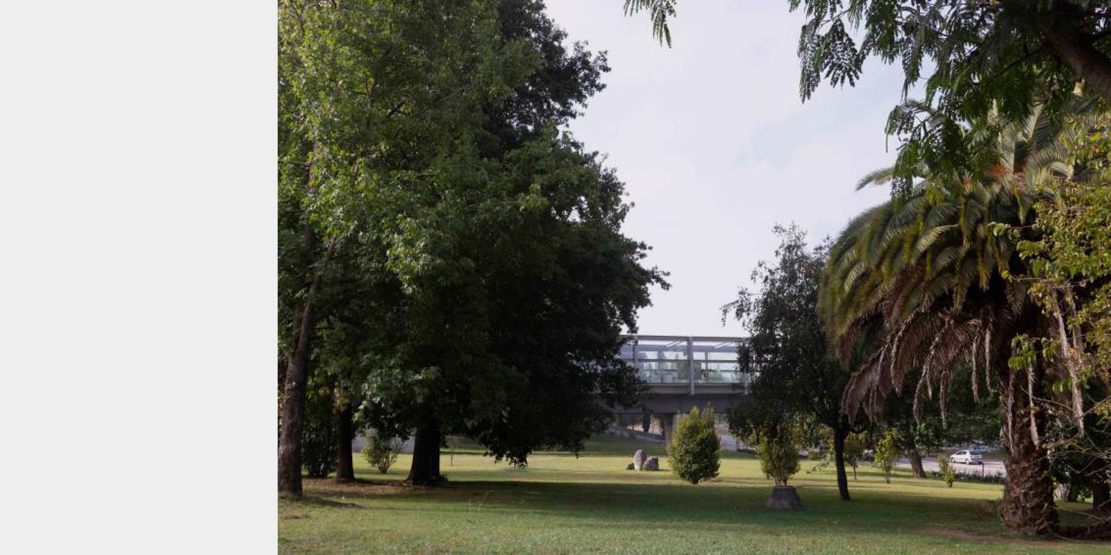
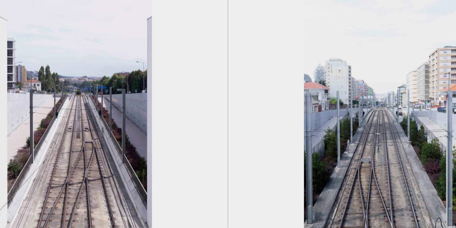
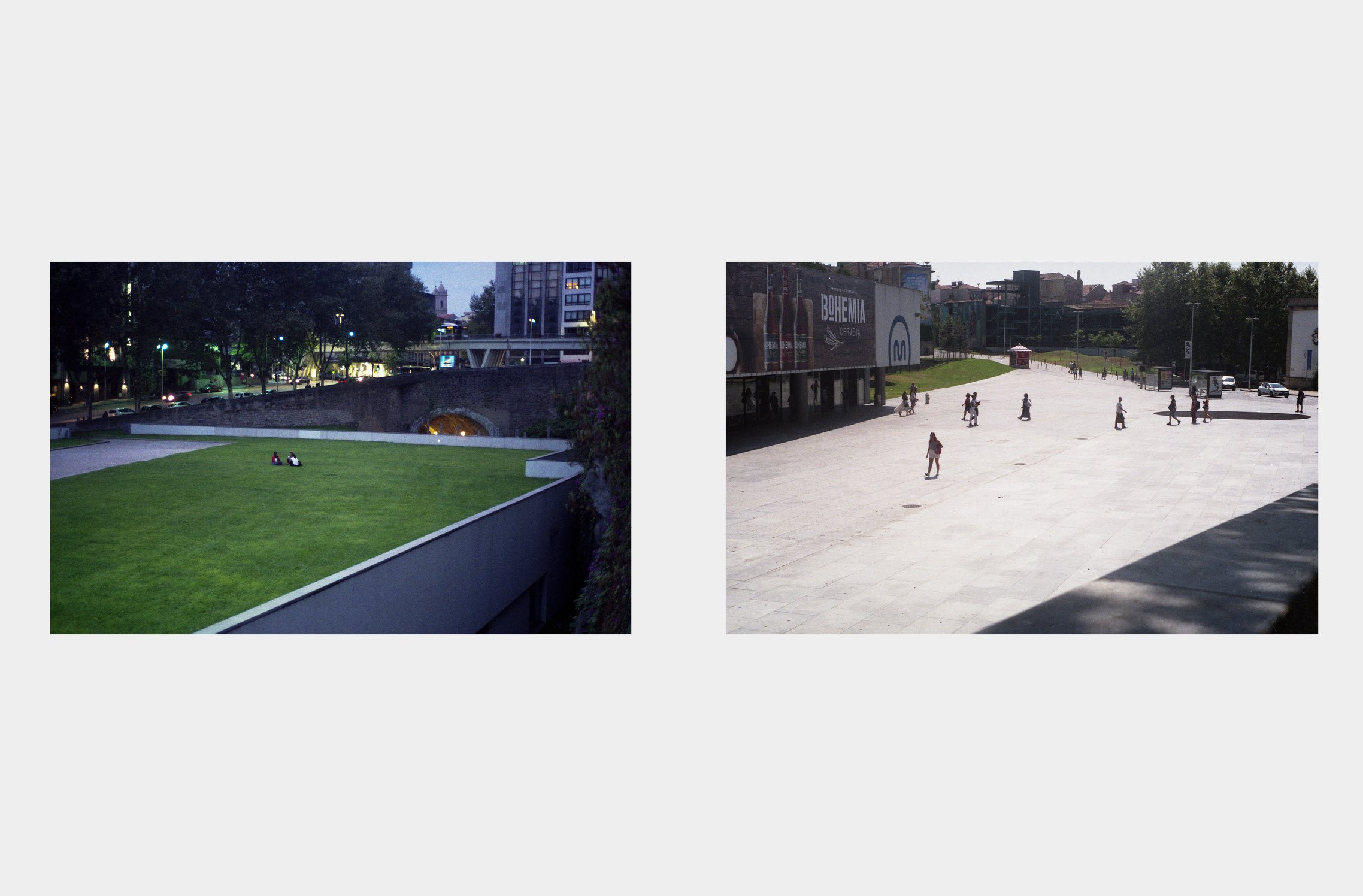
The above excerpt is part of the descriptive memorial for the Metro Station project: Parque Maia (2001-2007), authored by the architect João Álvaro Rocha. It is an object purposely inserted in that place as a structure that marks. The “building bridge”, in the words of the architect, inhabited infrastructure, consists of a metallic body and sealed in glass, as a kind of cocoon in visual contact with the live grove, the national one that passes below and the horizon, subtly announced, of the city. Glass, an extremely important element for this project, attenuates the strength of the structure, protects from the intense noise caused by the flow of automobiles. Above all, it allows its surroundings to invade the interior of the station, confusing "What is inside and what is outside". By revisiting Guido Guidi's countless studies on the changing landscape and the relationship established between internal and external environments; the precision of Gabriele Basilico when registering poetically architectures that move between macro and micro scale, the present work proposes to try such an exercise. In a visual narrative, he investigates the materiality of this “inhabited bridge” and how the limits of an architecture designed to be inhabited and transform a landscape are established. The bridge between two banks of a cinced site.


MARQUÊS METRO STATION


MARQUÊS METRO STATION

BY SARA ALVES, BENITO LARRAIN, SALOMO ZELTNER, MARÍA RIAL, ANTONIA PASCAL


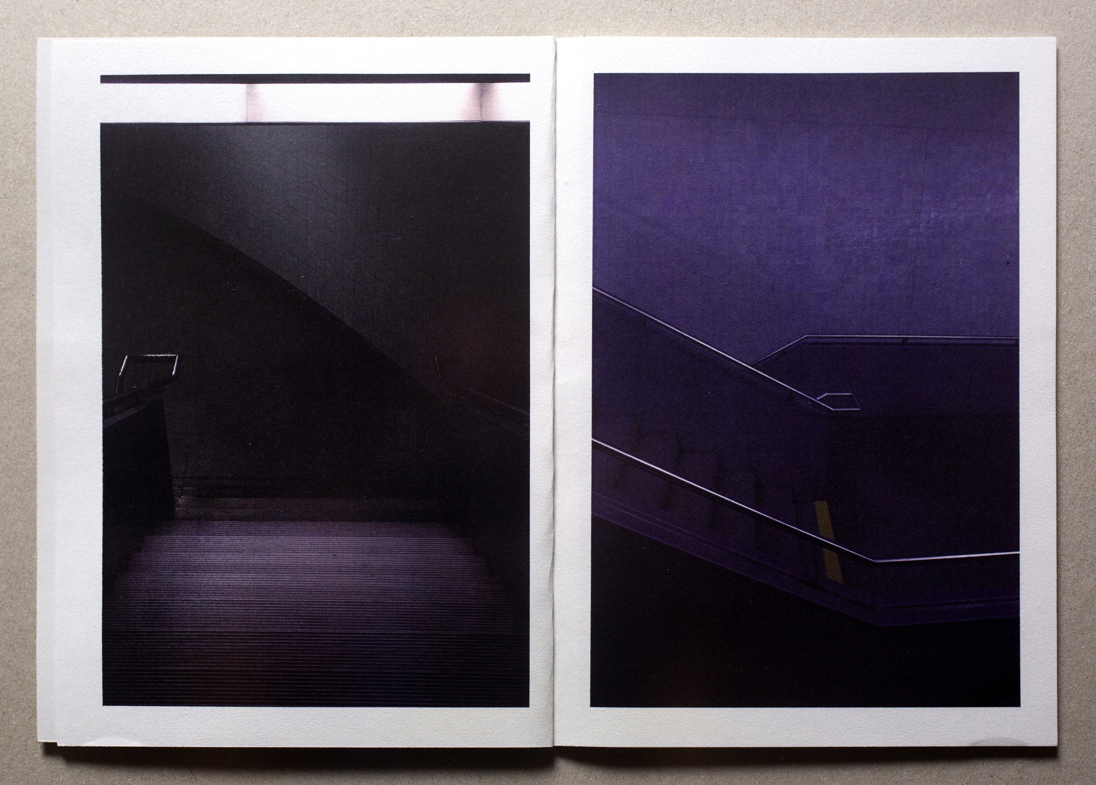
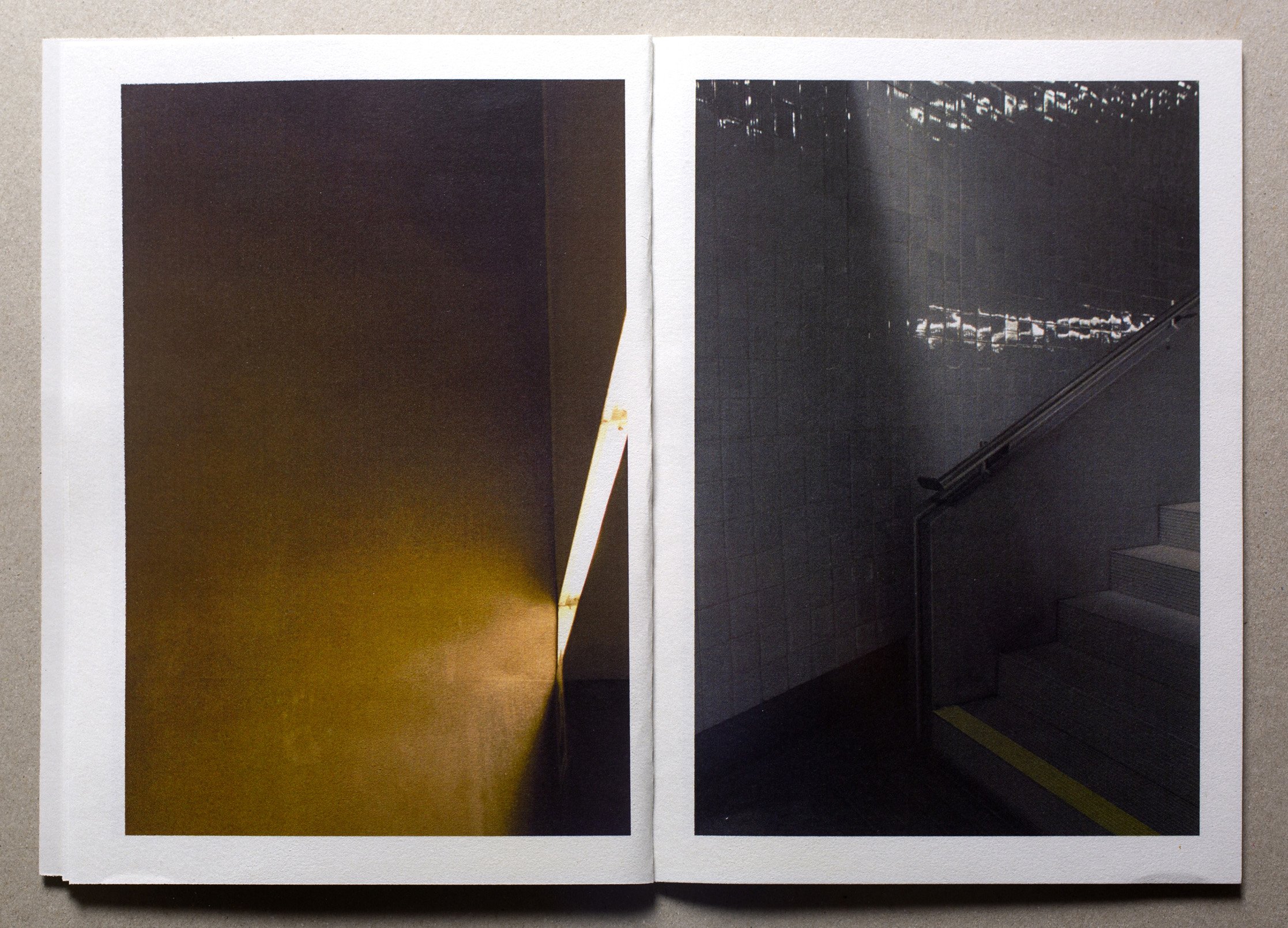
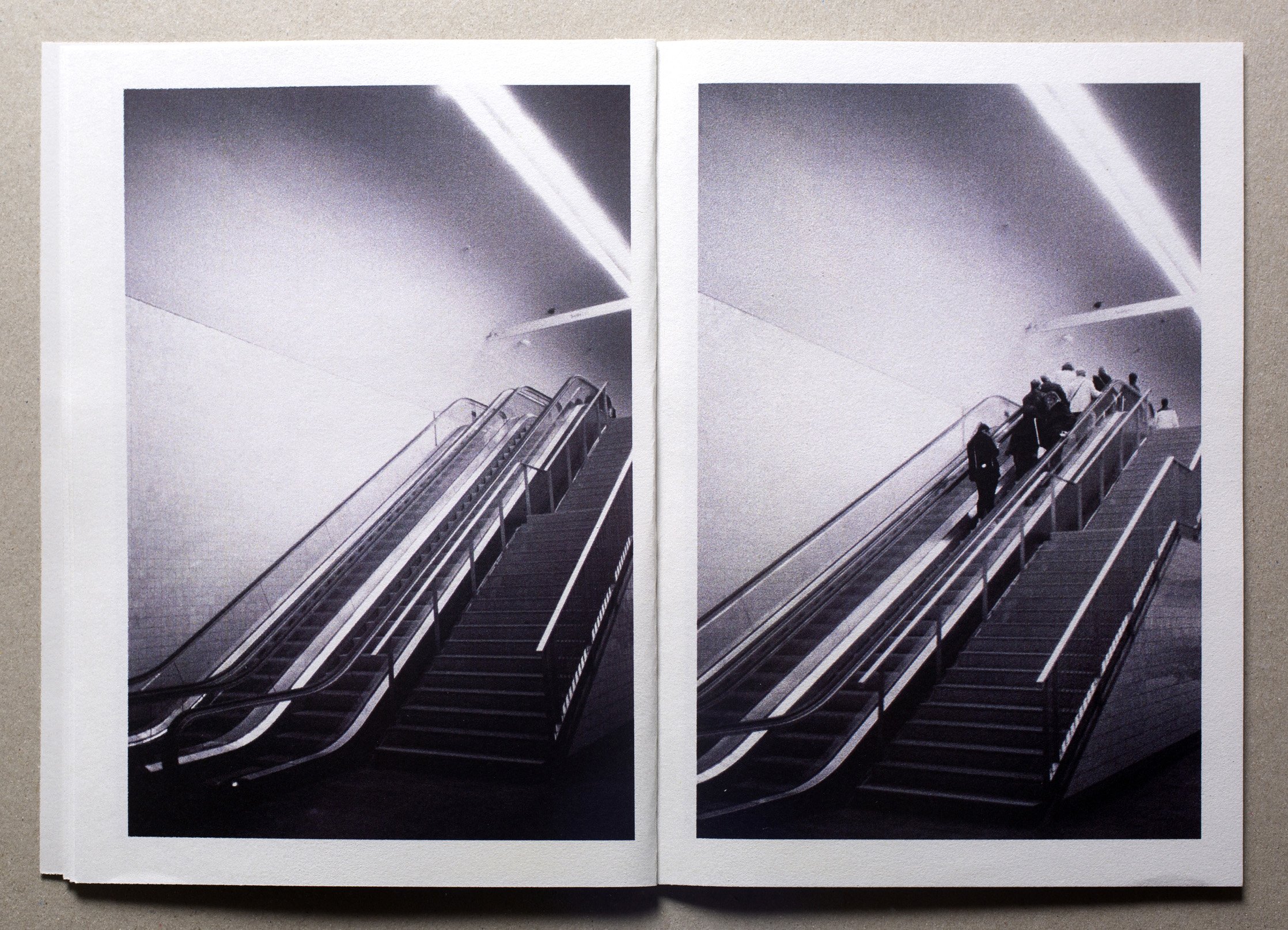
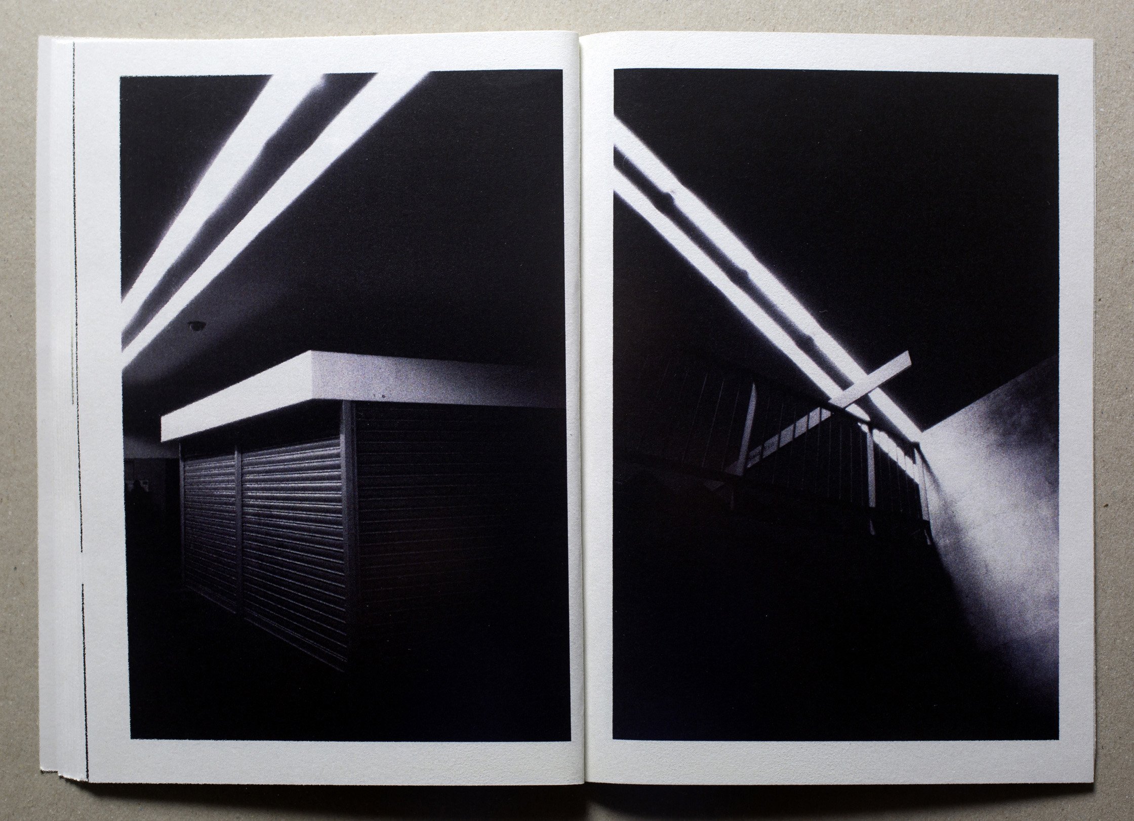
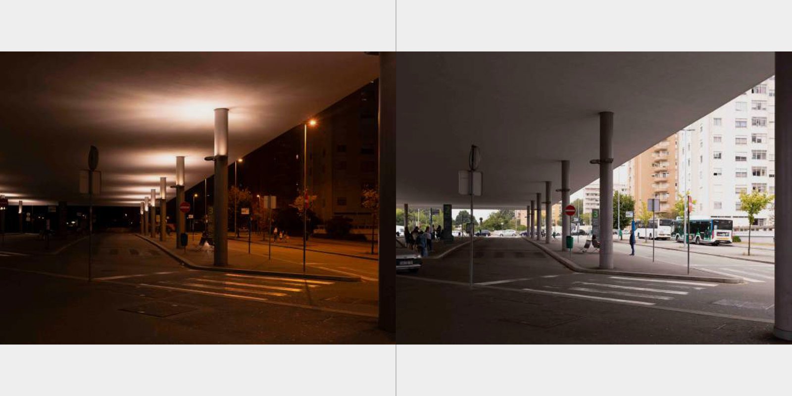
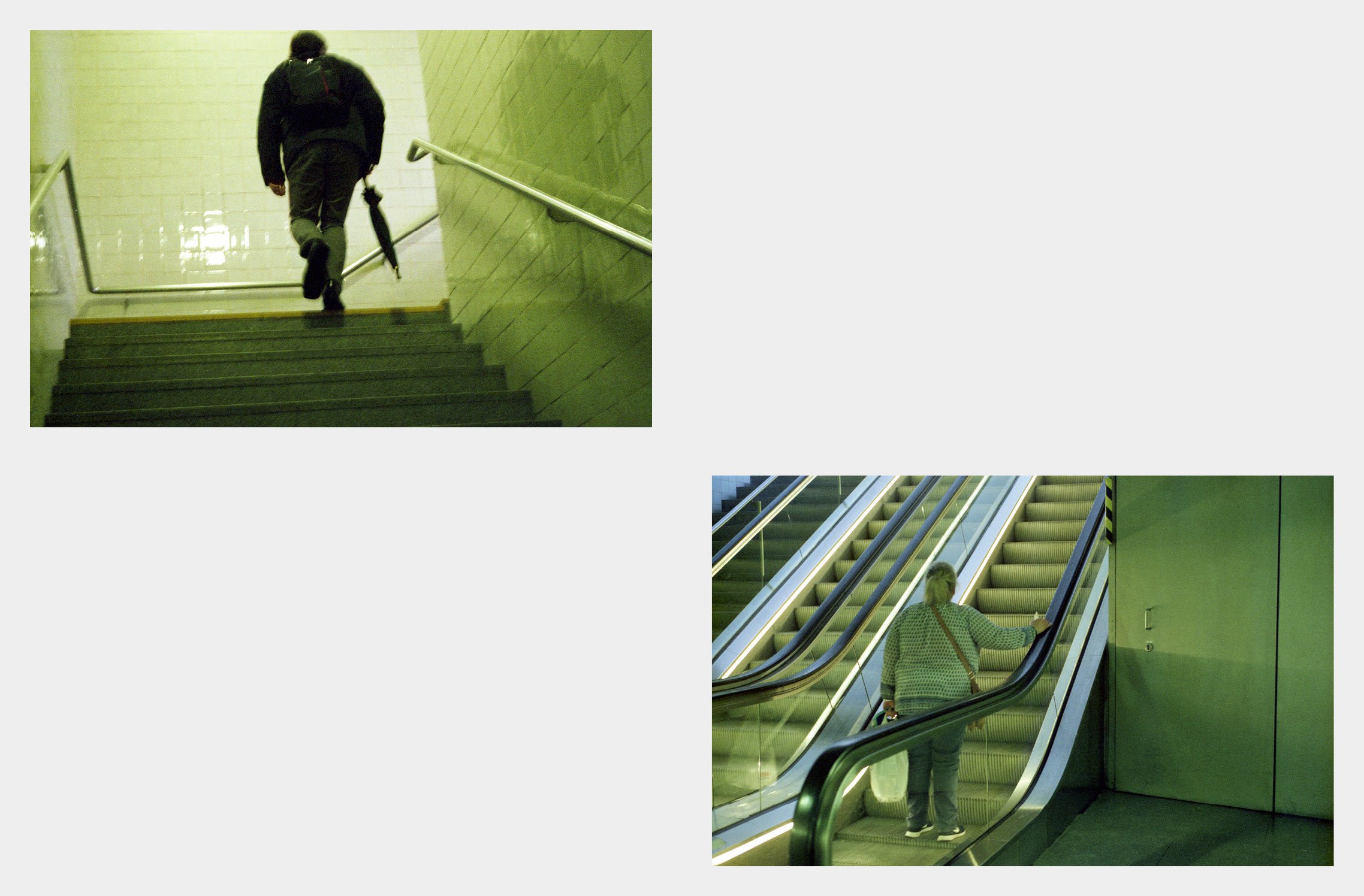
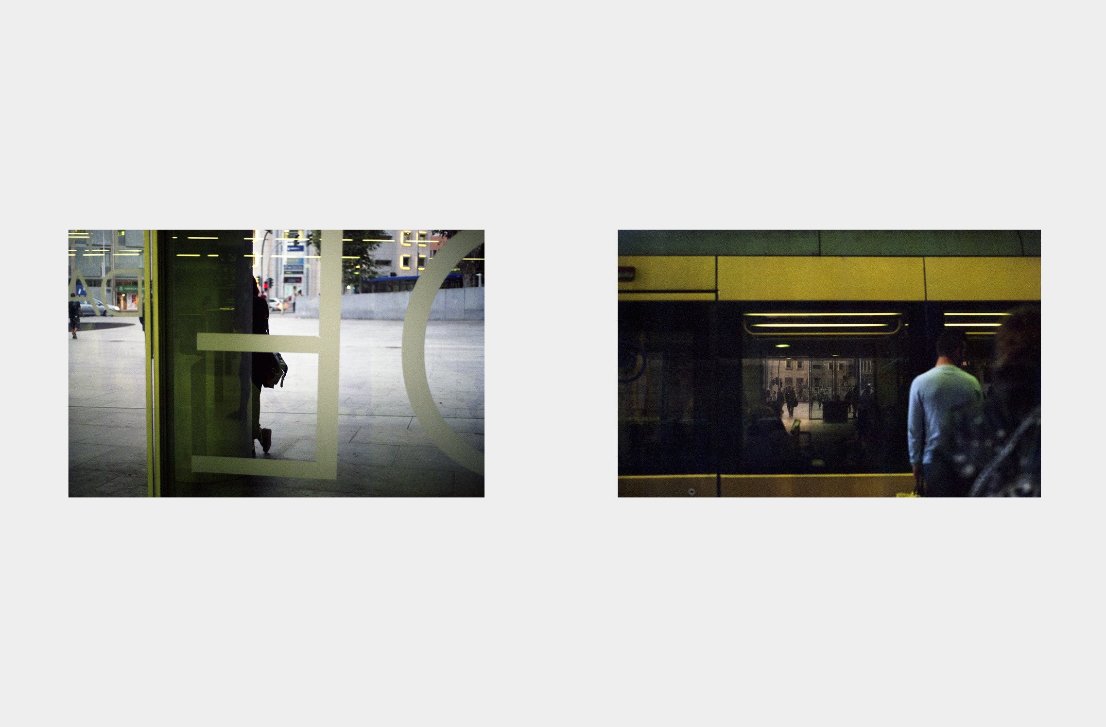
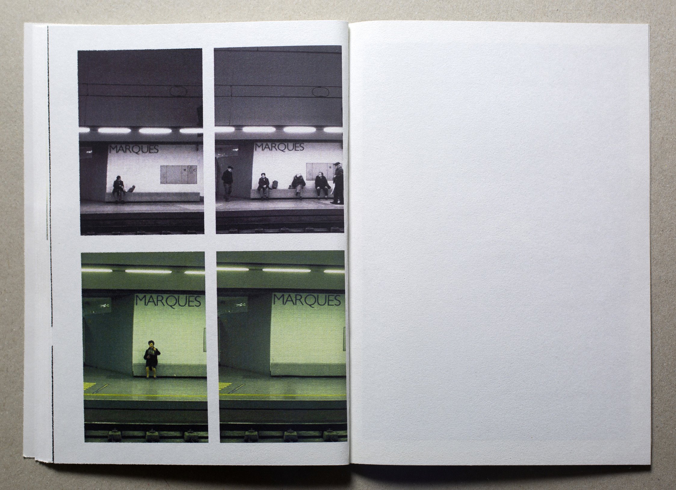
The metro is not a place of synchrony, despite the regularity of the schedules: each one interpretes its own definition of what a space is or is not. Spaces are never what they're meant to be. Inside these places, individuals manage their own space and their own time. They are clever when they have to encounter other individuals, they adapt to the spaces and create new ones with their automatic movements. They know where to stand and where to wait. They also know, by an unexplainable instinct, how to move and how to act. Therefore, subconsciously, they know how to build new places.


ANOTHER READING OF ARCHITECTURE THROUGH THE PHOTOGRAPHIC LOOK: THE VISUAL NARRATIVE IN THE METRO STATIONS OF THE CITY OF PORTO


ANOTHER READING OF ARCHITECTURE THROUGH THE PHOTOGRAPHIC LOOK: THE VISUAL NARRATIVE IN THE METRO STATIONS OF THE CITY OF PORTO

BY PAULA CAMILO


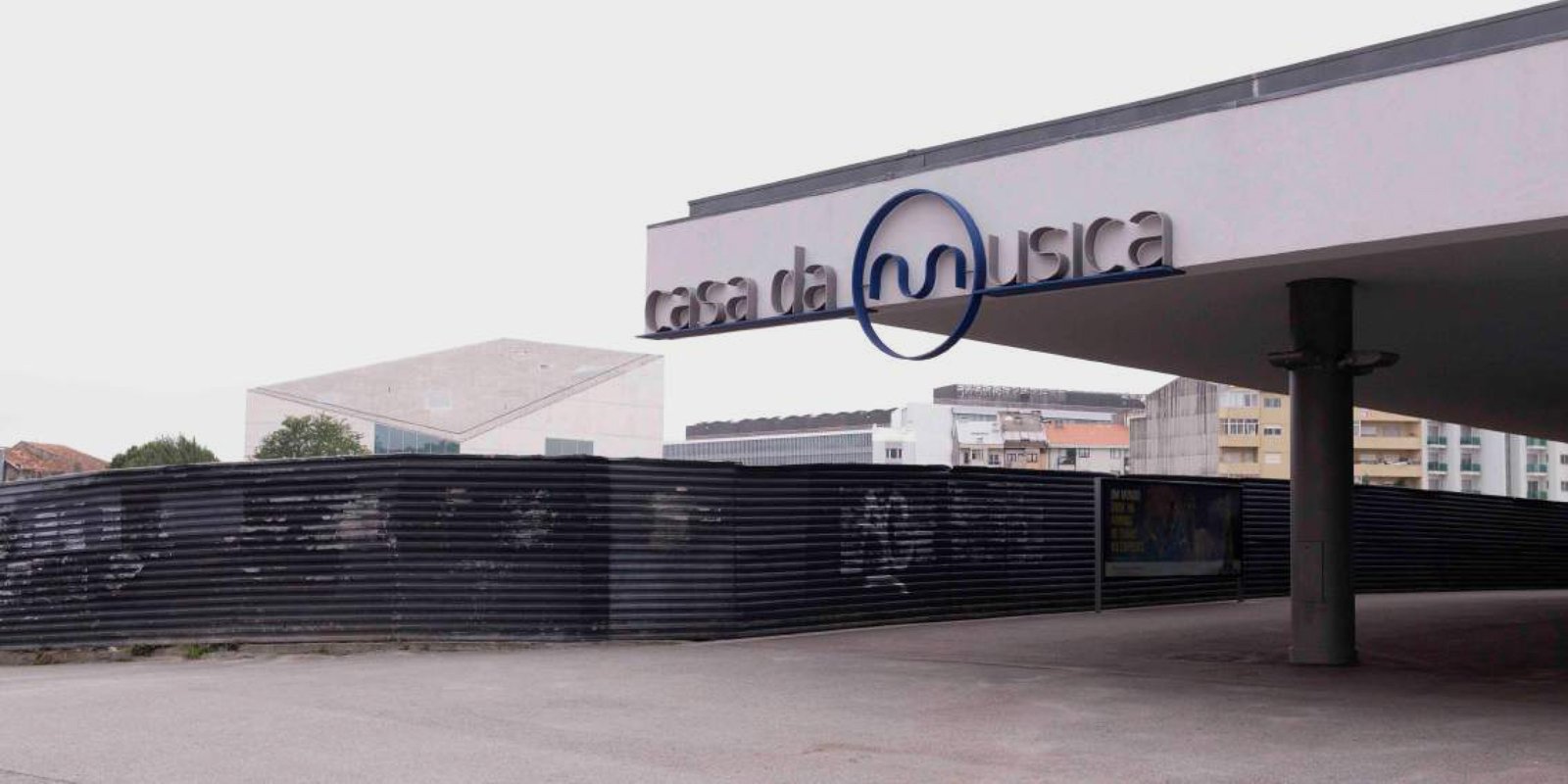
Music House

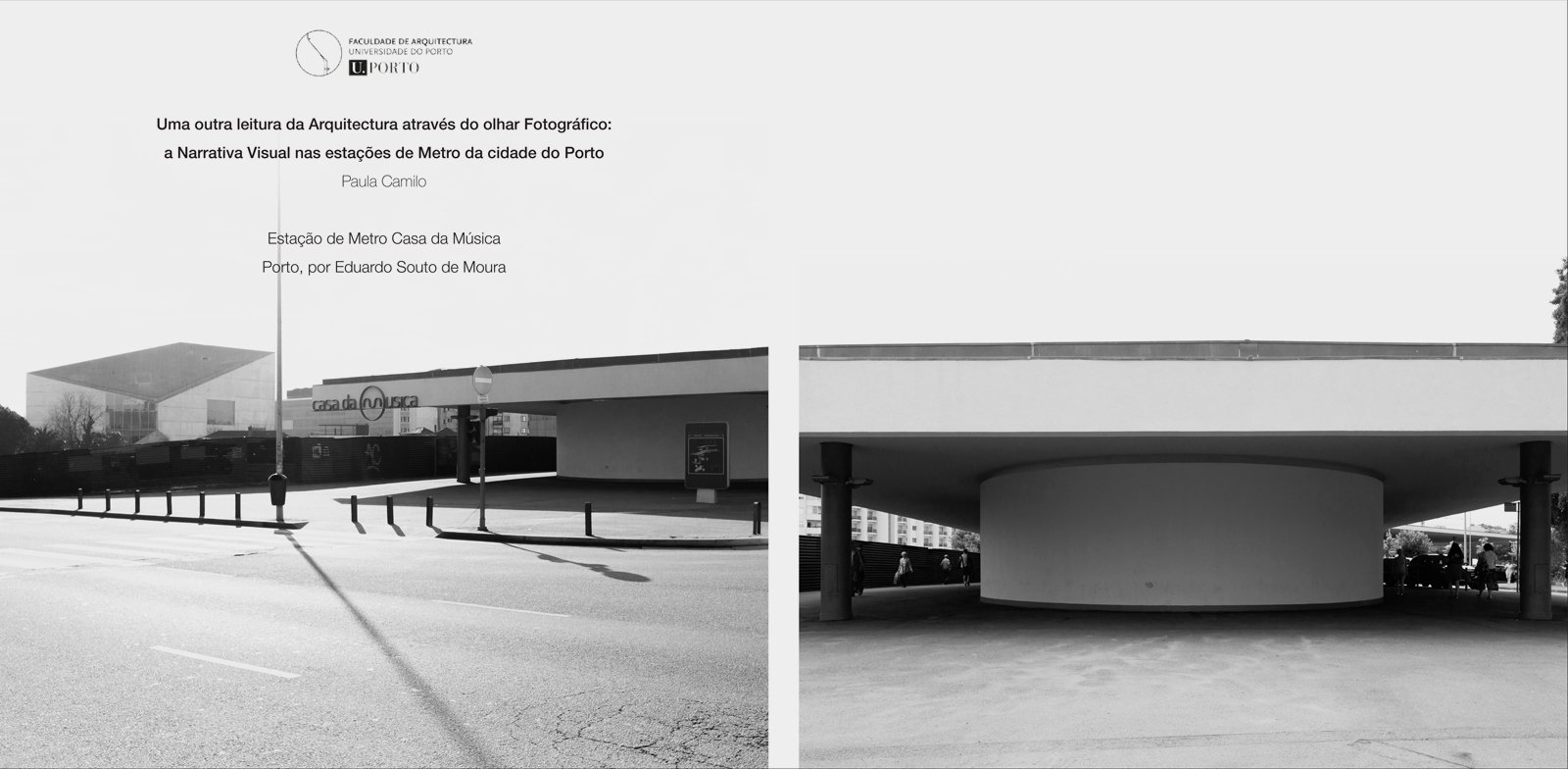
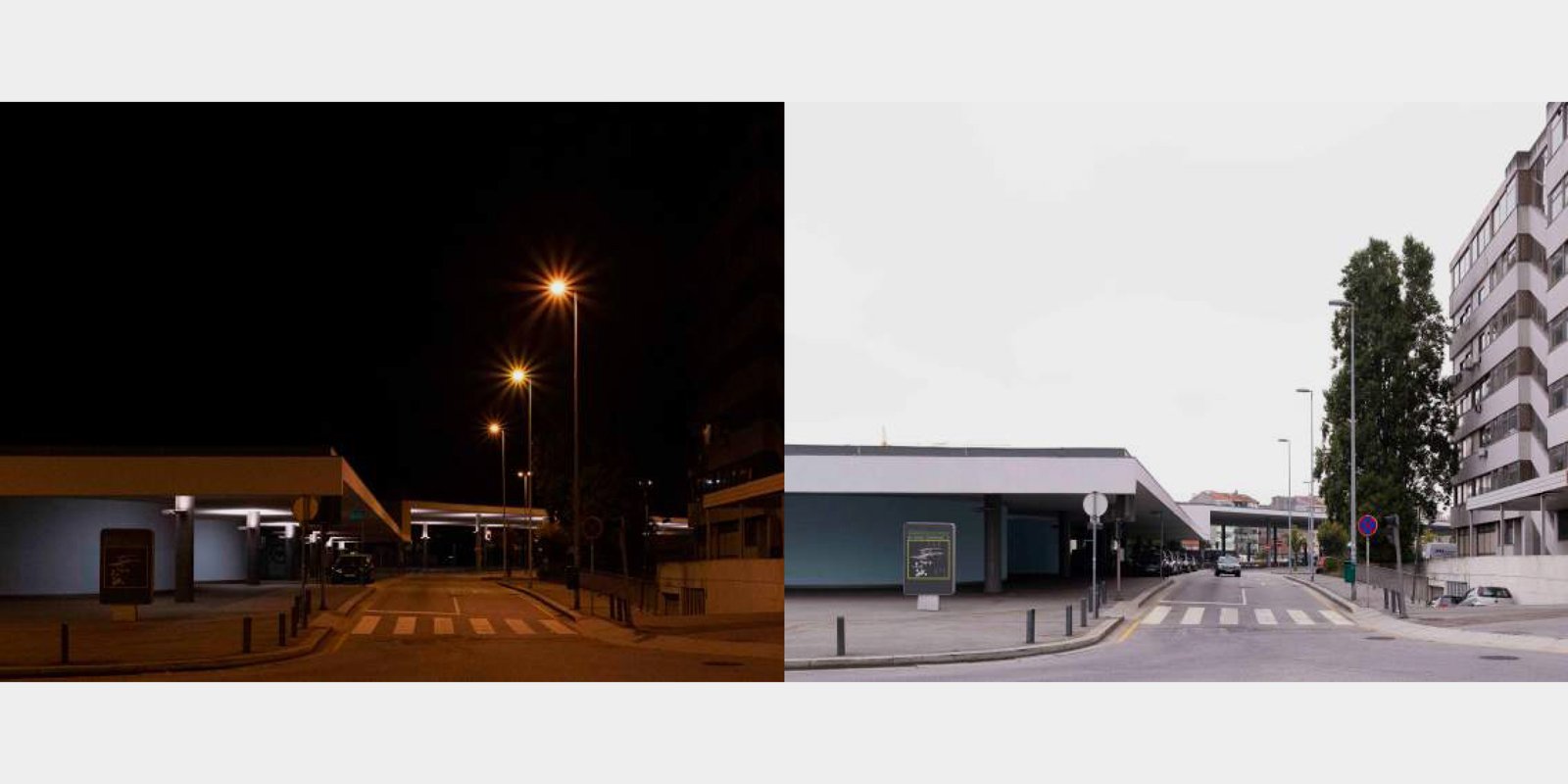
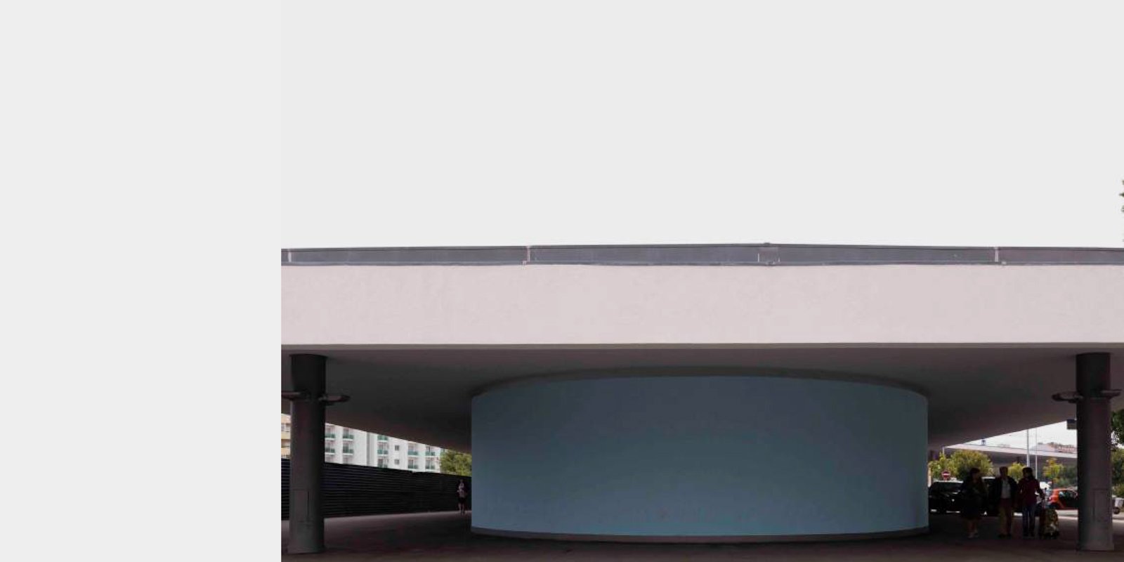
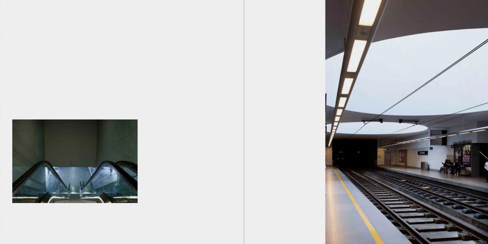
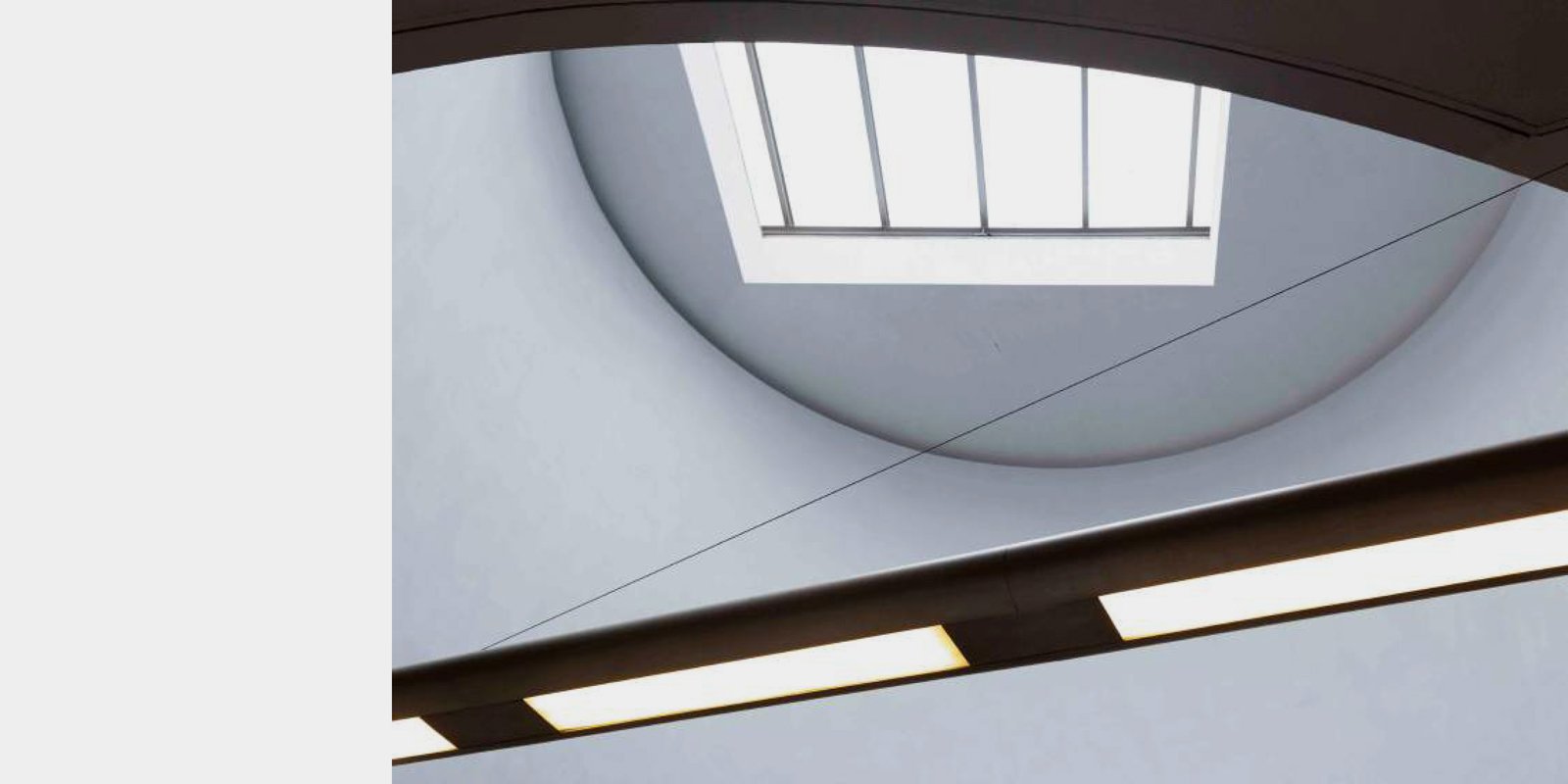
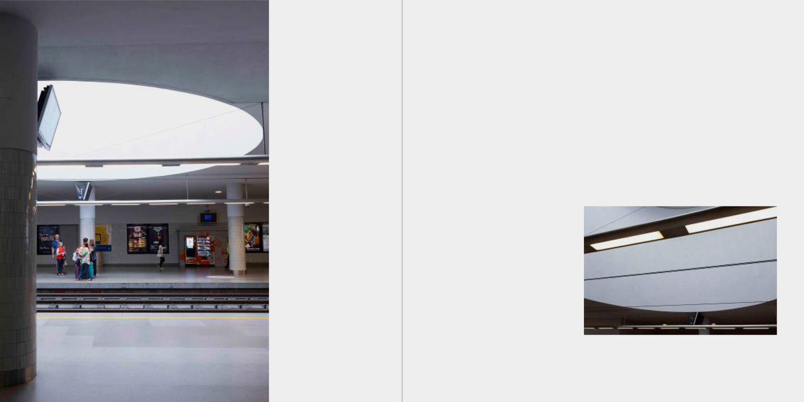
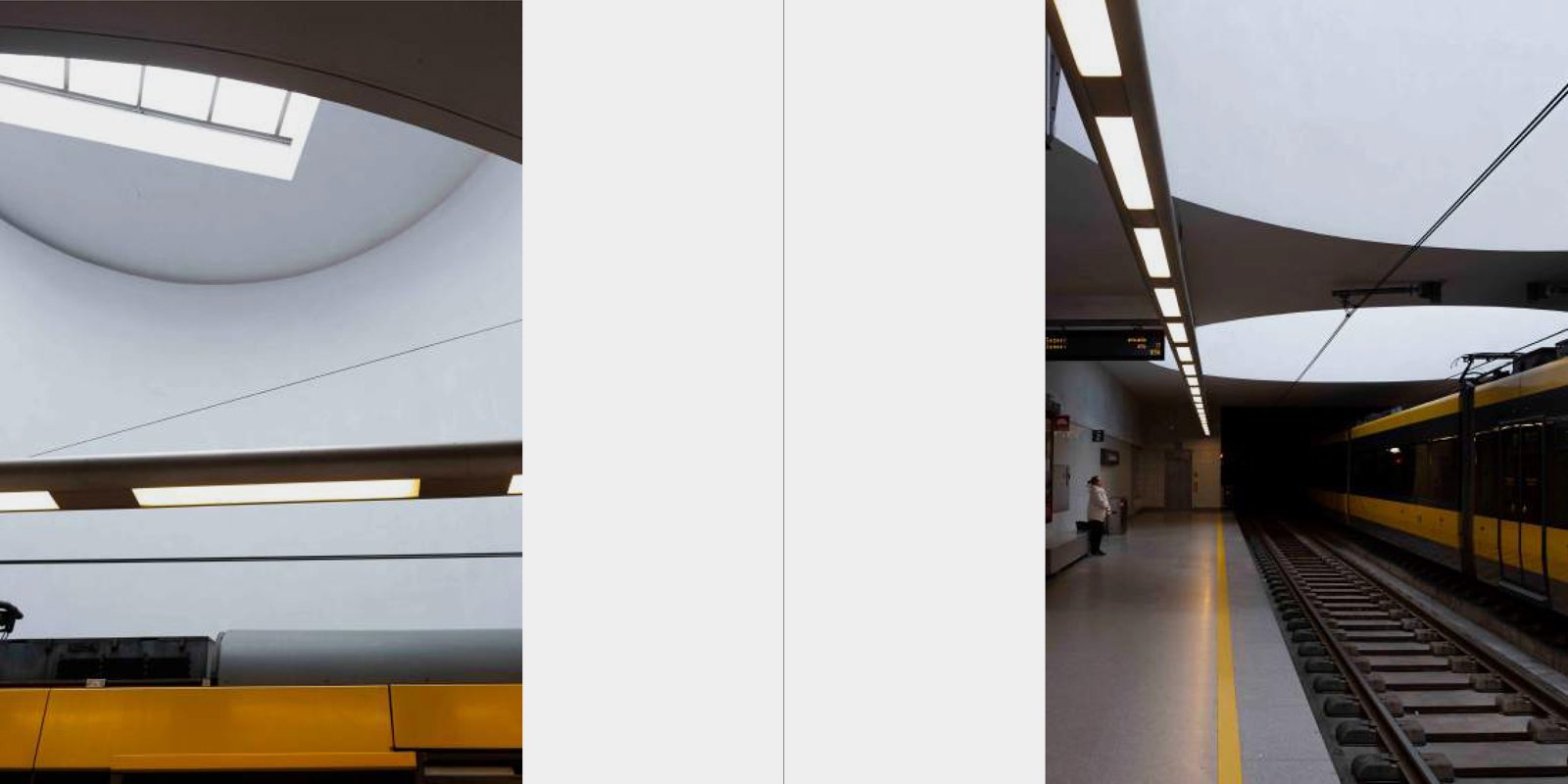
Homonymous with the most significant work and debated project from the “Porto 2001 European Capital of Culture” initiative, the Casa da Música Metro station reveals itself as the reflection of the architect to whom we owe its authorship, Eduardo Souto de Moura. Recognizing the dimension and presence of Rem Koolhas' work, he sought a discreet and uninvolved design,  capable of serving the interface of dense urban flows that characterize the peripheries of the Rotunda da Boavista. The patio roofing so characteristic of this work responds to a previous railway occupation and to a dense and accelerated territory. The simple line reveals itself to be calm, serene and capable of making this station a refuge for the urban fabric of this area. The dichotomy between the surface and the underground seeks to enhance the architecture which, through the natural light entrances so characteristic that can be seen on the pier, causes a naturally tense space and devoid of interaction to the point of bringing calm to those waiting for the next carriage. The configuration of this first large Metro station in the City of Porto reveals the way the city itself wants to live: recognizing the bustle, it depends and needs moments of serenity illuminated either by the sun or by the stylized lines of Eduardo Souto de Moura.

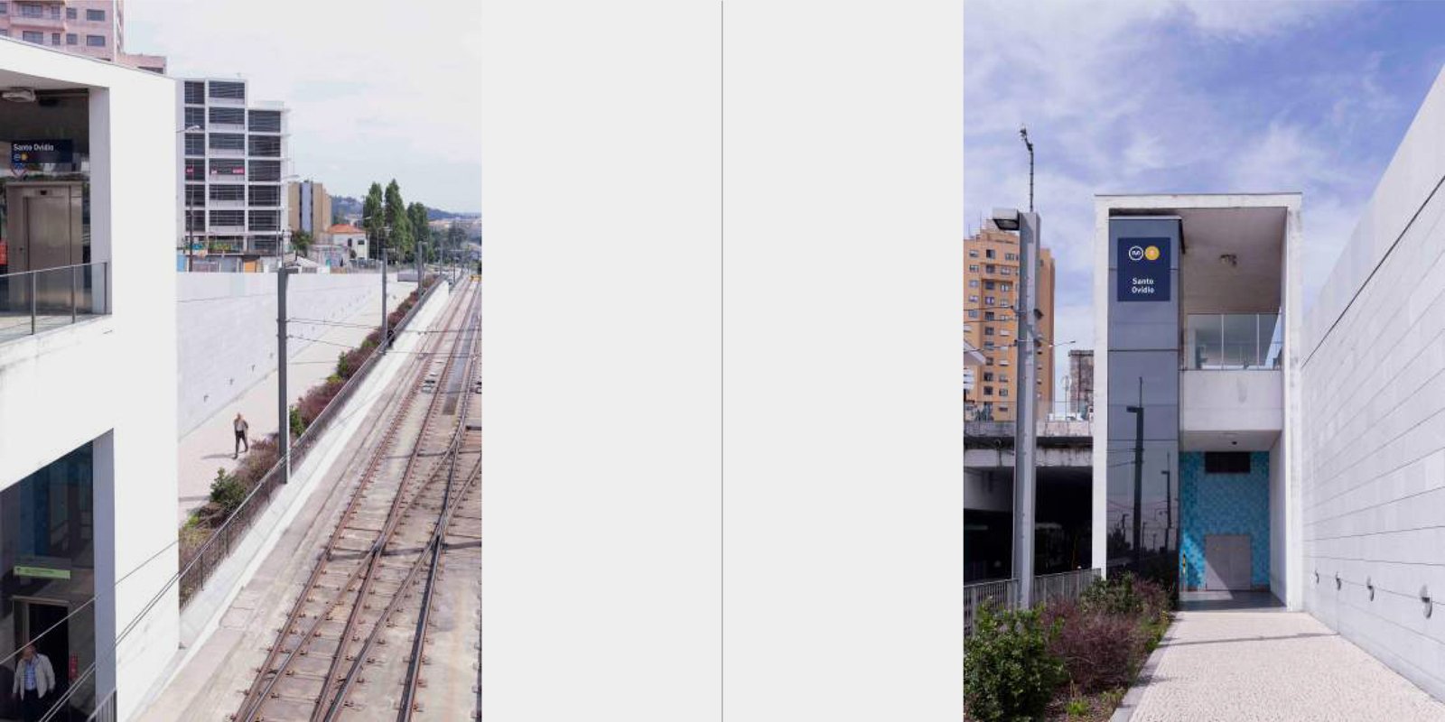
Santo Ovídio


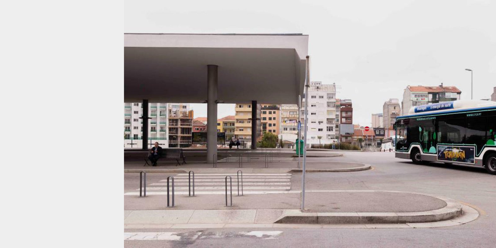
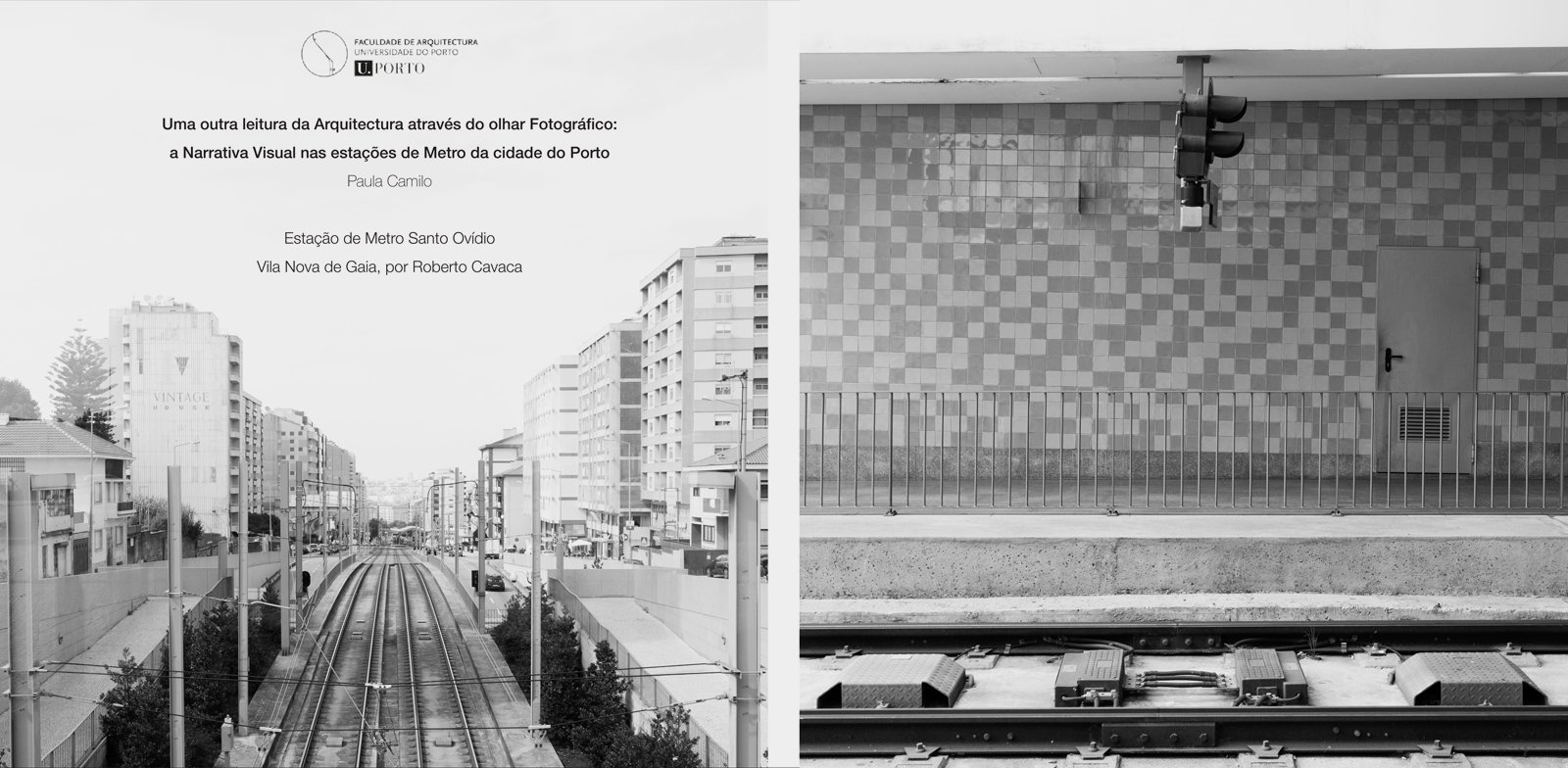
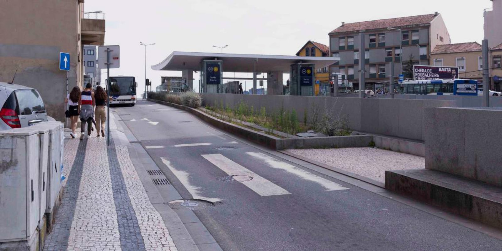
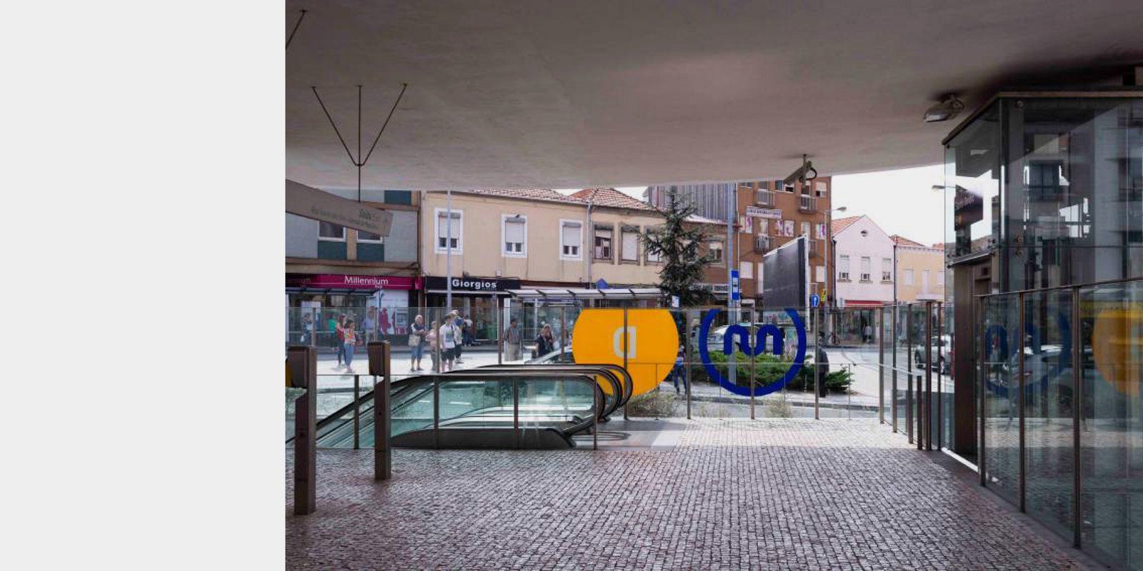
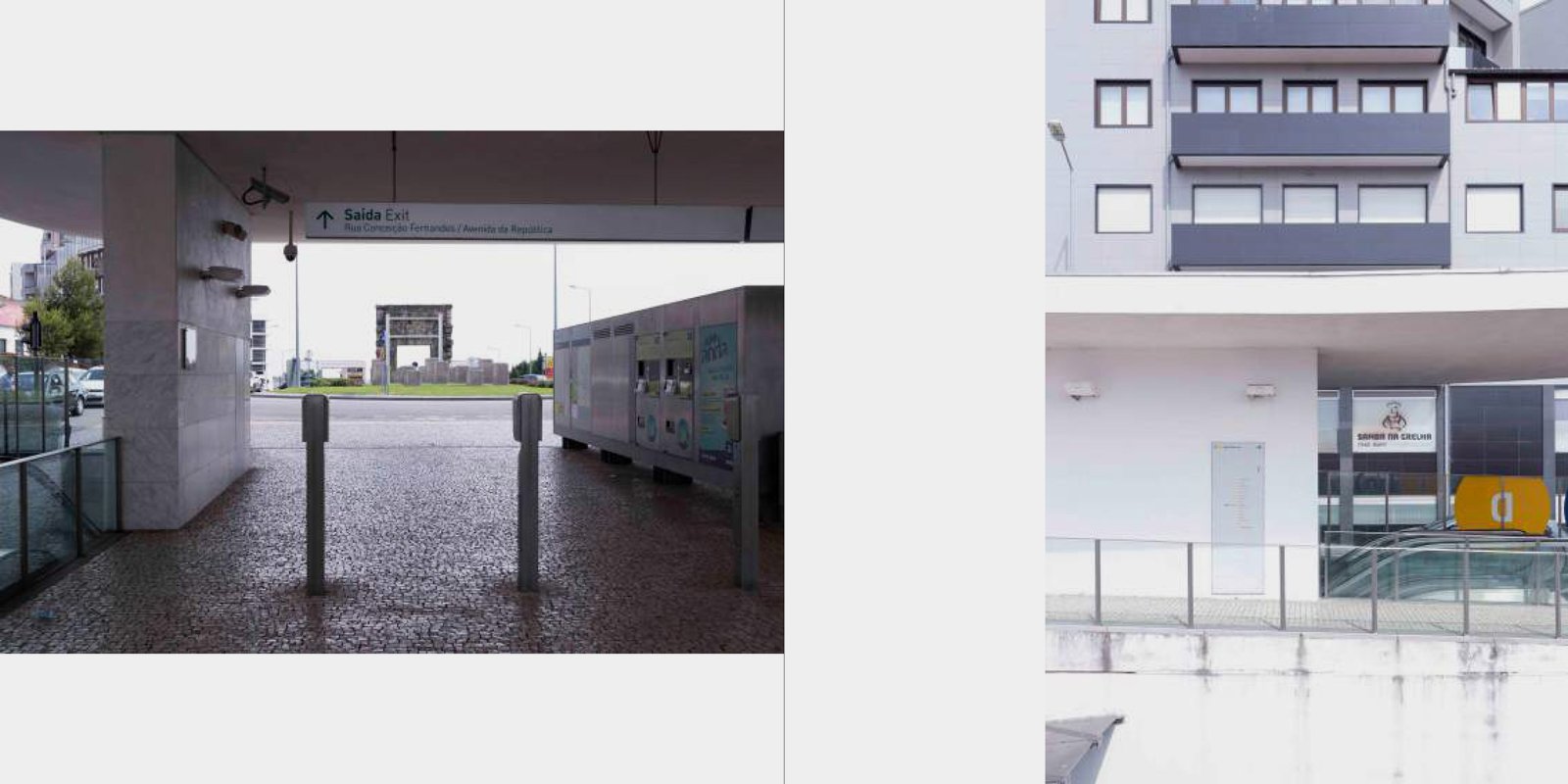
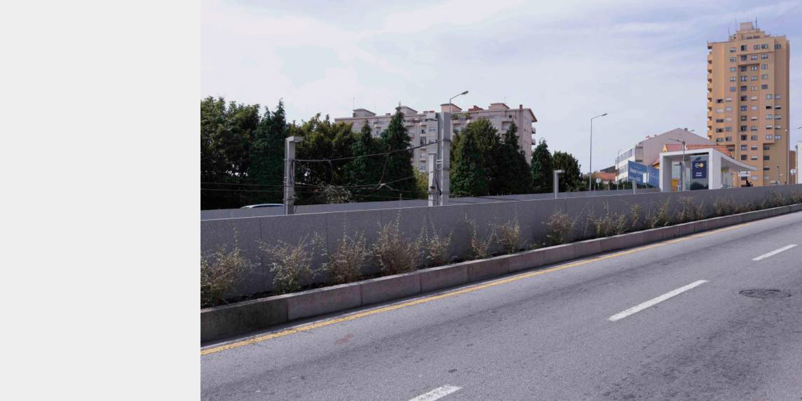
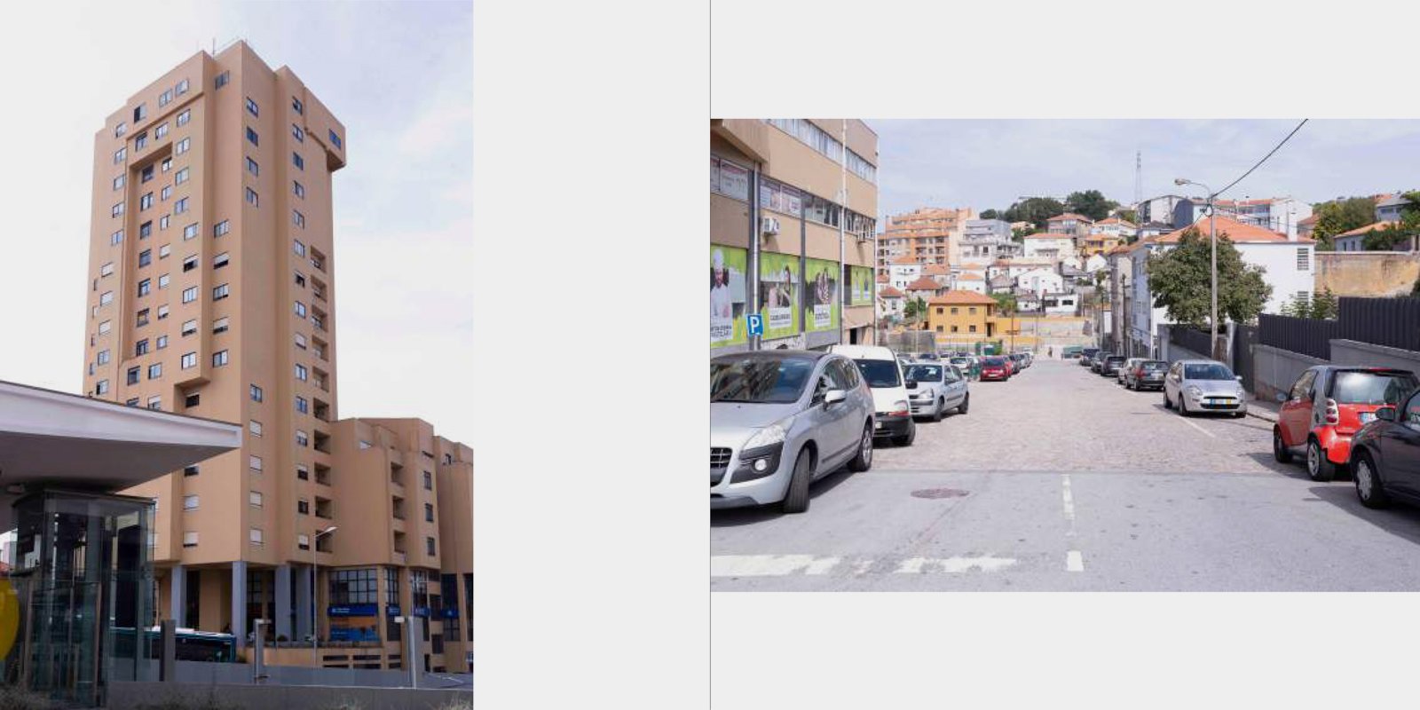
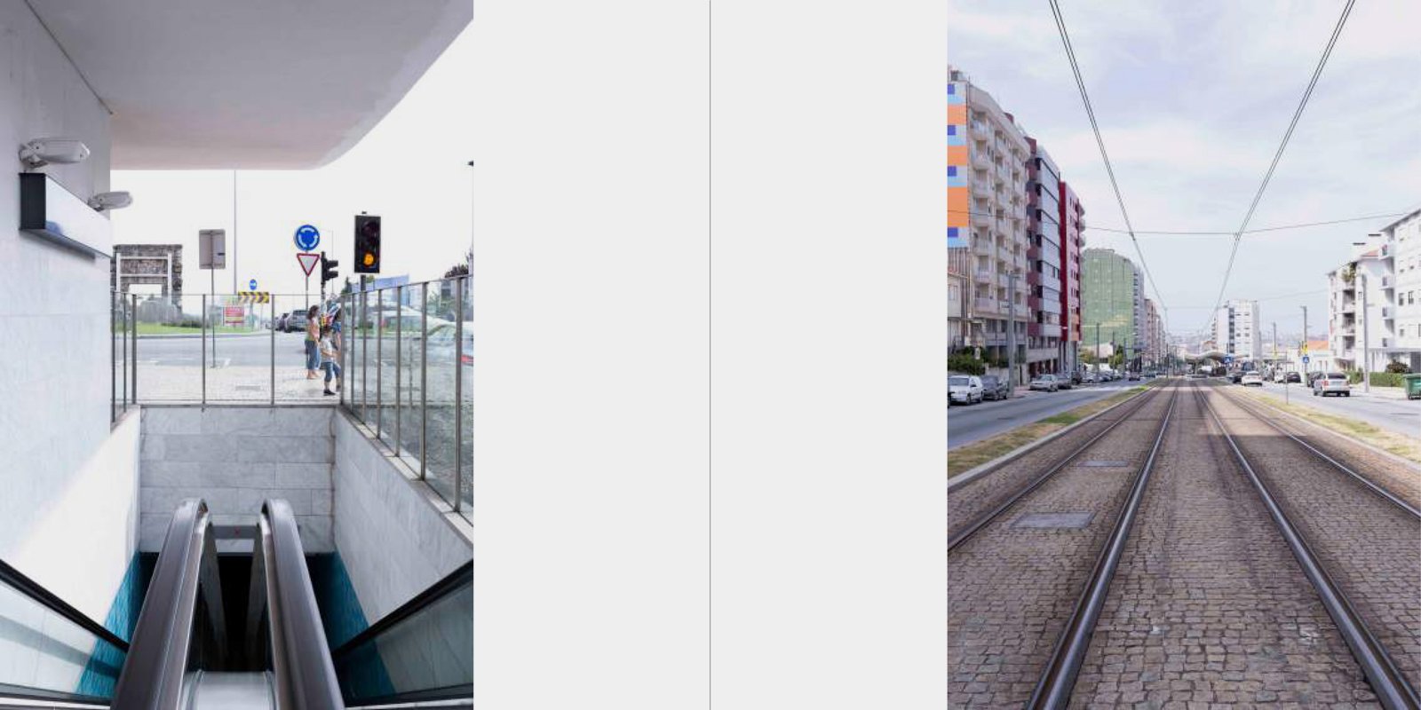
Part of an extremely important urban axis such as Avenida da República, the work of Rogério Cavaca proves to be able to respond to the challenges proposed by the city of Vila Nova de Gaia, more properly the area of ​​Santo Ovídio. An architectural piece that ends an incessant automobile flow, placing it under the roundabout that makes up its name and initiates another flow, on a larger scale, as they are the access to the highways and which continue the linear gesture originating from the Porto D. Luís I. Composed by simplicity and straightforwardness, we are faced with two entry points arranged in a which makes the roundabout an inherent element of this project, managing to create an underground space where the such a characteristic and even disturbing movement of this roundabout gives us some freedom. However, the gloom of its pier makes us look for light and frenzy, which takes us abroad, and in the meantime, between the gloomy and bright, we find moments of serenity composed of differences in levels that isolate us both movement and peace. We do not become isolated, but at the very least we become abstracted.


Maia Park


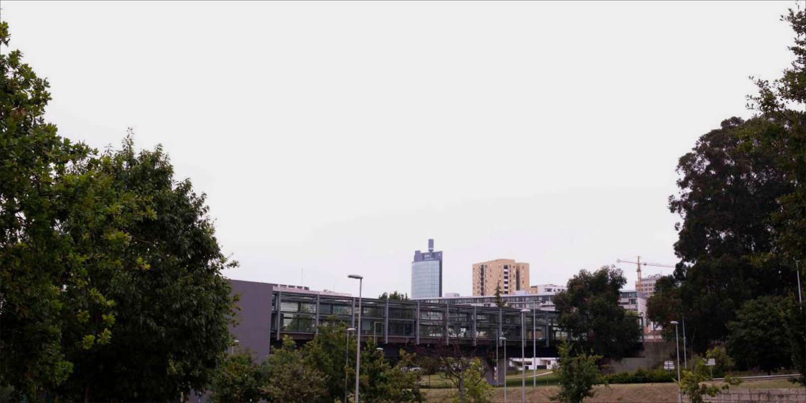
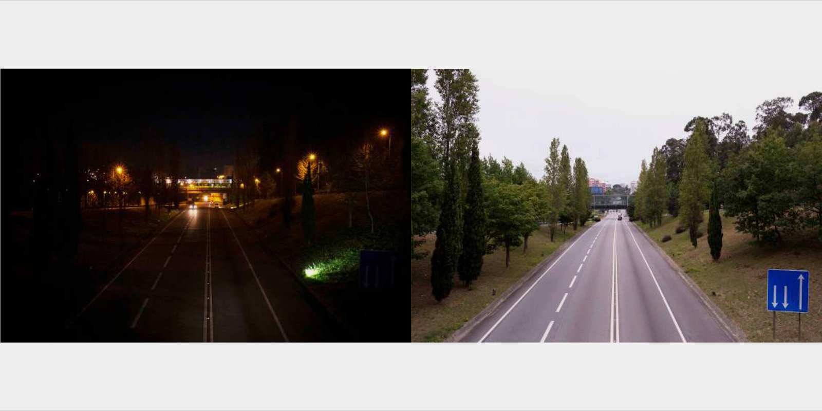
Designed by João Álvaro Rocha, this station is characterized by its autonomy as a Metro infrastructure from Porto. Located at the gates of the City of Maia, it establishes the connection between the rural and the urban, asserting itself as a bridge in a territory where the hierarchy and design strategy are not present and seeks, through of its lightness and simultaneous presence in the urban landscape, to enter the City. Its perpendicularity with the axis created by Nacional 14 creates a moment of tension between the structure and the territory, giving due meaning to the work as an urban connection structure, without wanting to overlap in relation to the territory itself. Surrounded by a contrasting green landscape with the set of buildings, the station gains autonomy by assuming itself as a structure and, before becoming a building, this work values ​​the concept and function of the bridge, where nothing is more relevant than its own structure that is revealed through its transparency and vigorous materiality. Whoever walks through it feels an integral part of the City, taking shelter but simultaneously at the gates of the city. Everything here is clear and evident, present and essential.

 

TRINDADE METRO STATION


TRINDADE METRO STATION

BY ANA MIRIAM


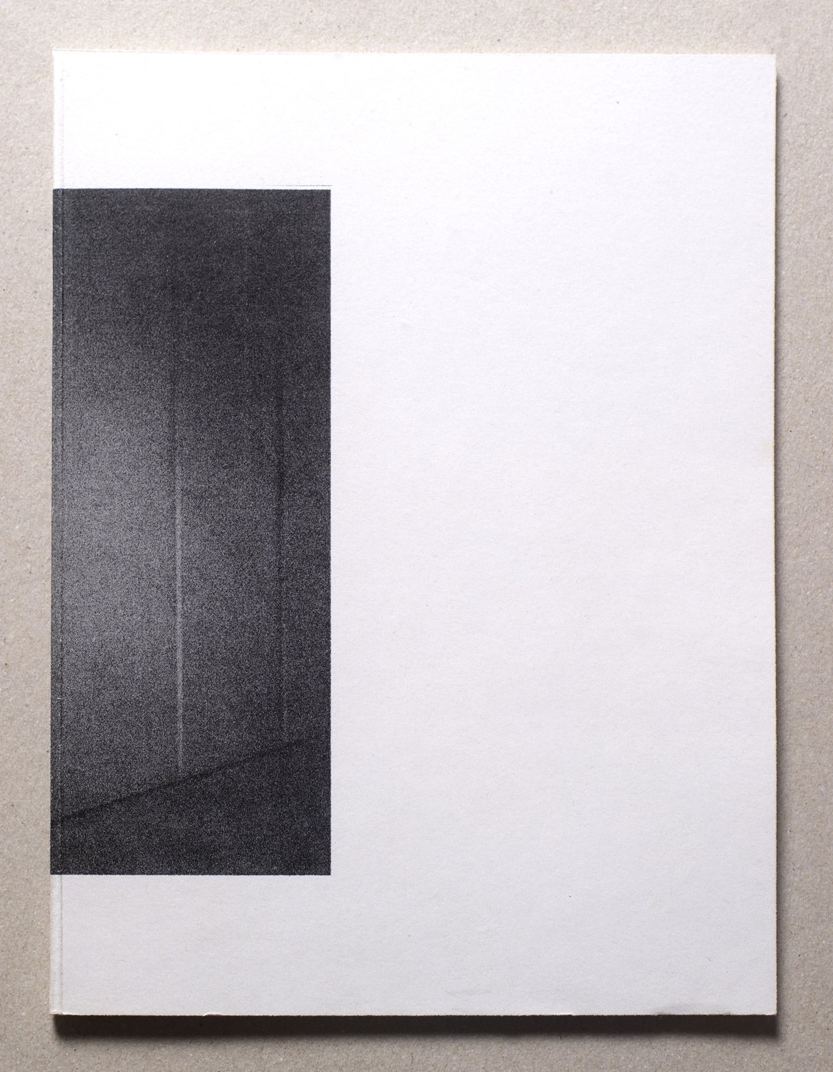
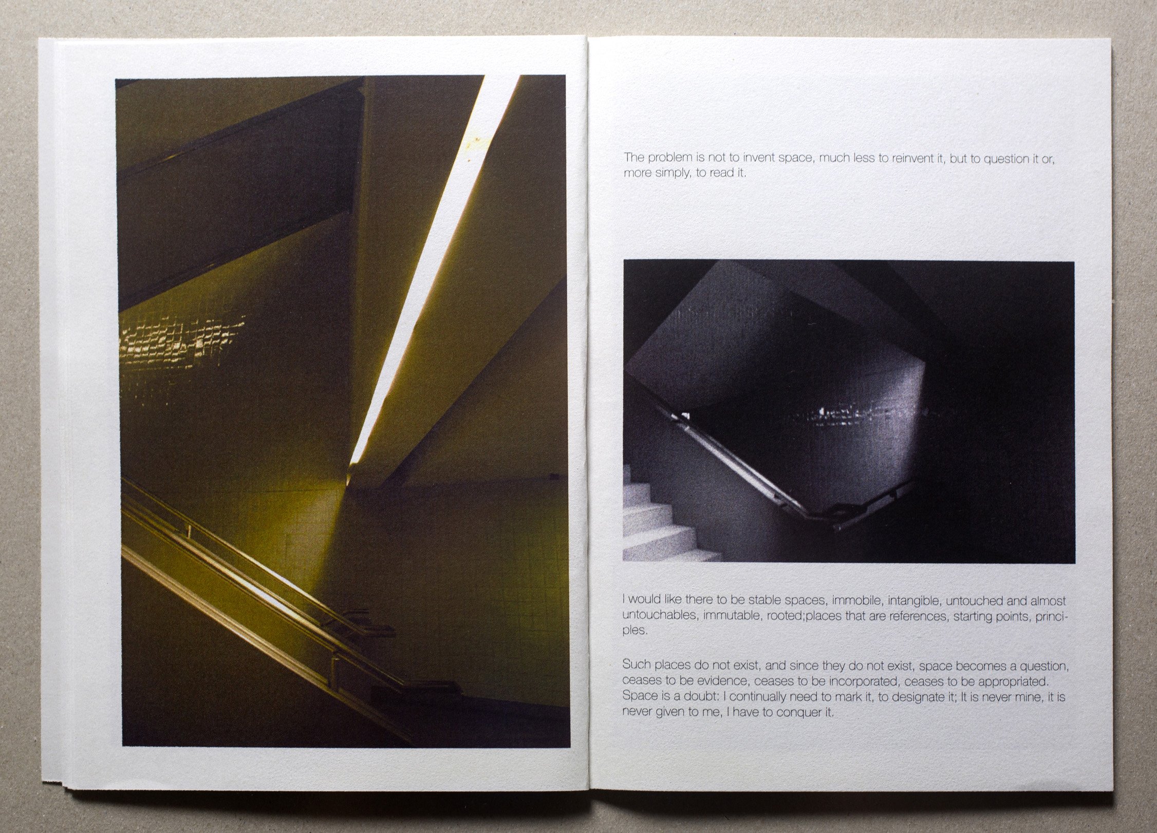
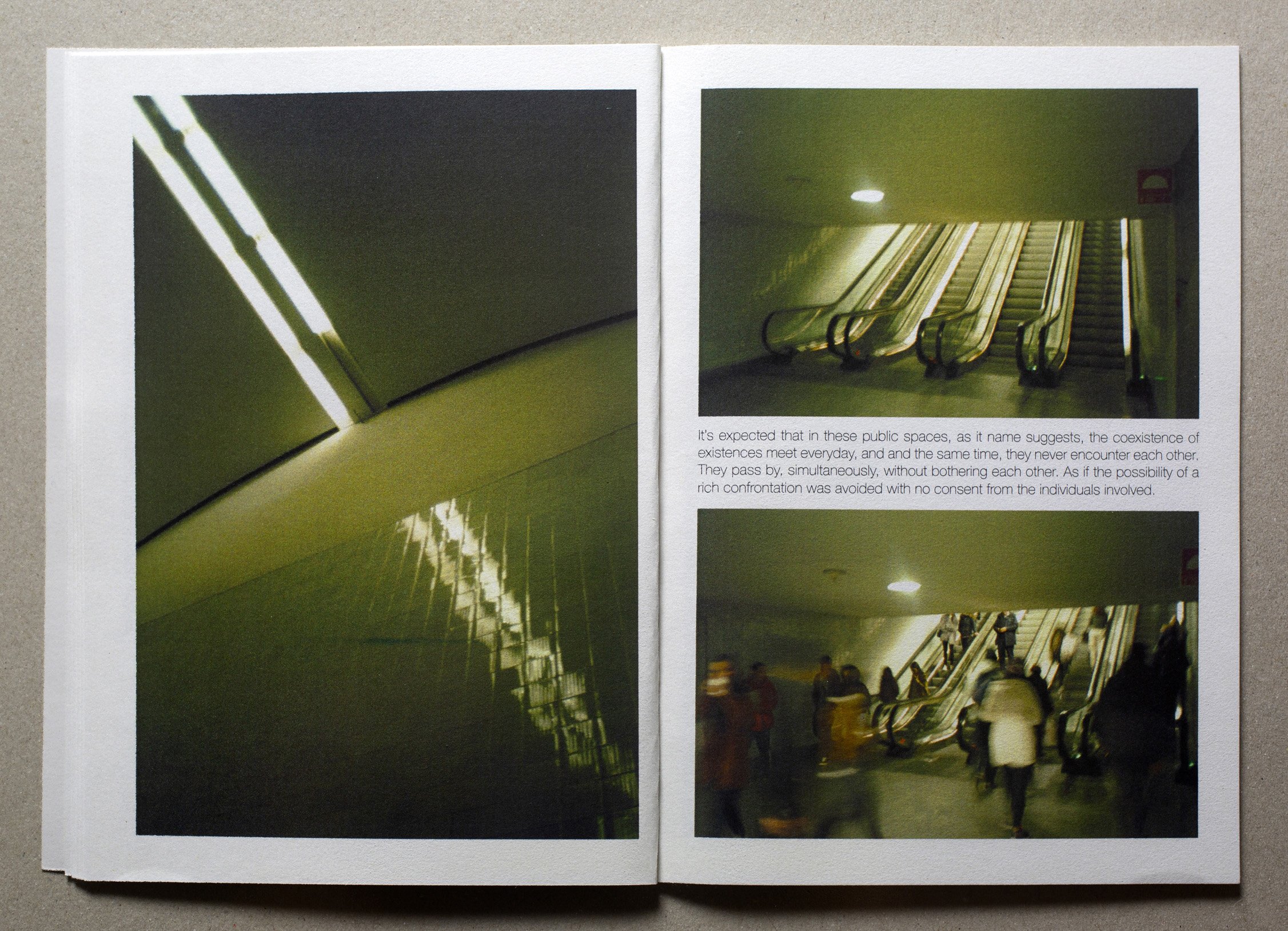
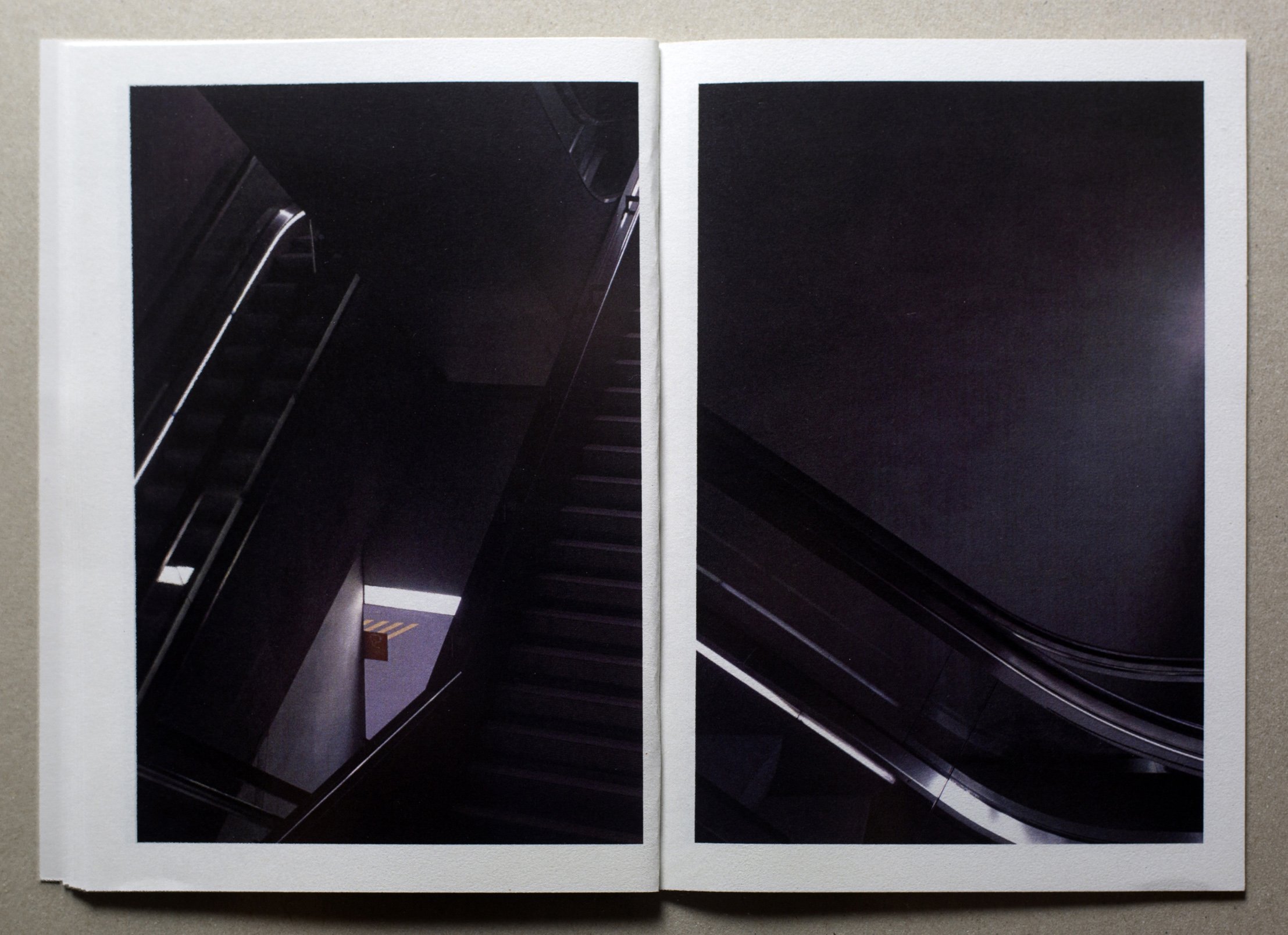
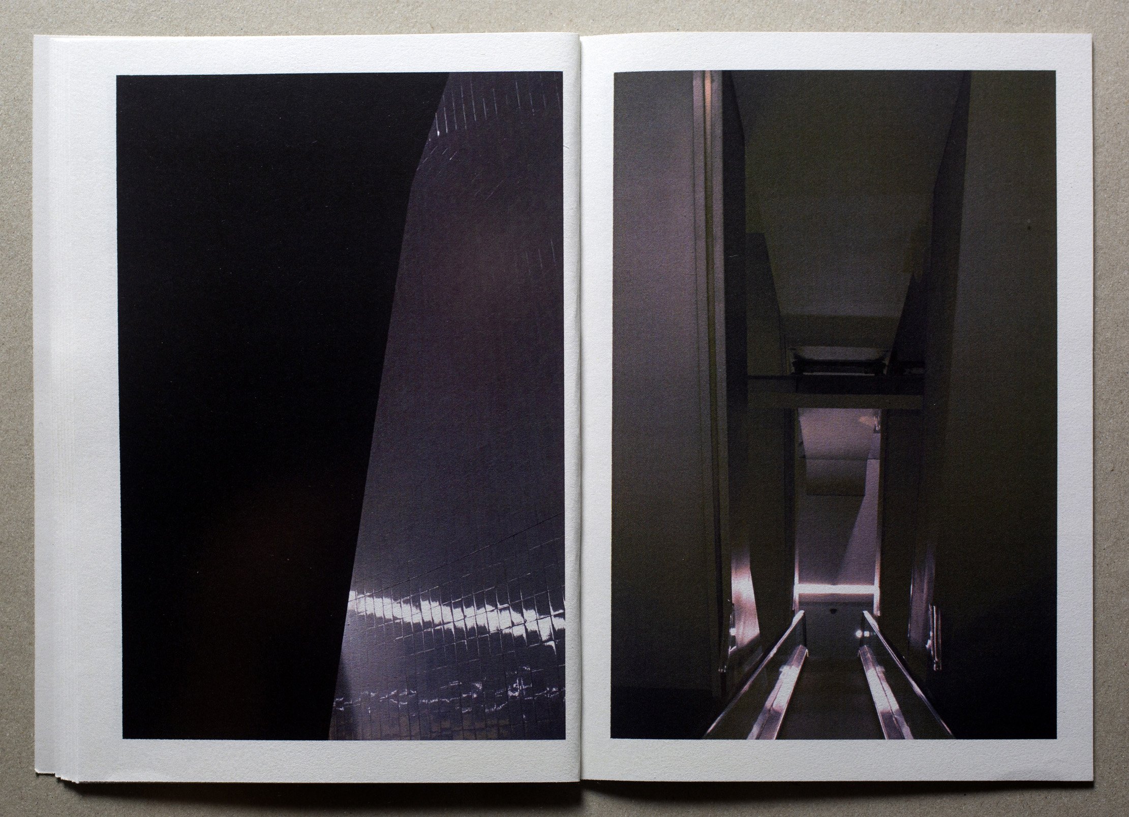
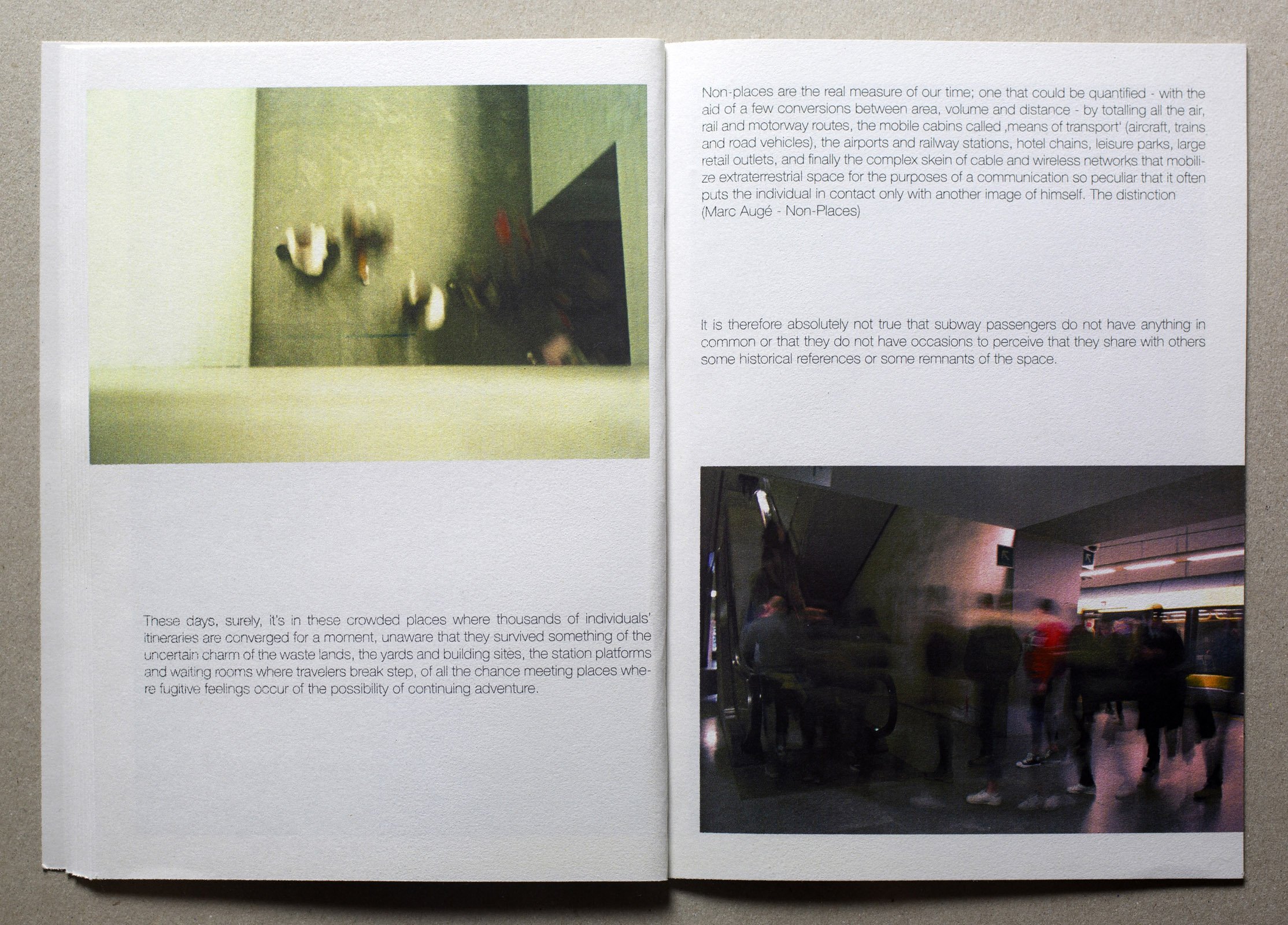
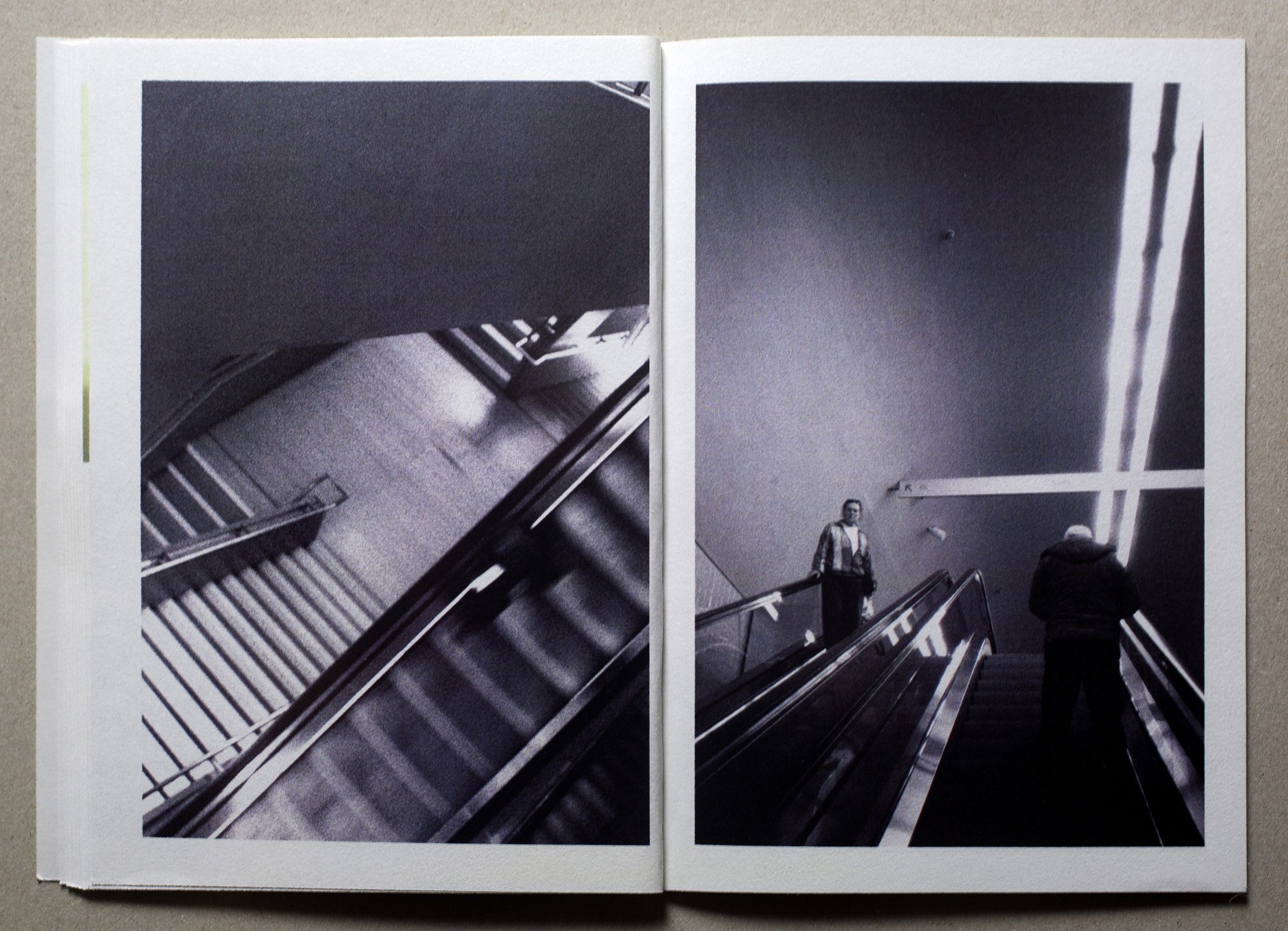
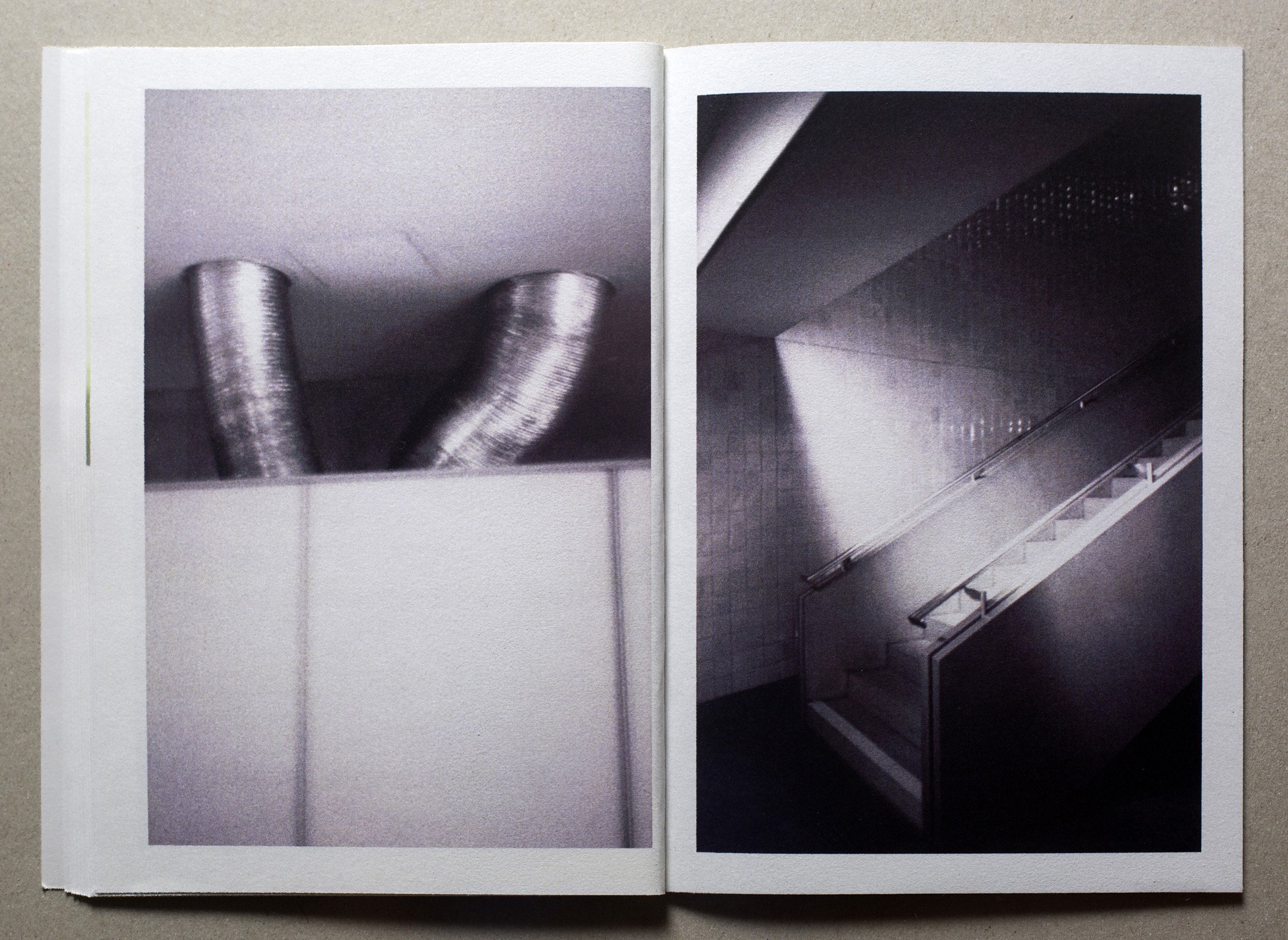
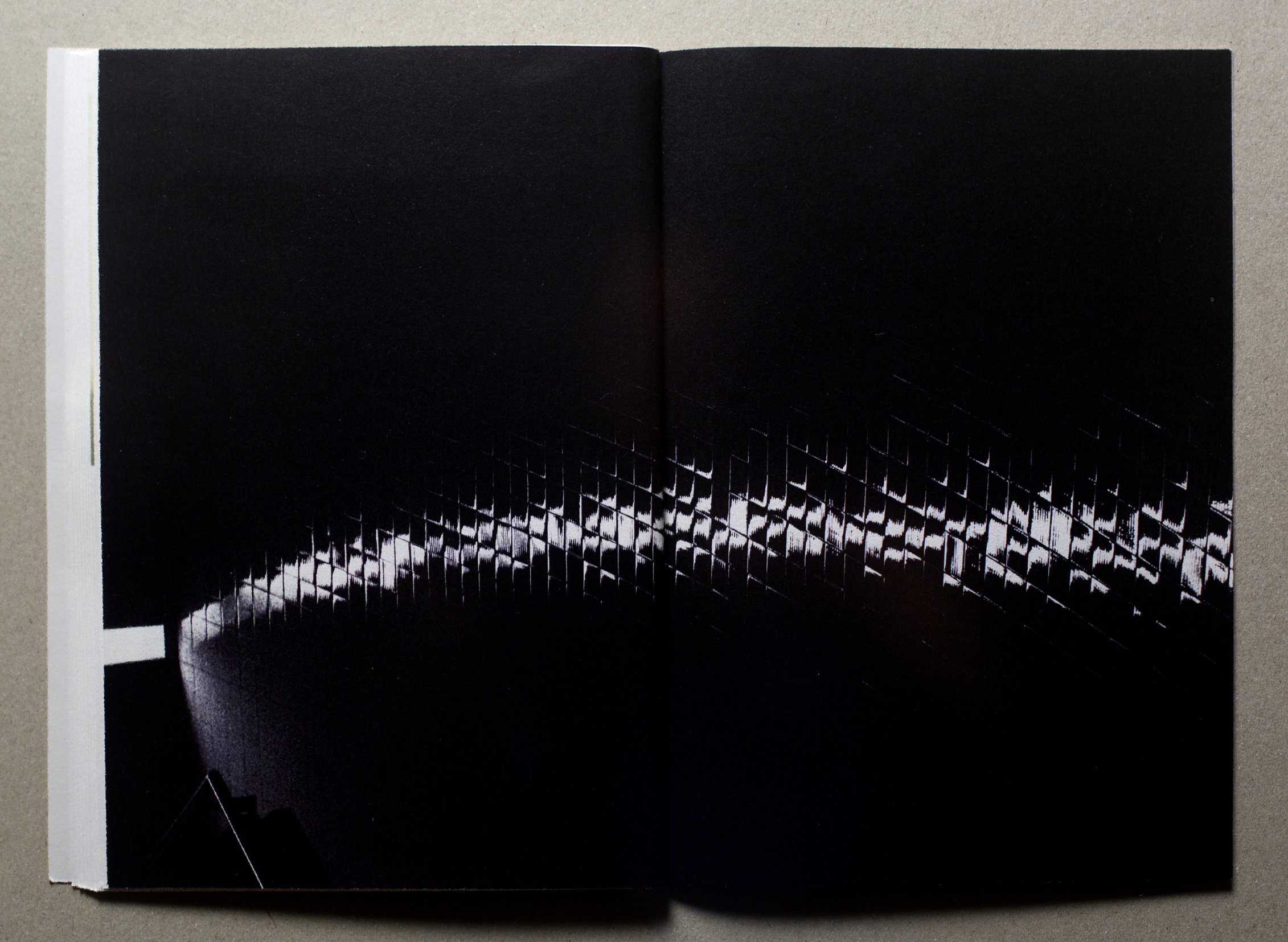
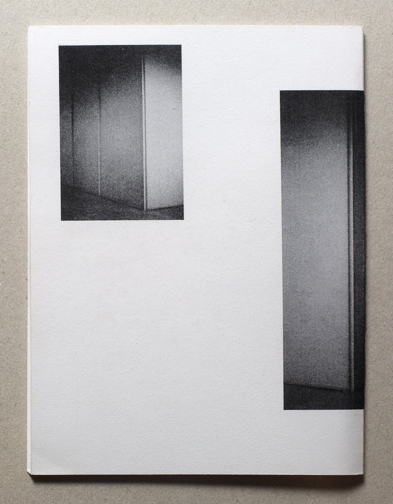
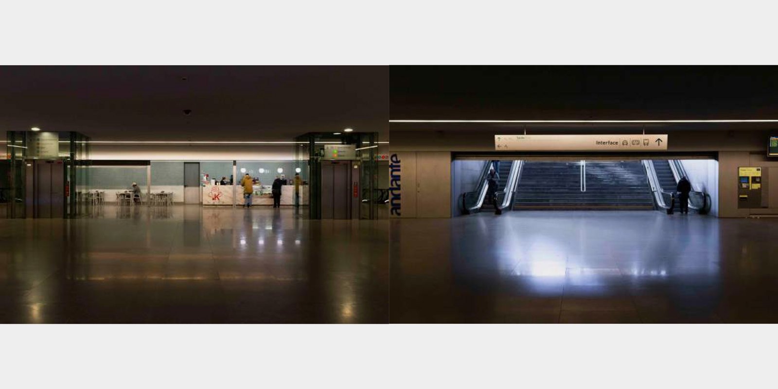
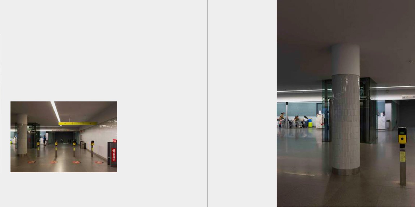
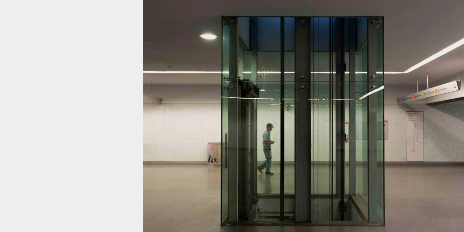
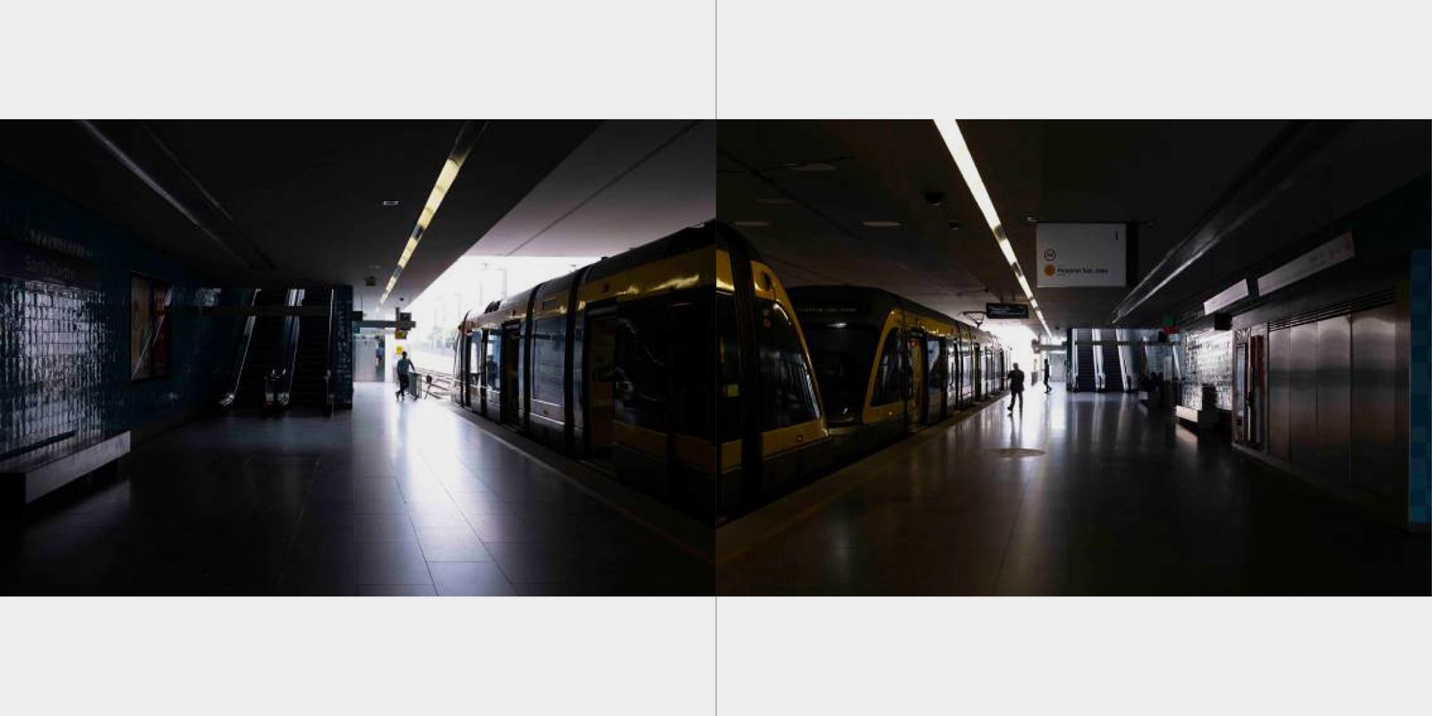
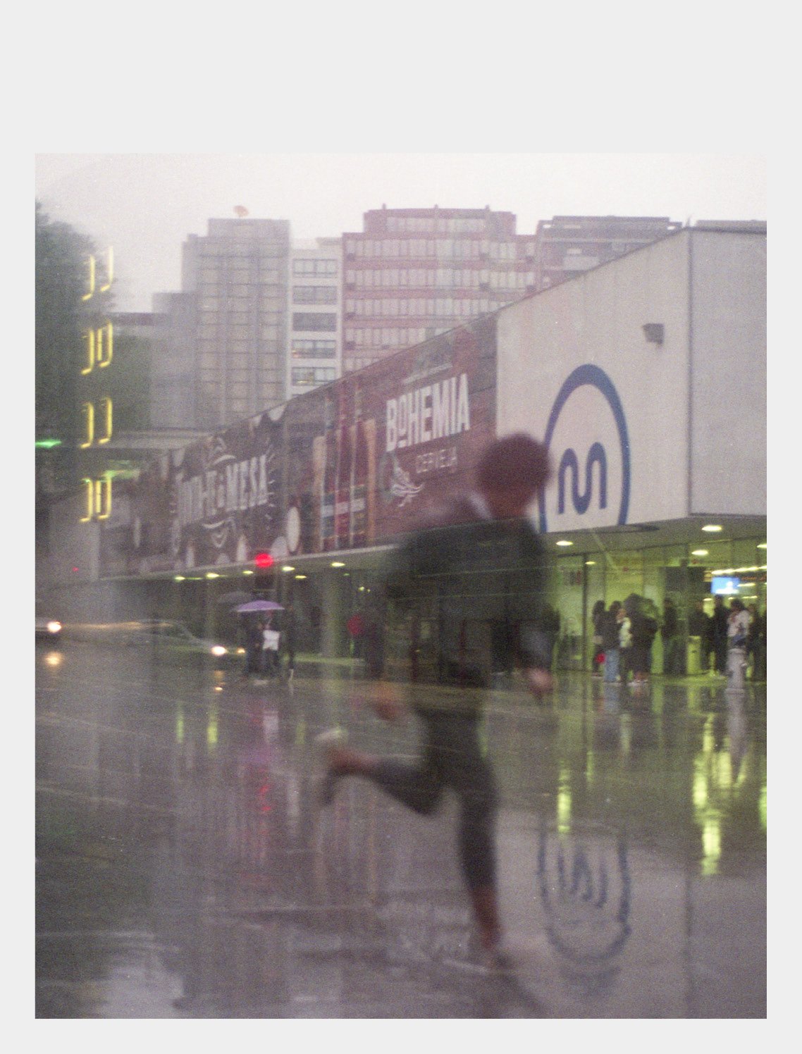
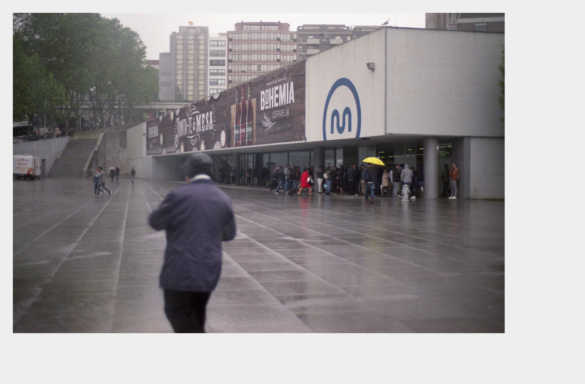
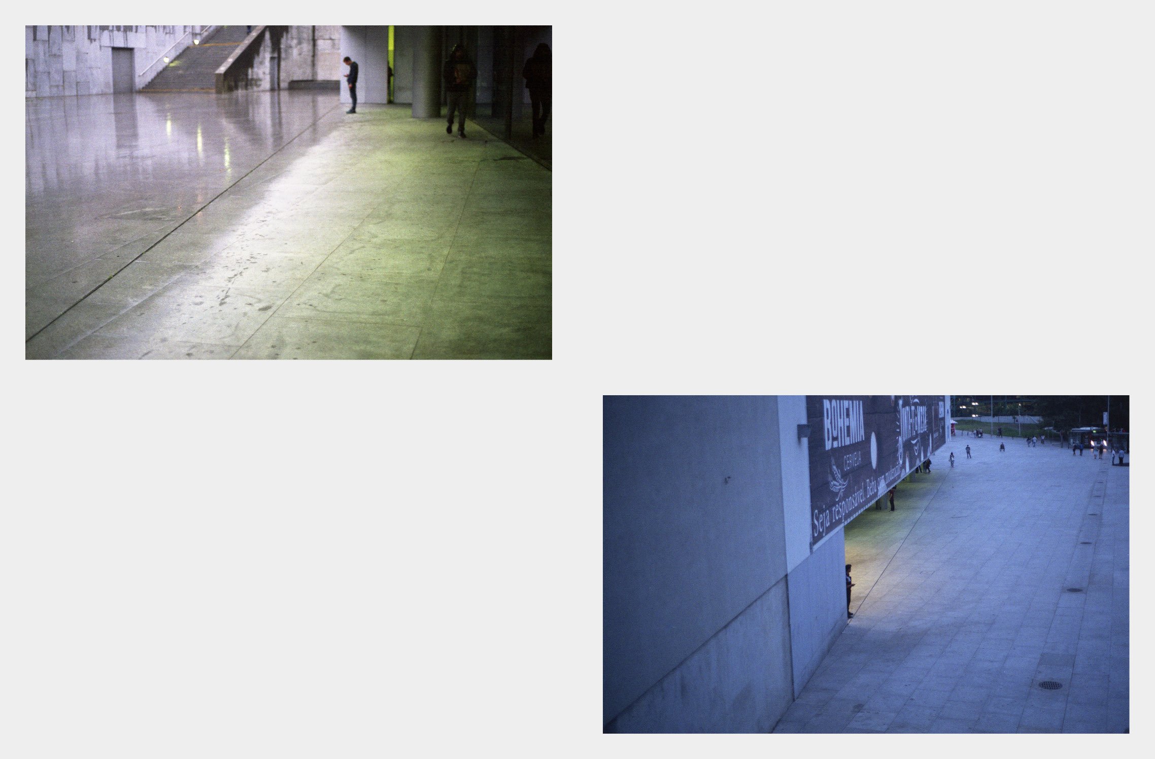
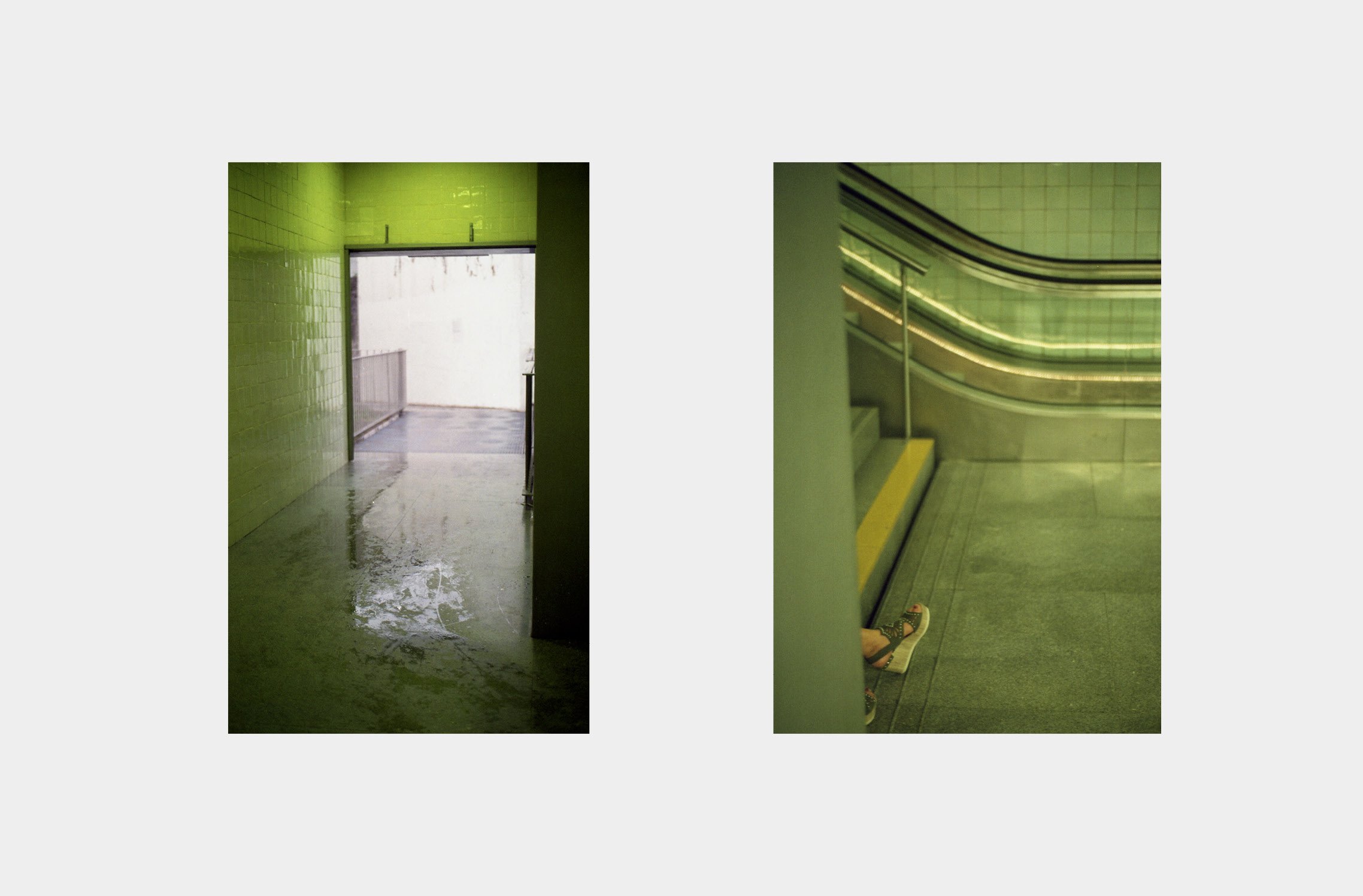
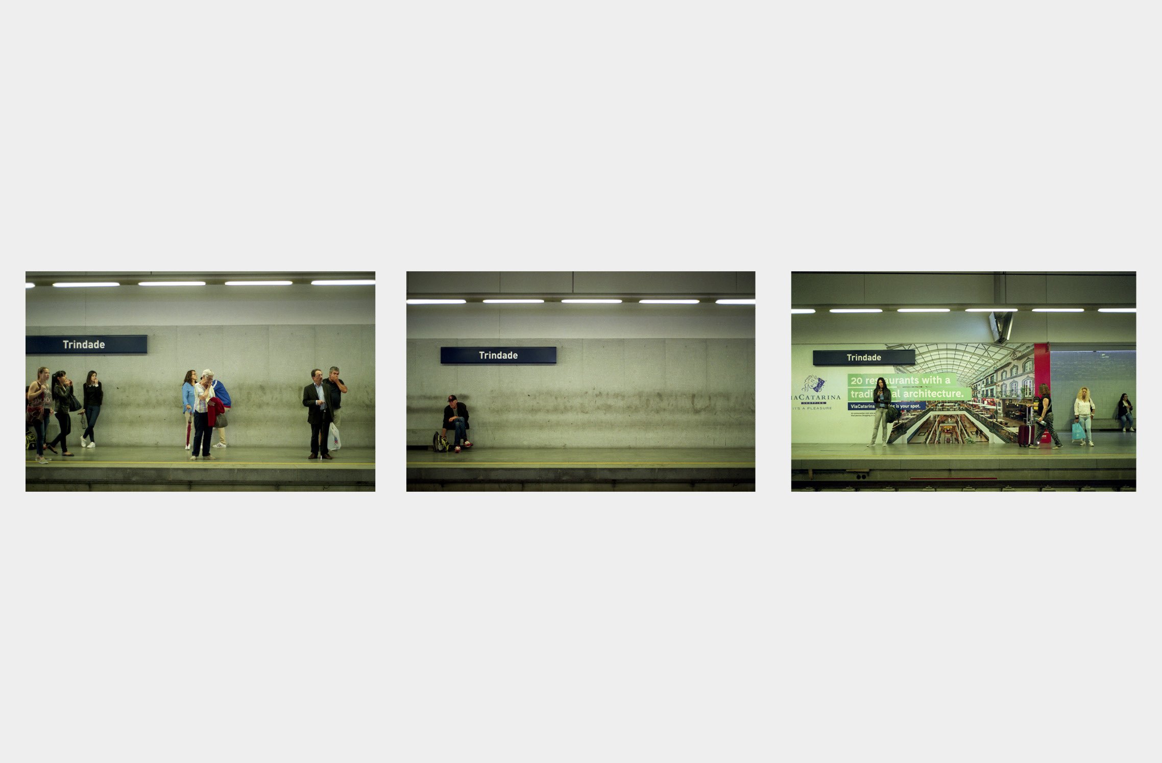
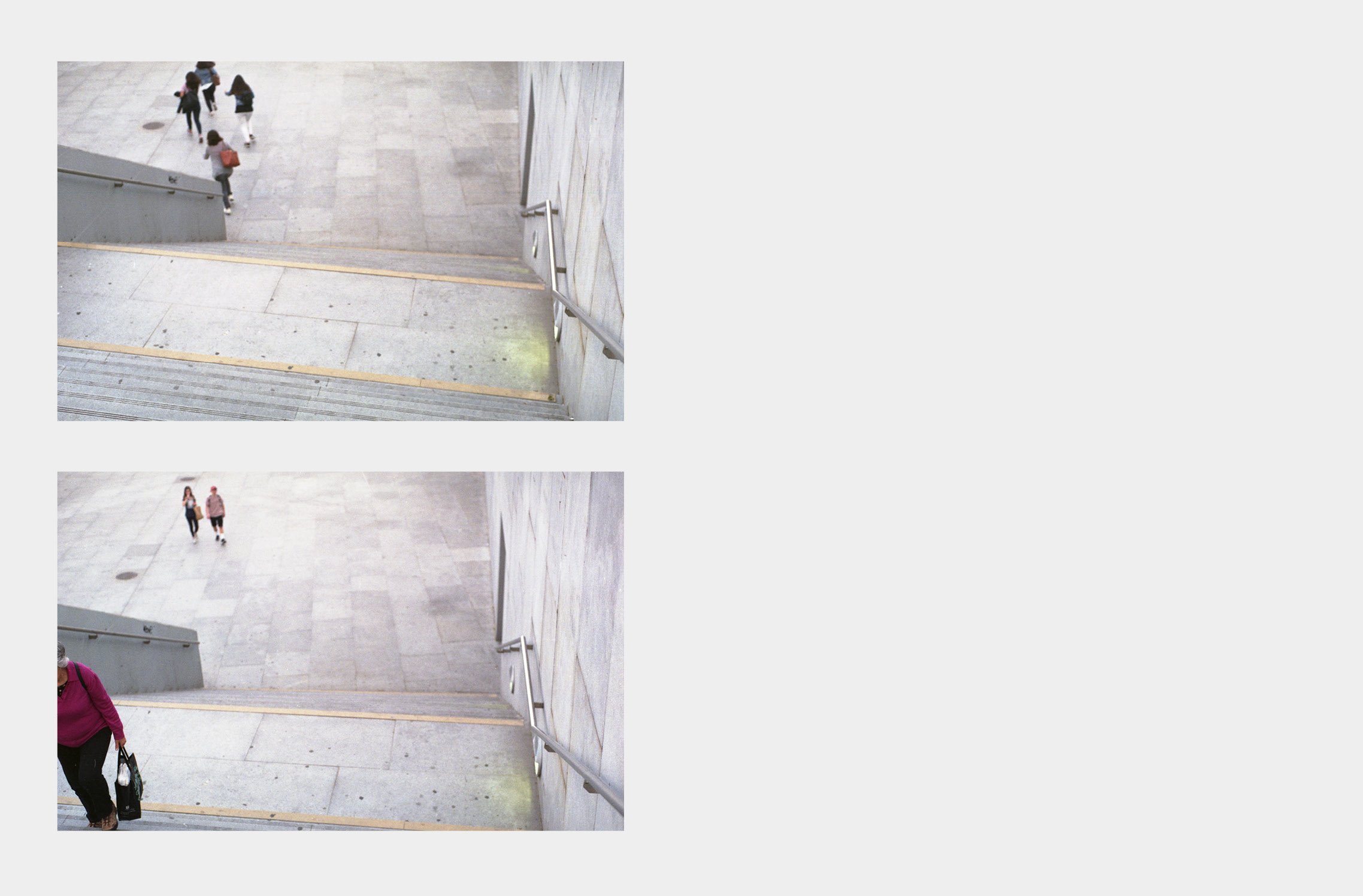
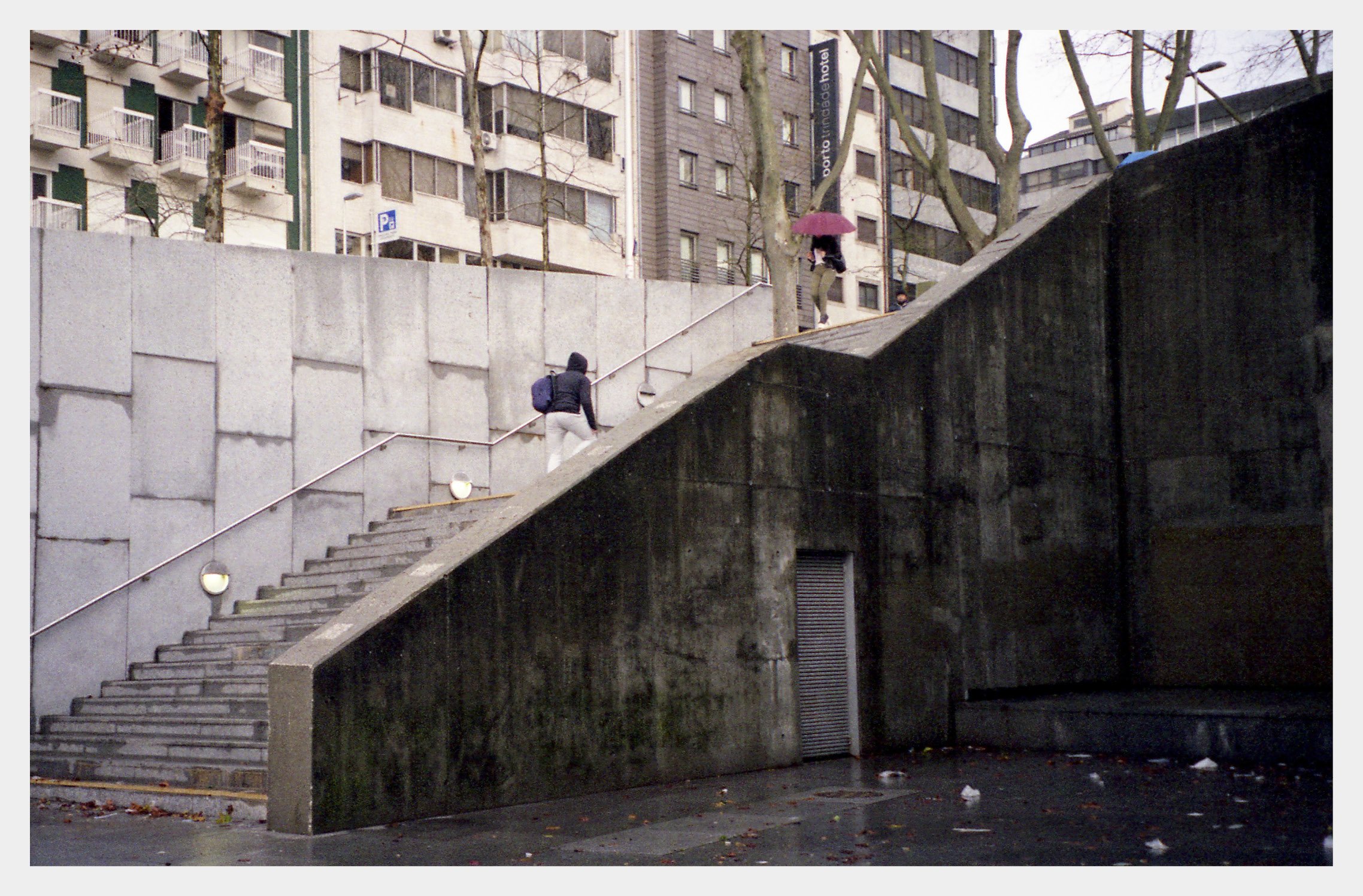
The set of images presented here constitutes a brief formulation of the result of a research project, which was concretized in a multiform printed object called Clareira. In this digital version, curated by Pedro Leão Neto and Né Santelmo, the aim was to create a visual narrative capable of communicating the essence of the photographic project, creating a series with a new dynamic. It is through the way the images are combined in the several pages that key elements of the photographic project are perceived and strengthened as, among others, the experience of the place, presences, absences and passages.
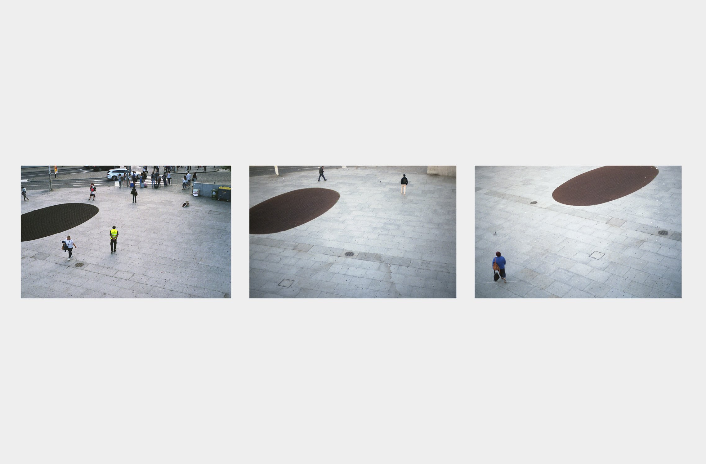
From a phenomenological perspective, Clareira proposes a visual approach that intends to contribute to the representation of the architectural space, as a place of experience. The Trindade subway station, for its condition of public space, at the same time building and square, daily crossed and appropriated by a great diversity of people, was chosen as a laboratory of experimentation of visual strategies through which the relationship of this space with the human and environmental elements that permeate it is observed and from which a reflection on the perspective from which the space is observed is also rehearsed.

The project is thus demarcated from approaches focused on communication and interpretation of architectural ideas, focusing on material existence, dynamics of use and the becoming of the work. The plastic language used seeks to distance itself from the formal legacy of photographic objectivity, still dominant, assuming a markedly subjective perspective and claiming the influence of authors such as Guido Guidi, Michael Schidmt and Rut Blees Luxemburg.

Peter Zumthor appears as the main theoretical reference, in the search for a positioning of oneself, and an attitude towards reality, characterized by an attentive and available physical presence, centered on sensory perception. It was from this way of being that a way of communicating the experience was sought, or in other words, a photographic approach. Clareira invites the viewer to take the author's place and observe the photographic traces of moments in which the magic of reality manifested itself somewhere between subject and object.