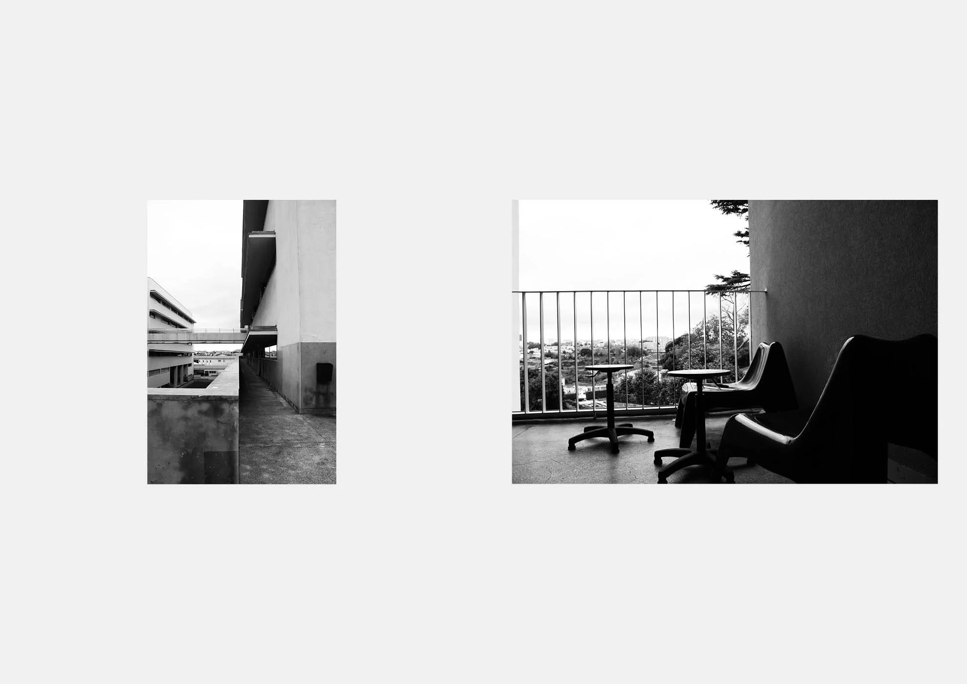
CONCEPT AND FORM: EDIFÍCIO DA FACULDADE DE LETRAS DA UNIVERSIDADE DO PORTO
BY ANA COSTA, IVO ROBERTO, SARA DI MASI
01. Background
The Faculty of Arts of Porto, initially designated as the School of Higher Education for Humanities and Social Sciences, was created in 1919, and was later extinguished in 1928, already as Faculty of Arts of the University of Porto, resuming its activity 33 years later. In the diploma that recreated the higher study of Arts it was given the "degrees in History, Philosophy and also the course of Pedagogical Sciences".
Gradually, the curricula for the courses currently taught at this institution were expanded. While it is true that the founding process was characterized as agitated and controversial, it was no less so with regard to the spaces it successively occupied, until it came to have definitive facilities. In fact, it passed through several buildings that were used on a precarious basis. Having the Faculty of Arts clearly expressed its displeasure at the possibility of being located in the University Campus of Asprela, Paranhos parish - as provided in the Master Plan of the City of Porto, by Robert Auzelle, approved in 1962 - it was necessary to wait for the reform of facilities of the University of Porto, promoted by its Rector, Professor Armando Campos e Matos.
Expressing the will of the various Faculties that did not accept their relocation to the so-called Pole 2, it was agreed with the Government and the CMP, the creation of three University Poles, with some of the Faculties remaining in the historic area of the city. Others moved to a relatively nearby nucleus, Pole 3, whose General Plan was initiated in 1980, covering the area between Rua do Campo Alegre and the Arrábida Bridge, already occupied by the bridge's access node to the city center.
Everything was happening at a time when the negative aspects of moving universities to suburban areas were being evaluated, even when their return to the historic core was already being put into practice in some cities in Europe, which were betting on the renewal of urban centers. Therefore, an immediate attempt was made to develop a "university" axis, with an east-west orientation, beginning at Gomes Teixeira Square and ending at the Botanical Garden, installed in the old Andersen house, opposite Rua António Cardoso. The Faculty of Arts itself had already occupied several buildings along that route (former Faculty of Medicine, Vilar Seminary and the Pedagogical Complex in Casa Burmester).
Although the 1962 PDM already foresaw a connection of the VCI to Rua D. Manuel II, the new study was based on an alternative promoted later by the Regional Direction of Urbanization of the North, of the Ministry of Public Works. Its goal was to create an entrance way into the city, starting at the northern top of the bridge and arriving at Praça da Galiza, which would give way to the expansion of the urban mesh from Rua D. Pedro V to the Via de Cintura Interna, integrating an entire territory "gutted" by the various loops that still make up the node. Faced with vested interests and commitments that are already difficult to alter, this hypothesis was thwarted. As a result, the spaces to be occupied were relegated to residual areas, isolated from each other by the layout of the one-way streets, intended exclusively for motorized traffic, without resulting in a surface area large enough to accommodate, among others, the new facilities of the Faculty of Arts.
The numerous difficulties raised to locate the future building were not enough to deter the firm determination of the Vice-Rector, Professor Horácio Maia e Costa, to find a site with the appropriate conditions. After considering various possibilities, including the Serralves Estate, and overcoming obstacles of various kinds, it was possible to approve the enlargement or "Expansion of Pole 3", to the east.
The vast land it came to occupy, largely delimited by Rua da Pena and the final stretch of the Via Panorâmica near Rua do Gólgota, was also the object of a Detailed Plan that began in 1983. As part of the readjustment of the General Plan, it was foreseen that the building to be implanted in this new sector would have a capacity of 3,500 students and would occupy approximately a covered area of 14,000 square meters, leaving enough free space to allow for an expansion equivalent to 50% of the initially calculated area.
02. The Program
Once its location was established and the plan readjusted, the premises that supported the program for the new facilities were elaborated - collegially by representatives of the various departments of the Faculty of Arts. For the purpose of the previous sizing of the building, taking into account those assumptions, a method of space management recently applied in the United Kingdom, in similar circumstances, was used.
Thus, several factors were considered, namely: the teaching process then practiced, the magisterial one; the curricula of each subject area; the number of students and respective occupation times; the document collection; the teaching staff; the administrative and auxiliary staff; the typologies of the spaces; the foreseen use for each one and the necessary equipment.
In the Base Program presented in the initial phase of the project, dated 1986.12.20, all the information previously proposed by that working group is systematized, as well as the inter-relationship of the spaces and their dimensions. This document, based on the data received by the designer, through the college of representatives of the Faculty, was submitted to the Rector's Office, which was approved after consultation with that institution.
03. References
Having already had a predetermined location, with a specific context (natural and humanized), part of that same document is a reflection on the historical, morphological and environmental characteristics of the place. Evidence of this concern are the textual citations taken from the "Topographical and Historical Description of the City of Porto" and the work of the Roman Vitruvius. From the former, and in relation to environmental characteristics we recall: "Finally, if the climate of this city is not the healthiest of the whole kingdom it is not one of the most pernicious, if it were not so, the many beautiful farms that surround it and make a delightful paradise would not multiply in its vicinity, or Spring continues ... Many of these farms extend to Massarelos, Vilar and Cedofeita. Raríssima there will be which does not enjoy a view of the river and sea". As for the second, an association was extracted between the symbol of wisdom, the goddess Minerva, the Athena of the Greeks, and the way of implanting temples dedicated to her, in this case symbolically represented by the Faculty, especially by its library, which is understood to be one of the generating nuclei of the modeling of the building's spaces.
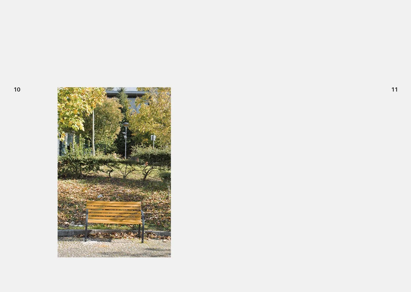
It will be a celebration of the spirit of the place, in which, in addition to its natural attributes, the humanities are evoked through the symbolism of classical antiquity. This framework of references and a certain enchantment of the place is part of the chromatic environment and the luminosity of the edge of the extensive valley that will open, downstream, over the ocean where the river flows. The gray tones provided by the thick mists are frequent there, alternating with the rosy tones of dawn and dusk, fading in the course of the day to the blues of the firmament and the golds of sunlight, typical of these parts, aspects that can be found countless times registered in the work of master Júlio Resende.
04. Land Occupation
The fact that the land is situated on the southeast edge of the platform that extends from Boavista to Campo Alegre, nestled between the festoons of Pena and Golgota, right at the beginning of the slope overlooking the north bank of the Douro River, gives it a peculiar morphology. This results, among other things, in a transition in terms of land use, which is characterized in the north by a high density of buildings and extensive alignments in the face of road routes.
On the contrary, on the hillside, to the south, the settlement is dispersed and almost random, although this is in the process of change, thanks to the developments that are currently being built there. From this framework emerges a variation in the amplitudes of the visual field, that is, in the direction of the river it is vast or deep, while on the opposite side it becomes more contained or confined. These are factors that contributed to suggest a differentiated modeling of the volumetric masses, as they are exposed to the observer and relate to the nearby urban design. At that time, the remote possibility of establishing a frank connection in the direction of the Praça da Galiza was also associated.
05. The modeling and the program
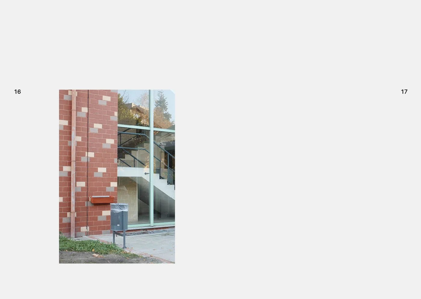
The clear notion of this complexity of circumstances, inherent to the site and to the program, was translated into the materialization process of the free and built spaces, which was configured as follows: - on the hillside, several towers are successively distributed, with the library tower standing out, which open over the small valley of Golgotha, standing out from an extensive predominantly horizontal body, embracing that set and demarcating the vast corridor whose planned alignment would integrate with the remaining urban mesh, extending towards Boavista and Praça da Galiza. The various volumes are interconnected at various levels by open galleries based on platforms that are not leveled according to the slopes, jointly delimiting courtyards, with different geometries and surfaces, from which the adjacent valley can be glimpsed; the constant alternation between free and built spaces, which would be accentuated by a notable landscape arrangement that was not realized, appeals to the perception of the place, both for its natural and humanized aspects; - thanks to the natural hues used in the exterior and interior cladding, sometimes predominantly ochre, sometimes iron oxide or even ash, the latter well present in the Porto light, a dialogue is established with the chromatic context, rich and delicate, typical of the Douro River valley, which in this final stretch is manifested in an inconstant manner, full of surprising alternations; - the coloring of the built surfaces, both exterior and interior, has a direct involvement in the spatial modeling, participating actively in the chromatic dynamics of the environment.
The application of the "Albers' law", becomes here an evidence, varying the presence and highlight of the various volumes according to the dominant tone of the environment, sharing the protagonism of the formal definition with the shadows, own and projected, through the use of color blends, standardized according to unique geometry, distributed on dominant backgrounds, provide indices of chromatic perception, variable depending on the degree of proximity of the observer. In all the spaces, a formal order determined by the laws of perspective does not prevail, where the vanishing point and the horizon line prevail. The diagonals, the curved surfaces and the demarcations of vertical development, both interior and exterior, regularly contradict it in a process that makes it less imposing in visual sequences, whether static or in motion. Through the altimetric representation of the spaces, sections and elevations, it is not possible to fully visualize the different faces of the set, according to the conventional orientations, N-E-S-W, which denotes a research process where this secular procedure is less valued.
Taking into account the numerous empty spaces, the interior and exterior patios, with pronounced vertical development and transparency, we realize that they emerge from another conceptual assumption, that of insistently attesting to a sense of community and gregariousness in the institution, which offers degrees, master's degrees, and doctorates in different areas.
In fact, the need to distribute the teaching spaces over several floors and the curricular diversity offered, when enclosed in watertight contexts, would generate the successive isolation of each sector and undermine the spirit of academia, besides wasting the advantage arising from interdisciplinarity and conviviality that enhance the scope of knowledge. Such intention was an opportunity to architecturally address the "Confucian" issue, translated into one of the most determinant formal attributes in defining space: the ambiguity between emptiness or its surrounding materiality (positive versus negative). It is also worth mentioning the fact that, in one part of the building, the usual demarcation between the roof and the façade walls was abolished. This continuity has since disappeared, due to a gross deviation in the planned construction method, which has resulted in various damages, among which those resulting in the plastic expression of the building, now showing a clear separation.
06. The accessibility
As Via Panorâmica and Rua do Campo Alegre are the main approach axes, together with Rua Gonçalo Sampaio, the main entrance is located in the vicinity of its meeting point, although not leveled in relation to the average level of those streets. It constitutes an alternative to the one initially foreseen in the Pole 3 General Plan. In fact, at this point, it makes sense to mention such an intention, since it integrated the building in a larger network supported by equipment common to all faculties located in this Pole and determined aspects of conception and design from which the construction was hampered.
A leveled pathway to the Faculty of Arts was planned, starting at the RCA, next to the nucleus of common support facilities to all faculties located there, where public transport would also converge, in addition to a final stretch, launched as a viaduct, over the road directed to the Praça da Galiza. Its path, exclusively for pedestrians, was a radial of the curved section of the building that was crossed by it, to end in the intermediate tower, overlooking the Rua da Pena. This access was housed in the only level that encompassed the entire building. Faced with the rejection of this concept of integration of the various institutions, another hypothesis of approaching the Faculty was put forward, again on a viaduct, now from the intersection of Rua do Campo Alegre with Rua Gonçalo Sampaio, which, in turn, was frustrated by the failure to establish the connection to the Praça da Galiza.
07. The spatial interrelation
In the organization and distribution of the spaces of the various sectors, both the levels of preferential proximity defined in the program are evident, as well as the application of a criterion of access permeability, directed to visitors and users, according to the degrees of privacy and security necessary for the effective performance of the various activities in question (free, conditioned and restricted). This, without harming the broader conceptual context mentioned above.
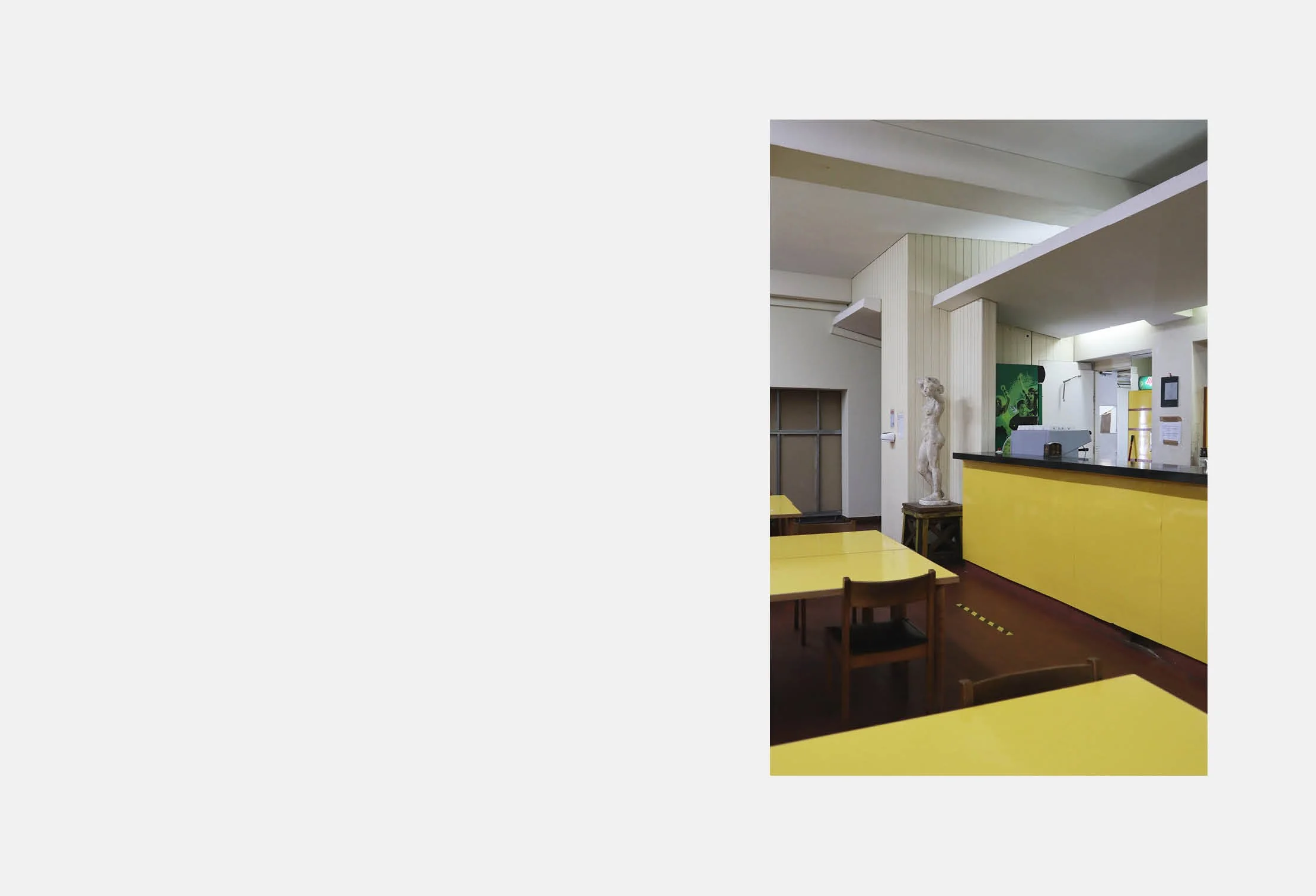
Annexed to the entrance portal, the main atrium is in direct contact with the areas destined for free access, for common use, and for conviviality spaces, such as the cafeteria, the esplanade, the main auditorium, and the library reception. That distribution point also borders one of the interior patios, from where two auditoriums and the various floors on which the building is developed are immediately visible. Adjacent to it, next to the curved wall, there is a triangular-shaped outdoor patio, bordered by two converging galleries, which houses a metal structure of great transparency, serving both as a light-break and as a bench for open-air shows. Strangely enough, this equipment - confined by architectural elements made up of facades equivalent to the others, but which configure sceneries - has practically never been used, despite its excellent environmental conditions.
08. The Library
Considered by the institution, at the time of the project's realization, as the repository par excellence of a vast collection of knowledge, the library came, therefore, to be located at a strategic point in relation to the building and the external surroundings.
Distributed over several floors, its shape does not escape the literary influence of Humberto Eco and Jorge Luís Borges. Although it is part of the conditioned-use spaces, it borders other spaces of free access, distributed around the reception area, and as a whole it can be a form of explicit support to the outside community, without disturbing the functioning of the other sectors of the building.
Given the help it can provide, the main auditorium and the Educational Resource Center were located in its immediate vicinity. The latter, inexplicably, was never put to its intended use. The library's programmatic areas, with the exception of the technical services, are arranged around a central lobby, where an extensive spiral staircase rises, symbolizing the depth and infinite reach of knowledge. The openings, opening on the slope shaped by the line of the talweg pointing to the river, invite to a serene and reflective contemplation, provided by a landscape of rare beauty. Topped by an immense entrance of tripartite light, and covered by an accessible terrace, from where that same panoramic view can be enjoyed, in conditions of great attractiveness that, until now, have been practically ignored.
9. Other spaces and their attributes
The upper floors are reached by two wide security staircases, where the teaching spaces are located, flanked by a long corridor, which is finished at the top by a curved section, whose expression is much more accentuated on the top floor, occupied by the laboratory spaces. The effect of surprise and discontinuity are attributes of these accesses of horizontal prevalence, which at the ends connect to the outdoor galleries and successive courtyards, covered or open air.
In the first, the fenestration of the interior walls replicates the rest of the building's facades, contributing to the ambiguity of the spatial definition of the three small covered squares, which appeal to the meeting, communication and debate of the results of intellectual production generated in an academic environment. The fusion between the processes of architectural modeling and the offer of conditions for sociability and face-to-face communicability are present in numerous places in the building, factors that are nowadays highly valued, due to the tendency for physical isolation generated by computer technologies, which we cannot do without. It can be noted that the importance of that approach has, in fact, been emphasized throughout time, since the relationship between Man and the spaces of conviviality are a constant of his existence.
Taken as the nerve center, guiding the activity of the institution, the spaces allocated to the Directorate occupy part of a floor, which sits on the cafeteria, in visual contact with the library and in direct connection with the terrace that covers it. That sector interconnects with a lounge area exclusive to the faculty that is supported by a large vaulted gallery, whose characteristics are close to some "lost spaces", brightly lit by natural light, and appealing to an informal use and relaxation, in any weather conditions.
10. Adaptability
Once again, the range of spaces provided meets the variability of the time users spend at the Faculty. Nowadays, there is a tendency for less student presence, due to the reduction of "teaching" time, and a tendency for a longer stay of teachers in research and tutorial support, as was already happening in other countries at the time of the beginning of the studies and projects. This is because the parameters that were initially defined in the Program, as to the distribution of the teaching staff, are now changing. In order to cope with eventual changes, constructive flexibility conditions have been foreseen (namely in the teaching sector), in accordance with the recommendations of research centers on spaces for higher education, allowing the repositioning of partitions and, thus, the resizing of rooms to meet new demands or constraints.
Finally, the technical and logistical support facilities are located at the level of Rua da Pena, from which access is made through an exterior patio, which they largely adjoin.
11. Transformations
Faced with the overall implementation of Pole 3 - quite different from the initial objectives, where the logistical support equipment would be for common use - it was necessary to find specific answers for each of the institutions, which had repercussions on the need to rearrange the spaces to the east of the Faculty. In such circumstances, it became inevitable to establish connections with the urban mesh that extends from Rua da Pena to Praça da Galiza. Although in a compromised way, due to all the constrictions in the meantime, it would not be possible to implant the necessary equipment there.
In that residual space, initially foreseen as an extension area of the building, a building complex was implanted that houses a covered parking lot, a canteen, a cafeteria and a residence for students. The set of infrastructures necessary for the use of the new facilities, which are based on the old Pena streets (street, alley and ramp), articulated with the easement arranged along the northern façade of the Faculty, has made it possible to establish a network of roads with a reduced cross-section, under conditioned access. However, and despite the fact that the conditions of insertion in the road structure to the east of Pole 3 were not the most favorable, the possibility remained open for a better integration into the rest of the urban fabric in the future.


