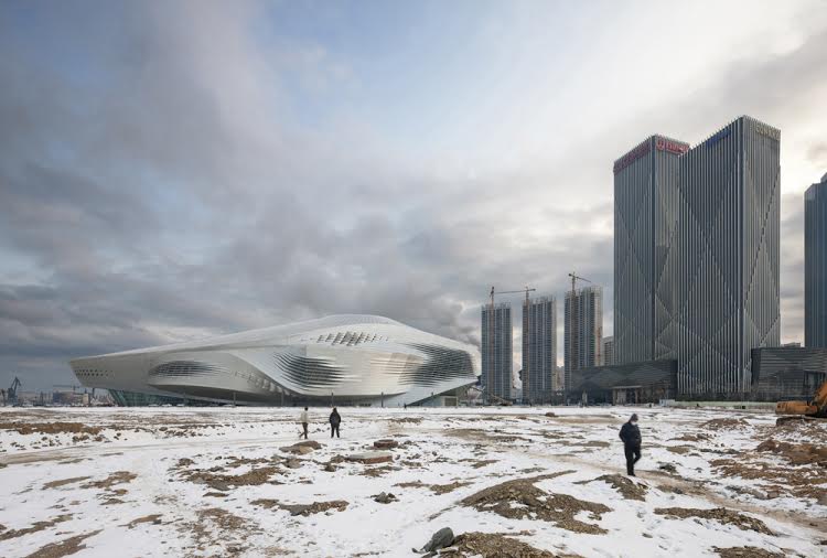
1 PHOTO(GRAPHER): DUCCIO MALAGAMBA
BY HUGO OLIVEIRA
HO: Where was this image taken?
DM: It is an exterior image of the Dalian Congress Centre in Dalian, China by Coop Himmelb(l)au Architects.
HO: Had you been there before?
DM: No, it was my first time in Dalian and just my second trip to China.
HO: When was is taken?
DM: I can remember that the photo was taken in the afternoon of a day at the beginning of December 2013.
HO: How did you end up registering this?
DM: I was commissioned by the architects to portrait their building.
HO: What were the conditions at the site?
DM: The area is close to the seaside and at the moment of the shooting there was a chilly sea breeze. Very chilly, actually, as in those days the temperature was around 10/15 degrees below zero. The site was almost silent as the workers already ended their working day and the traffic was far away. The entire afternoon had been cloudy, but getting closer to the sunset the sky opened up a little and a mild light timidly appeared.
HO: Are there any technical aspects of the photograph that you want to point out?
DM: Well, to work in cold conditions is always very demanding, both for the photographer and the equipment. Nevertheless I have to point out that in one week of work under those harsh climatic conditions I never had specific problems with the batteries or the camera.
HO: Why did you select this image among so many others?
DM: I find many reasons to like this image. First of all, I love its surreal atmosphere. The three figures look very small and lost in such an unusual surroundings, I also find very funny that the closest one wears a safety mask. This detail immediately transmits the sensation of an unsafe ambience. It somehow contributes to convert the Congress Centre into a space ship that possibly contaminated the area. Or perhaps the ship is there to evacuate the surprised and disoriented survivors from this post disaster landscape… I find the image satisfactory also looking at it from a more orthodox point of view: thinking to it just as an architecture photography it shows the building perfectly lightened, enhancing the peculiarity of its form and reflecting skin. The relationship with the surroundings is clearly expressed and finally the figures add scale and some action. Another aspect I like of this image is its balanced composition with almost one half of the image dominated by a “crescendo” of dark other half relying on a bright horizontal volume.
HO: Was there anything particular that you were trying to communicate through this image?
DM: I was definitely interested in showing the very peculiar context where the building was standing and I was fascinated by the contrasts in terms of scale and aesthetic. But let me reproduce what Architectural Review’s Editor Catherine Slessor said about my picture during an interview in port-magazine.com. She perfectly describes what I had in mind and, of course, she is able to express it much better than I could ever do when we come to English:
“It’s simultaneously beautiful and bleak – the beautiful new building like a delicate piece of sculpture or haute couture set against the backdrop of a still terraforming cityscape of bleak and anonymous skyscrapers. It’s exceptionally evocative of our times and how architecture is being relentlessly commodified, used as a bauble to prettify what is essentially a terrifyingly banal and overscaled urban development being realised at breakneck speed. By pulling back to include the wider context, Malagamba invites you to consider a much more revealing and complex picture.”
Duccio Malagamba is a photographer and architect.
The selected image and interview are part of the editorial project "1 Photo(grapher)".

