POÉSIE LINÉAIRE: EXPLORATION DE L’OMBRE ET LA LUMIÈRE
BY AUDREY MARQUES, THOMAS CHEN, VIOLETTE CAIREY-REMONAY, ZOÉ MAILLARD
PHOTOGRAPHIC PROJECT ABOUT THE FACULDADE DE CIÊNCIAS DA UNIVERSIDADE DO PORTO
Initially, we focused on the study of Hélène Binet’s work, to guide us in this practice.
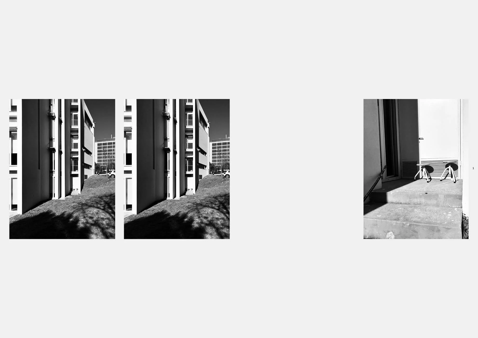
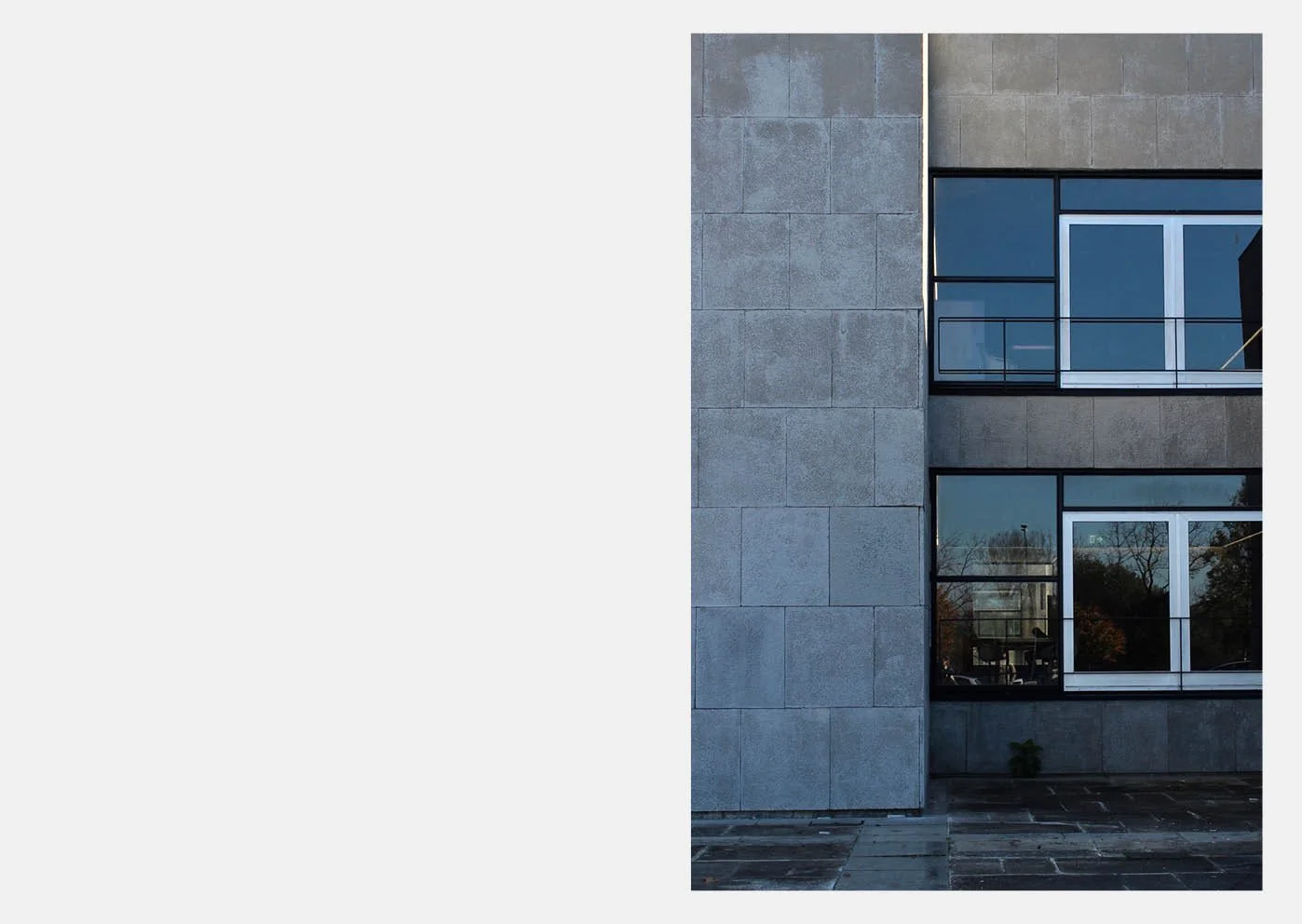
Her work began with the use of different scales, and her poetic language around light inspired us. These lines of thoughts were the guide- lines on which we based the creation of this book. We made the choice to work with black and white, a binary vocabulary of color. We thought it was well suited to capture and highlight the straight geometry of the Faculty of Science. Furthermore, this choice allows us to lter parasitic information from the environment that would jump out too much with a high impact of color. Because we want to focus on the deep meaning of the photographs. We want to identify different atmospheres through the accentuation of geometry or the symbolic content of the photograph, without being impacted by the temporality emitted by the use of color, the effect of time. This use of black and white accentuates the work carried out on the poetics of light, with its play on light and shadow. And it highlights the vertical and horizontal lines of the building.
This place exhibits a straight architecture that is frozen in space. These guidelines are in contrast to the organic forms of the environment. Indeed, the Faculty of Science is located in a large park where vegetation is present. This parti- cularity of the place offers a counterexample to our line thoughts: in the strong geometry of the building, we encountered small imperfections such as air vents or technical ducts. These building components are neces- sary for the proper functioning of the latter and bring life in this rigidity. They appear as the organs of the building.
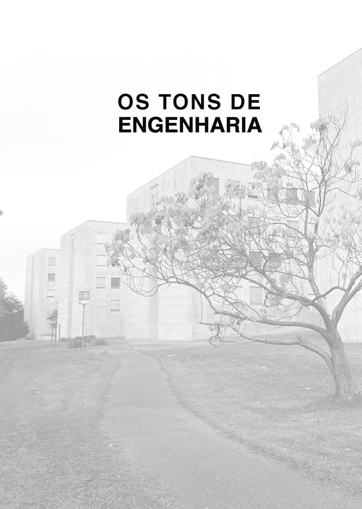
Its environment reveals a diversity of space, biodiversity and architecture. When dense vegetation comes into contact with the right architecture of the buildings, strong tones are accentuated on the image. The black and white showcases all the human constructions, all the buildings of the site. The relationship between two colors conveys the idea that everything is straight, ortho- gonal, geometric, in order, and in simple and pure shapes.
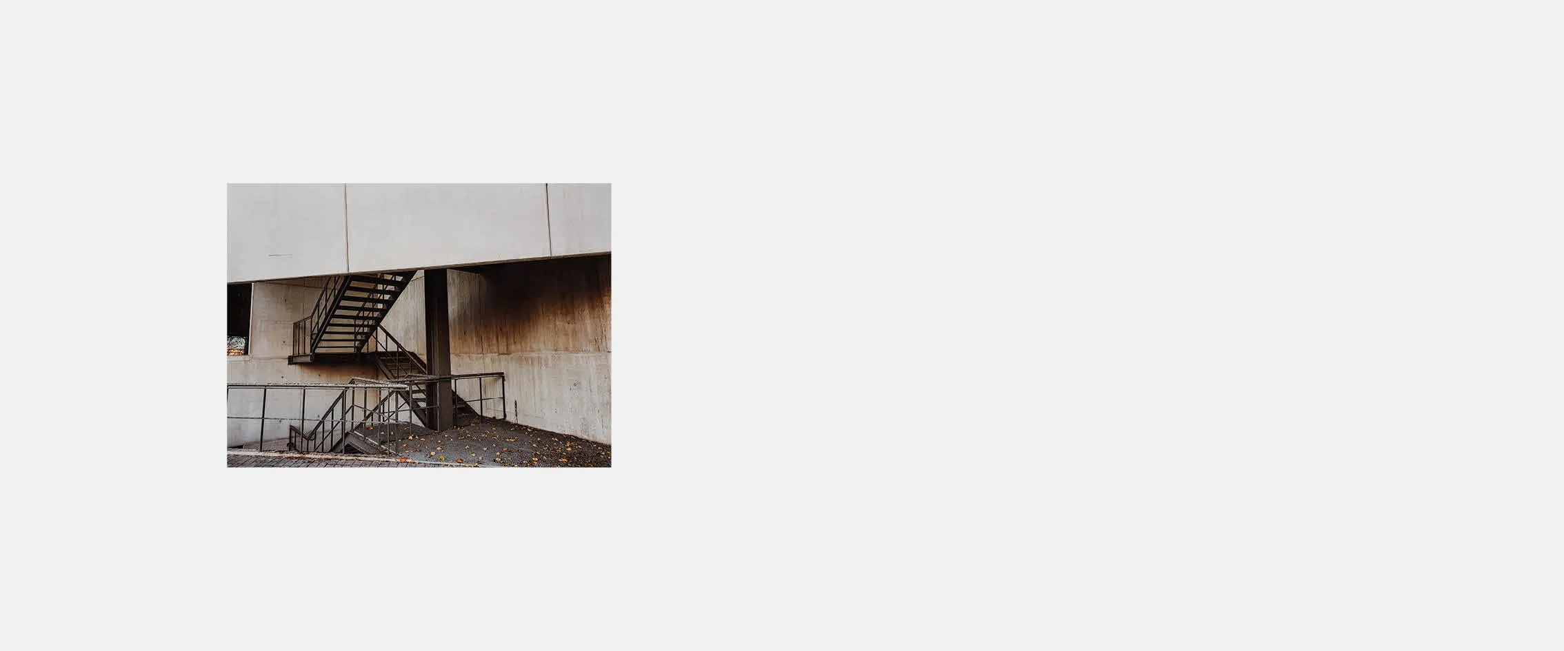
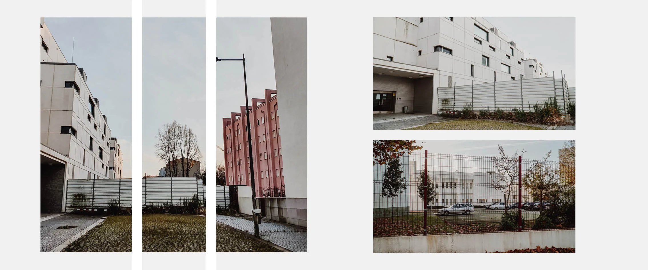
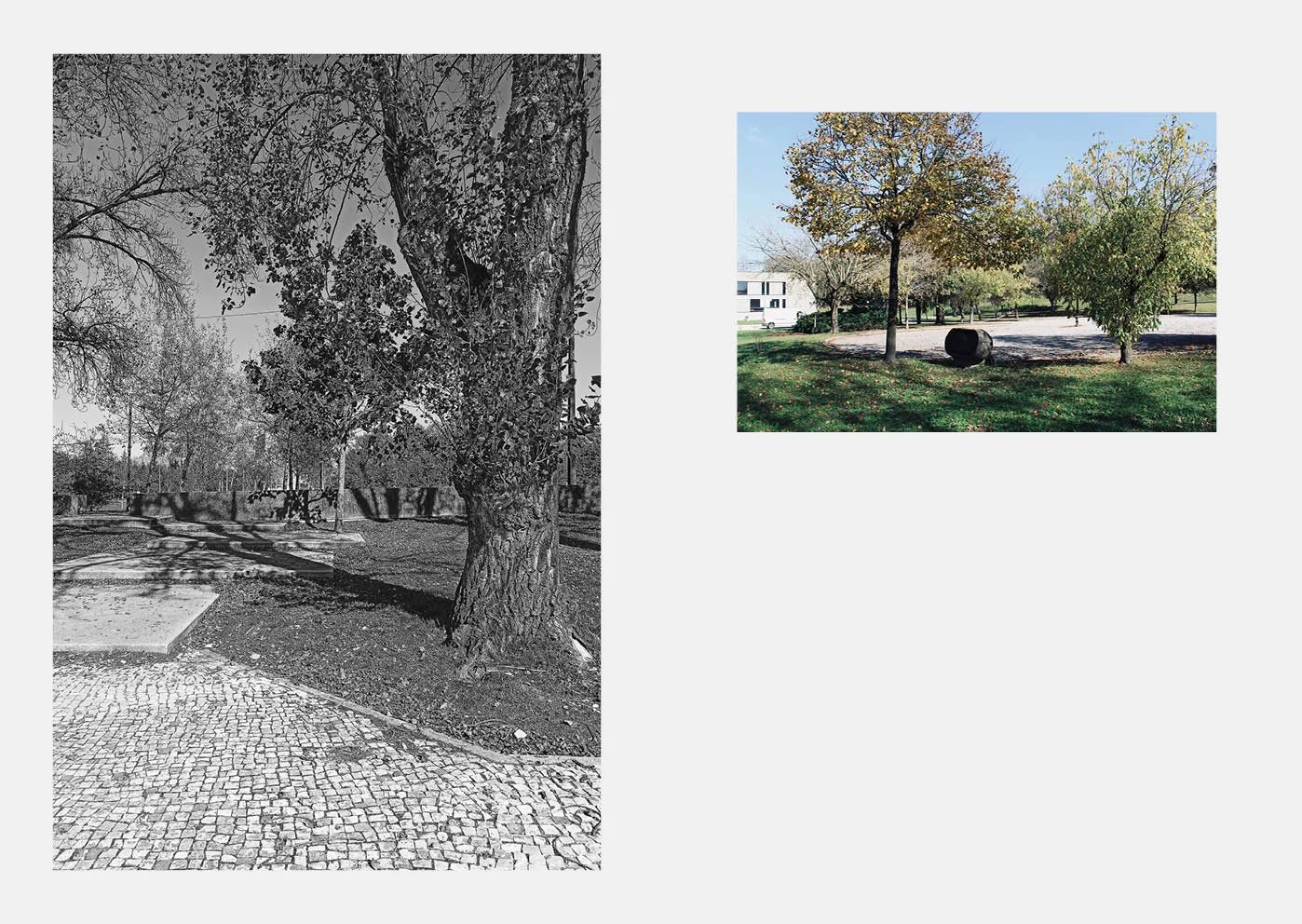
The walk was an important drive for our thoughts. We want to share with you this walk, where the out- door area is unveiled like a space lled with rich details and surprises. The orthogonal ensemble is part of a more chaotic natural en- vironment, which cannot be described simply by two colors. For this reason, we have chosen to punctually bring color to our photographs, in order to reveal all the diversity present in the outside space of the faculty.
This change concerning colors is a desire to illustrate the complex relationship that the site emits, between a building with strong lines and dense vegetation. When we en- counter the organic and intricate forms of the park, the use of color becomes important in order to illus- trate the dense vegetation.


